I need to raise awareness of the issue, and also to try advertise a solution. Knowing about a topic like this is pointless if it doesn't encourage people to do something about it. The best way to do this would be to show them how atrocious it is. I don't however want to use too shocking imagery as to put people off looking (I believe PETA have done this with their activism which has helped with their growing amount of critics)
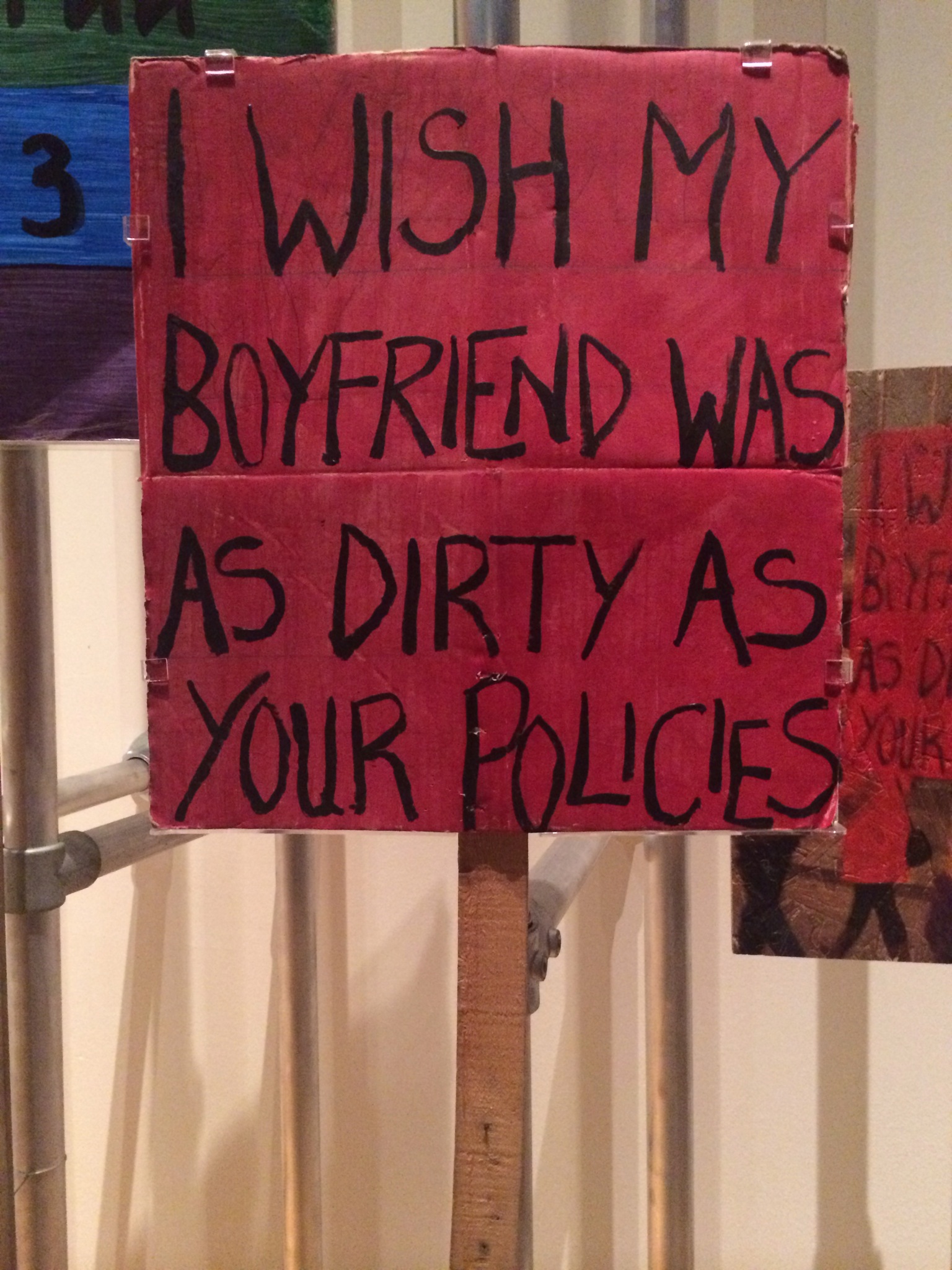
After trying to develop a symbol for my awareness campaign, I found that it was incredibly difficult to do due to the complexity of the issue. I've also found that most signs and picketing posters aren't very effective. They are very attention grabbing and communicate a message, but often it is lost due to the connotations of protests.
I also felt like the amnesty international posters (they have created some for raif badawi) are too generic and well made. They don't have that human element which hand painted signs and activist graffiti does that sparks something inside of you. They're so cliche and bland that you almost look right through them.
I believe this is why the objects curated in the Disobedient Objects exhibit in the V&A were nearly all handmade items rather than digitally produced signs etc, They carry an aura similar to how artworks do.
I then started thinking about how my use of colour, type and pattern could help.

I also looked at the Saudi Flag, which has a sword on it along with an inscription of the Islamic creed. I looked into using the same colour scheme and sword and making a parody of it.

I love this piece of activist design, as I feel that having a sense of humour about issues can be incredibly effective, as it adds another level of humanity to it. It also makes it more memorable, and incourages the audience to interact with the other material the group is presenting.

BIG CHANGE
Over easter I really struggled with coming up with concepts and work for this topic. I'm thus expanding it to look into Saudi Arabia as a whole, exploring it's culture, laws and history. I couldn't find any inspiration when trying to produce campaign/protest material because I wasn't interested in it. I am going to produce a publication instead as I enjoy editorial design.
Trip to The Village Bookstore
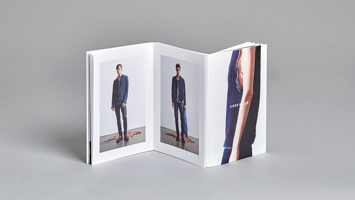
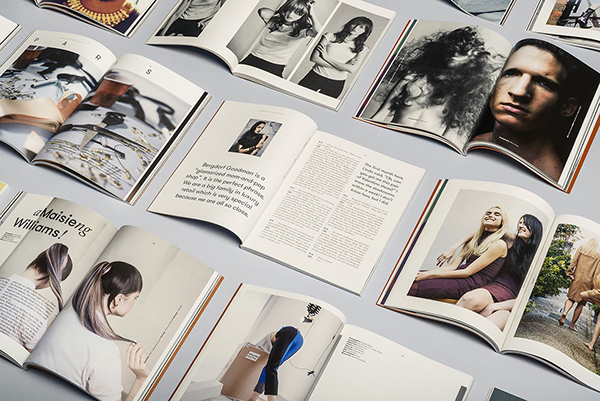
I went to the village bookstore in the corn exchange looking for publications to inspire me. I found a number of publications and magazines which I loved, and spent a fair amount on them. I went through them looking at how type and image are laid out and how they interact together. I also looked into production techniques, as well as paper stocks and binding techniques.
My favourite was a magazine called 'Another Escape', which to me was perfectly designed. The paperstock was soft but not easy to damage, and also held colour beautifully. The photography and illustrations were all stunning. The choice of typefaces and layout of said type was incredible easy to read and looked amazing. The title and spine were foil pressed which gave the publication a professional and quality look. I am going to get in touch with them as soon as possible and find out whether they run any internships.
Raif Badawi will still be featured in my publication, but won't be the main focus. I want to explore all of the bizarre contrasting elements of Saudi Arabia, from the modern elements such as the richest company in the world Saudi Aramco and the huge military spending to the medieval judicial system of beheadings and lashings, as well as the oppression women face in the country.
Primary Research


Design Inspiration
Back to Back bind. I could create 2 books, one looking at the modern rich arab culture, whilst the other explores the human rights abuse and corrupt monarchy.
I like this layout which runs over the spine and also utilises an interesting colour palette. The mix of matte and gloss materials is also nice to look at.
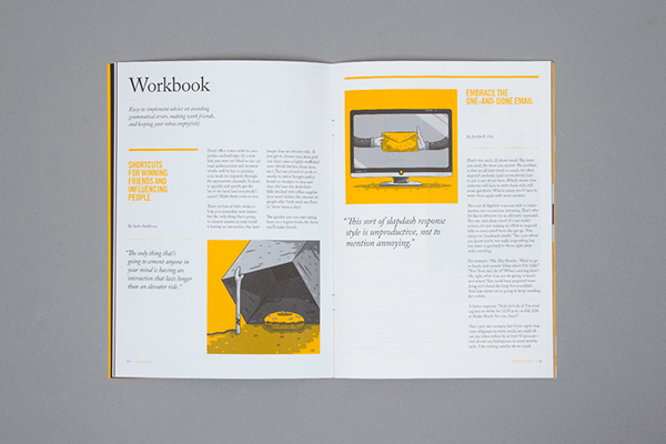
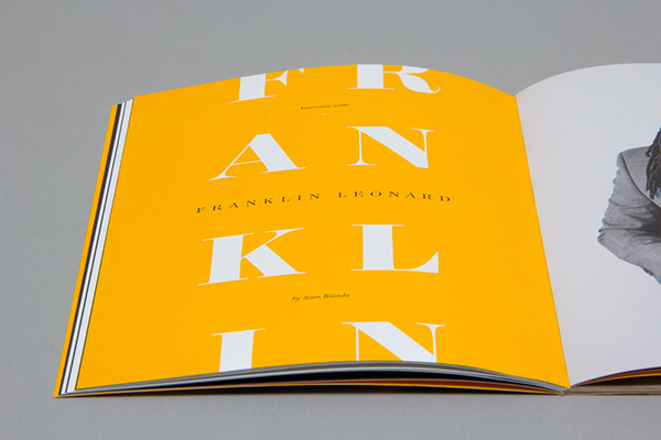
This use of colour and type is beautiful to me. The typographic hierarchy is great and the bright yellow contrasting against the white and black is very striking and aesthetically pleasing.
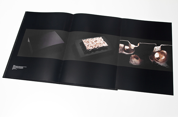
This double fold is very interesting but I don't know how i would utilize it in my publication. I also like the small isolated text in the left corner. The size makes it second on the hierarchy and doesn't take away from the image yet is clearly readable and noticable thanks to the black/white contrast. If I use black and white stock I will almost certainly use black/white body copy to keep readability and legibility high, as I plan on using a small pt. size due to their being a large amount of copy.
Hopefully I can mix up my body copy to keep it interesting as using the same column no. throughout can get tedious. I don't however want it to look too confusing by using too many different grid systems. The coloured text on this page is also interesting, contrasting against both the black text and b/w imagery. I may use black and white for my photos to keep with the concept on contrasts in Saudi Arabia.
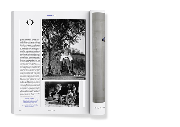
I dislike the overlapping imagery shown here. I think that it looks clumsy and showing of a lack ability using grids.

This design uses typography which is very understated which I like a lot. It emphasises the illuminated figure by not distracting from it. The 5 column grid is also very interesting as it allows for a large amount of information to be applied in an understated way.

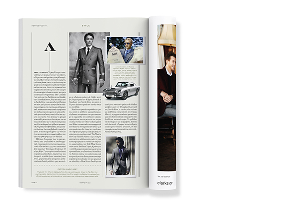
The typesetting on this publication is very interesting. It reads very well, more so than having a space between each paragraph. The red type is also very interesting however I feel that after some time it would becoming straining on the eyes. I'm also not sure about the image which squashes the type as I find it annoying to read when the starting word for the next line is in a different position.
Publication Name
+966 - Saudi Arabia's Calling Code
King's Decree/Decree of the King - Everything in Saudi Arabia is as is because it's the King's Decree
Dammam 7 - The first oil drill to hit oil and give Saudi Arabia it's wealth
7 King's - 7 King's since Saudi Arabia's founding
Deera Square - The square where public beheadings take place
I have chosen King's Decree as I feel it sums up everything that will be in the publication. I will be looking at both the good and bad of SA, both of which are so because of the King. It sounds snappy and memorable. Decree of the King sounded too much like the Lord of the Rings.


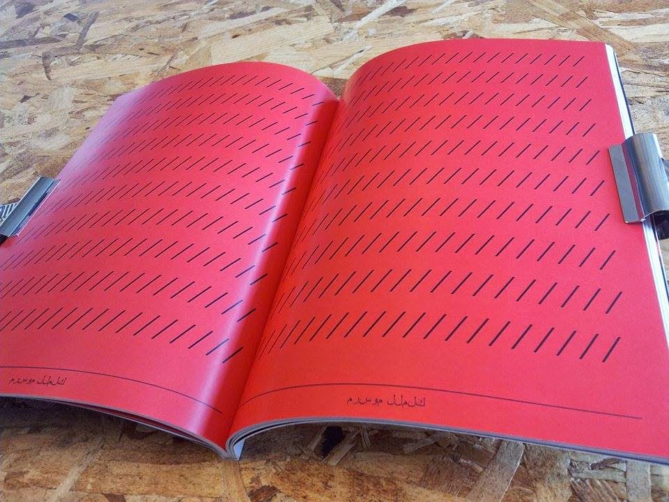
Working on a frontcover I want to keep it black and white to signify contrast. I have also added the title in both English and Arabic for the same reason.

I am using a combination of Tribute, Brandon Grotesque and Baskerville, inspired by the 'Another Escape' book that I purchased from the Village bookstore.
Typeface change - From baskerville to King's Caslon. The new typeface's name fits nicely, and is a more weighty version of caslon. In arabic books that use english the typefaces are usually more heavily weighted and on a slightly yellow stock. I will use white stock because I'm using black and white photography.
The pull quotes here are very interesting. the larger size and bold makes them super readable and it is obvious they are a seperate piece of text. Using a restricted amount of fonts keeps the publication looking professional.
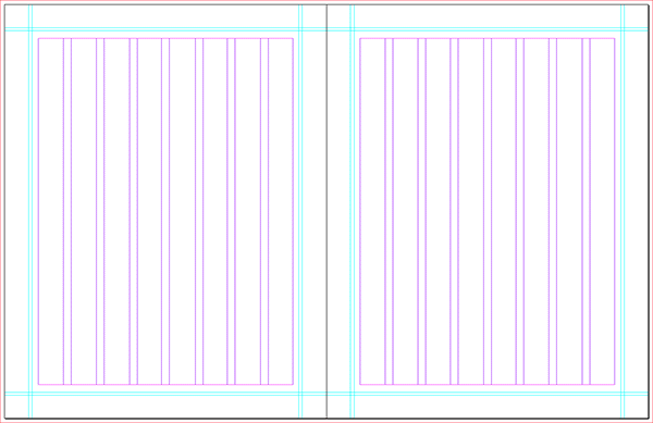
The 8 column grid which assistant magazine uses looks super versatile, allowing many different column structures to be used, as well as lots of freedom with the imagery.
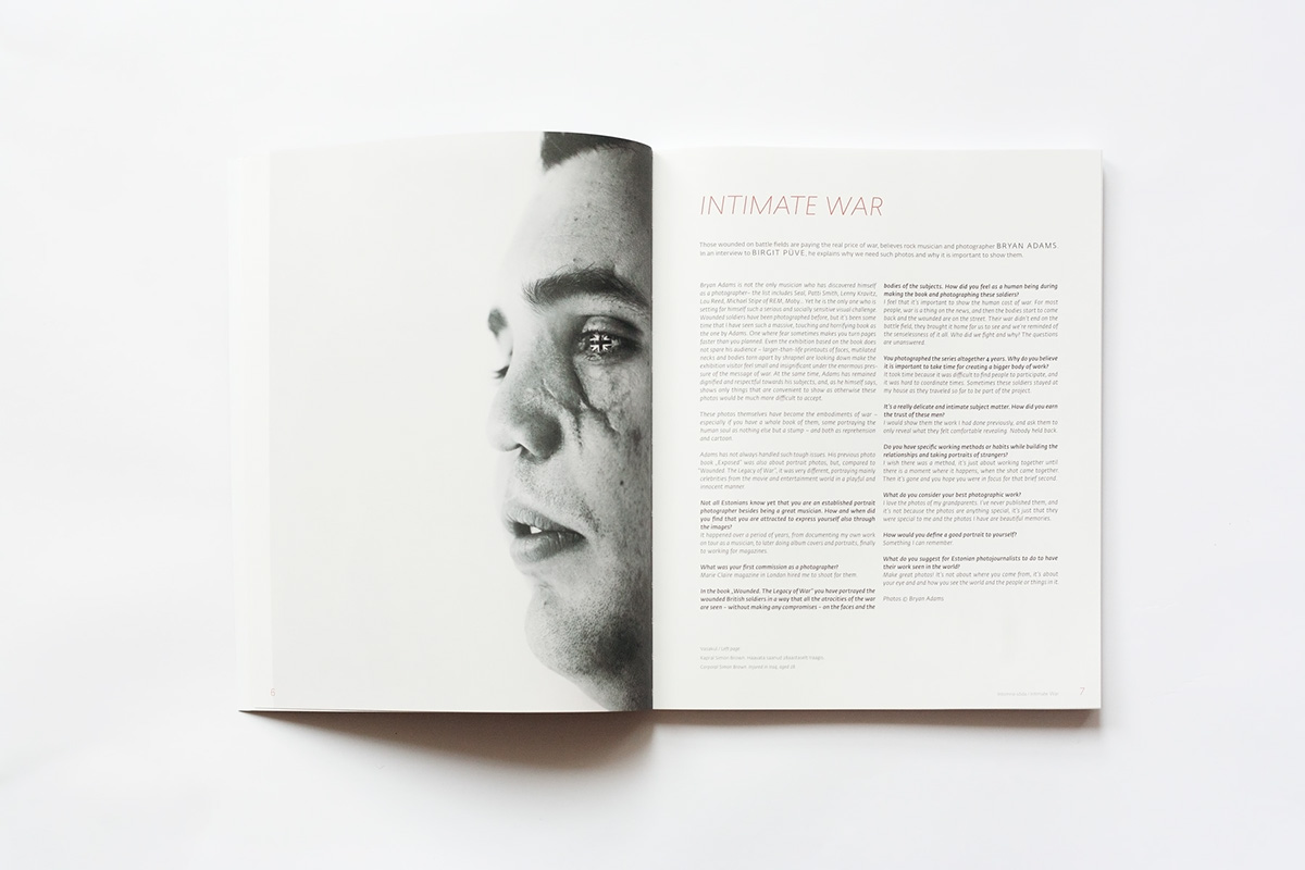
the full bleed black and white photo is very cool, especially when paired with a 2 column grid which uses a light typeface keeping the page quite white.

An insert bound into the publication would be very cool, allowing me to explore different tangents of saudi arabia. I do dislike however how it makes the book look when closed, bulging out and not laying flat.
I really like this typeface for frontcovers. The contrasting line weights makes it look very elegant whilst the extreme thickness and size makes it look great given the amount of negative space.
Coloured pull quotes look good although i'm not keen on it slightly overlapping the image. The different coloured stocks however looks great and stops the book looking too dull if there is not much content on the dps.
Content
I am wanting to showcase different aspects of Saudi Arabia and highlight contrasting aspects in lifestyle, law, culture, economics and politics.
Contrast will be a key theme in the zine, looking at the lifestyles of men and women, the rich and the poor etc.
In May, 2012, the head of the mutaween, Abdul Latif Abdul Aziz al-Sheikh, stated that anyone using social media sites, such as Twitter, "has lost this world and his afterlife"

The current king, King Salman, has twitter. He was almost 3million followers.
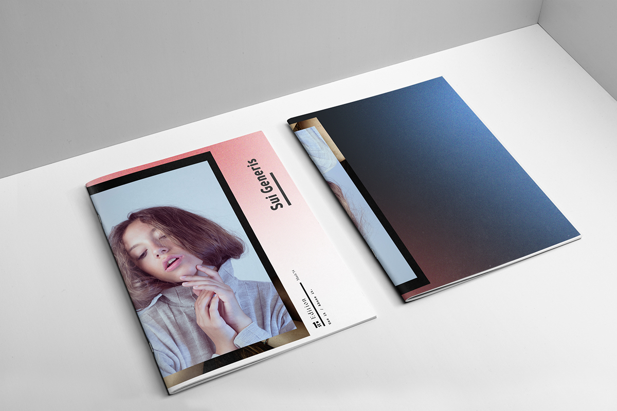
Research into informative magazine frontcovers.

I wanted a front cover that would look interesting whilst standing out on a bookshelf. Black is a great colour for saudi arabia given it's dark history as well as huge oil connections. I contemplated using an all black cover using on imagery but after considering my target audience I believe it would look too bland. I also created something similar for the covered brief, so wanted to create something a little different.
I found that my grid was not versatile enough. The 8 column grid used by assistant magazine looked great. It allowed for interesting placement of pull quotes and the 2 column text looked more readable than the 3 column i was currently using. I have also changed the typefaces I was using.
I have chosen to use brandon grotesque [light] for the body copy instead of king's caslon, opting for a thin sans serif rather than a serif. I've done this because there is more white space in the text which looked nicer. I also felt that the King's Caslon text was too old fashioned and novel-like for a book which is more informatory and aesthetic.


I thought about muliple printing and binding methods. I figured that given the amount of pages and use of both small text and photography having it printed professionally would be better than any other method. As for binding I thought that perfect binding would be best due to the amount of pages and style of my publication.
Product, Range and Distribution Evaluation
This brief started out
very rocky for me. Ethics has never been a concern of mine, so trying to find a
topic which I could properly get my teeth into and enjoy was tough. I also
misunderstood the brief to an extent. During the first crit in which we all
outlined the topics we were going to explore, people were suggesting topics
that they would work on that I hadn’t contemplated such as space travel or
virtual reality. After our visit to Disobedient Objects, I figured the brief
was much more about creating placards and banners etc, which is why I neglected
the brief for some time.
I began by researching
Raif Badawi, a Saudi man who was given an inhumane sentence for blogging. The
story had very minimal traction in mainstream media and was really only being
shown on the internet. Whilst researching I began creating work to try raise
awareness for Raif, however I really did not enjoy what I was creating. After
consulting with friends, who asked me what I want to produce as a designer in
the long run, I said editorial work. It was then I realised that I wanted to
create a publication which not only looked into Badawi’s conviction, but also
many other stories about Saudi Arabia which were tied in. The public’s opinions
of countries, especially the Middle Eastern countries are sculpted by
mainstream media and often racist views. I wanted to create a book which was
non-bias that showed Saudi Arabia’s culture, history and people, as well as the
controversies. This would help people create more founded opinions and help to
reduce the spreading of misinformation. I started out at the Village Bookstore
where I purchased a number of publications, some educational, some design based
and some that showcased Arabic culture. I also read some books on grid systems
to help with the production as I am still relatively new to editorial design. I
put together a grid system, chose typefaces and started to churn out work,
sourcing information from the internet, which was crosschecked with multiple
sources to try keep it as unbiased as possible.
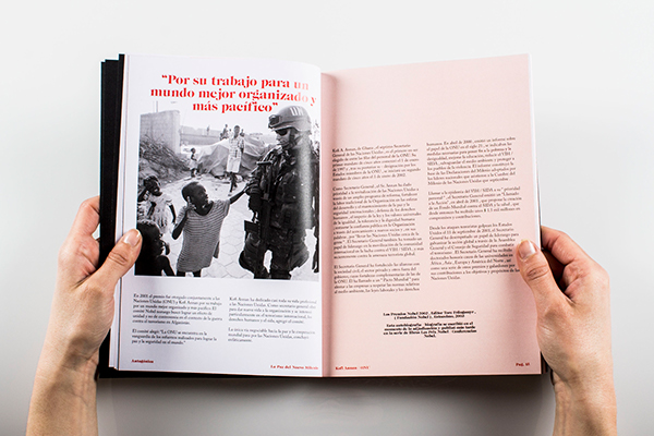
The photos were difficult
to source as I needed them to be as close to 300dpi as possible. I turned them
black and white and added a grain; the concept being contrast and imperfection.
The contrast concept comes from stories about Deera Square where beheadings take place, where you can see
skyscrapers and modern life take place next to barbaric and medieval events. I
originally wanted to print onto an off-white stock resembling papyrus however
it would look strange using black and white photography on that stock. When all
was done I was very happy with what I produced. I believe I still have far to
go until I am a successful designer, however the effort which I am now putting
into my work is massively improved. My confidence is increasing the more work I
produce and I believe this will also help increase my quality of life on the
whole. If I were to redo this task, I would have studied the brief more
intently and considered outcomes that I want to produce rather than simply
taking the most obvious trajectory. I finally feel like I am creating work that
I can build a portfolio with, and I will try to carry this momentum onto the 3rd
and final year of the course.
No comments:
Post a Comment