I have decided to tackle a brief from 99designs.com in which I am tasked with creating a logo for '852 Fitness'. They are a company which have class orientated fitness programs, sell apparel and health foods and run a gym.
They ask for '852' bold, simple and vivid. 'Fitness' can be placed at the bottom.
The text should be converted to outlines before sending and I am to send the client a message which explains how to acquire any fonts which I have used.
They provided a handful of logos to take inspiration from which use the desired aesthetic.
Obviously looking for a vintage feel using geometric shapes and bold text, possibly incorporating a graphic.
Current Branding
No too bad a logo, feels top heavy though and it's generic.
Their aesthetic looks rustic and you can tell they are cleaving for a brand which is a mix between rough and traditional with new and luxurious.
Research into existing gym logos
I like this logo using just black and white with careful consideration put into line weight. However it doesn't fit my brief. I may try using image as text somewhere if it fits.
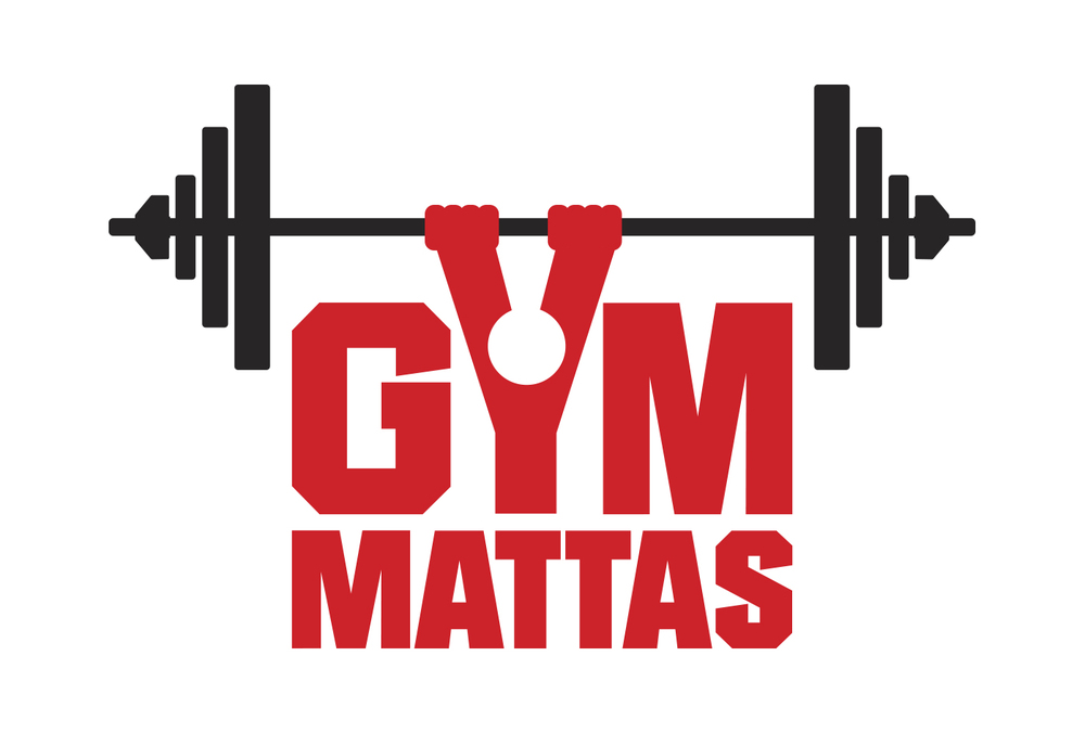
One of the most famous gyms in the world I believe has a terrible logo, only iconic because of the gyms success and celebrity clientele. The text looks tacky and the bar which the bodybuilder is holding is comically small. the colours however are good and suggest quality.
Eyecatching text and clearly represents a gym, however the spelling and Y character make it look unprofessional and cheap.
All of the logos i came across seemed to be all centered around men and muscles, which I don't want to do. Since the gym I am designing for is more about fitness I think the muscle aspect may put off more casual gym goers. They also seem overly masculine and may put off women, cutting off a large demographic.
Inspiration
I took inspiration from these logos which very often had a grain and rustic look. the typefaces were either sans serif and bold or script. Given the nature of 852 a script would be a poor choice so I believe I will use a bold sans serif similar to Bebas or maybe one with more stylized features like Haymaker.
Producing sketches. I explored the way the numbers could possibly fit together, as well as shapes, different styles and ways that imagery could represent the numbers.
I decided that my strongest sketches were the bar logo with the 3 sections, and the logos with vintage shapes. I also wanted to mock up the 5 and 2 that used arms just to see how it would look.
Apparently not very good.
Experimenting with type/imagine combinations. It looked far too gimmicky and hard to read. Very unprofessional.
I created the final 2 in illustrator experimenting with colours and typefaces. I knew sans serif would work much better and that a larger more bold font would be better than a geometric or curved font. I chose Franchise bold.
This is my final logo. It works well against different backgrounds and clearly represents 852 thanks to the use of the word 'fitness' and the weight imagery. The vintage style paired with the bold typeface and interesting shape would also work well on clothing, looking more fashionable than other gym logos.
In Situe mockups. For the tag I added an 'apparel' element to show how easily it would be to branch into different areas of business without having to create a new logo.


No comments:
Post a Comment