Thursday 28 January 2016

Penguin - Clockwork Orange

SYNOPSIS
''A Clockwork Orange takes place in a futuristic city governed by a repressive, totalitarian super-State. In this society, ordinary citizens have fallen into a passive stupor of complacency, blind to the insidious growth of a rampant, violent youth culture. The protagonist of the story is Alex, a fifteen-year-old boy who narrates in a teenage slang called nadsat, which incorporates elements of Russian and Cockney English. Alex leads a small gang of teenage criminals—Dim, Pete, and Georgie—through the streets, robbing and beating men and raping women. Alex and his friends spend the rest of their time at the Korova Milkbar, an establishment that serves milk laced with drugs, and a bar called the Duke of New York.
Alex begins his narrative from the Korova, where the boys sit around drinking. When Alex and his gang leave the bar, they go on a crime spree that involves mugging, robbery, a gang fight, auto theft, breaking and entering, and rape. The last of these crimes is particularly brutal. The boys travel to the countryside with their stolen car, break into a cottage and beat up the man inside before raping his wife while making him watch. They then head back to the Korova, where they fight with each other. Alex, who loves classical music, becomes angry at Dim when Dim mocks an opera that Alex likes. Alex punches Dim in the face, which prompts the others to turn against their arrogant leader. The next time they go out, they break into an old woman’s house. She calls the police, and before Alex can get away, Dim hits him in the eye with a chain and runs away with the others. The police apprehend Alex and take him to the station, where he later learns that the woman he beat and raped during the earlier robbery has died.
Alex is sentenced to fourteen years in prison. At first, prison is difficult for him. The guards are merciless and oppressive, and several of the other prisoners want to rape him. After a few years, though, prison life becomes easier. He befriends the prison chaplain, who notices Alex’s interest in the Bible. The chaplain lets Alex read in the chapel while listening to classical music, and Alex pores over the Old Testament, delighting in the sex, drinking, and fighting he finds in its pages.
One day, after fighting with and killing a cellmate, Alex is selected as the first candidate for an experimental treatment called Ludovico’s Technique, a form of brainwashing that incorporates associative learning. After being injected with a substance that makes him dreadfully sick, the doctors force Alex to watch exceedingly violent movies. In this way, Alex comes to associate violence with the nausea and headaches he experiences from the shot. The process takes two weeks to complete, after which the mere thought of violence has the power to make Alex ill. As an unintended consequence of the treatment, Alex can no longer enjoy classical music, which he has always associated with violence. This side effect doesn’t bother the State, which considers Alex’s successful treatment a victory for law and order and plans to implement it on a large scale.
After two years in prison, Alex is released, a harmless human being incapable of vicious acts. Soon, however, Alex finds he’s not only harmless but also defenseless, as his earlier victims begin to take revenge on him. His old friend Dim and an old enemy named Billyboy are both police officers now, and they take the opportunity to settle old scores. They drive him to a field in the country, beat him, and leave him in the rain. Looking for charity, Alex wanders to a nearby cottage and knocks on the door, begging for help. The man living there lets him in and gives him food and a room for the night. Alex recognizes him from two years ago as the man whose wife he raped, but the man does not recognize Alex, who wore a mask that night. Alex learns later in the night that the man’s wife died of shock shortly after being raped.
This man, F. Alexander, is a political dissident. When he hears Alex’s story, he thinks he can use Alex to incite public outrage against the State. He and three of his colleagues develop a plan for Alex to make several public appearances. Alex, however, is tired of being exploited for other people’s schemes. He berates the men in nadsat, which arouses the suspicion of F. Alexander, who still remembers the strange language spoken by the teenagers who raped his wife. Based on F. Alexander’s suspicion, the men change their plans. They lock Alex in an apartment and blast classical music through the wall, hoping to drive Alex to suicide so they can blame the government.
Alex does, in fact, hurl himself out of an attic window, but the fall doesn’t kill him. While he lies in the hospital, unconscious, a political struggle ensues, but the current administration survives. State doctors undo Ludovico’s Technique and restore Alex’s old vicious self in exchange for Alex’s endorsement. Back to normal, Alex assembles a new gang and engages in the same behavior as he did before prison, but he soon begins to tire of a life of violence. After running into his old friend Pete, who is now married and living a normal life, Alex decides that such a life is what he wants for himself. His final thoughts are of his future son.''
THEMES, SYMBOLS AND MOTIFS
The Inviolability of Free Will
More than anything, Burgess believed that “the freedom to choose is the big human attribute,” meaning that the presence of moral choice ultimately distinguishes human beings from machines or lower animals. This belief provides the central argument of A Clockwork Orange, where Alex asserts his free will by choosing a course of wickedness, only to be subsequently robbed of his self-determination by the government. In making Alex—a criminal guilty of violence, rape, and theft—the hero of the novel, Burgess argues that humanity must, at all costs, insist that individuals be allowed to make their own moral choices, even if that freedom results in depravity. When the State removes Alex’s power to choose his own moral course of action, Alex becomes nothing more than a thing. A human being’s legitimacy as a moral agent is predicated on the notion that good and evil exist as separate, equally valid choices. Without evil as a valid option, the choice to be good becomes nothing more than an empty, meaningless gesture.
The novel’s treatment of this theme includes, but is not limited to, the presentation of a Christian conception of morality. The chaplain, the novel’s clearest advocate for Christian morals, addresses the dangers of Alex’s “Reclamation Treatment” when he tells Alex that “goodness is something chosen. When a man cannot choose he ceases to be a man.” F. Alexander echoes this sentiment, albeit from a different philosophical standpoint, when he tells Alex that the treatment has “turned [him] into something other a human being. [He has] no power of choice any longer.” Burgess’s novel ultimately supports this conception of morality as a matter of choice and determination and argues that good behavior is meaningless if one does not actively choose goodness.
The Inherent Evil of Government
Just as A Clockwork Orange champions free will, it deplores the institution of government, which systematically seeks to suppress the individual in favor of the collective, or the state. Alex articulates this notion when he contends, in Part One, Chapter 4, that modern history is the story of individuals fighting against large, repressive government “machines.” As we see in A Clockwork Orange, the State is prepared to employ any means necessary to ensure its survival. Using technological innovation, mass-market culture, and the threat of violence, among other strategies, the State seeks to control Alex and his fellow citizens, who are least dangerous when they are most predictable. The State also does not tolerate dissent. Once technology helps to clear its prisons by making hardened criminals harmless, the State begins incarcerating dissidents, like F. Alexander, who aim to rouse public opinion against it and thus threaten its stability.
The Necessity of Commitment in Life
Burgess saw apathy and neutrality as two of the greatest sins of postwar England, and these qualities abound in A Clockwork Orange. Burgess satirizes them heavily, especially in his depiction of Alex’s parents. Fearful of going outside and content to be lulled to sleep by a worldcast program, Alex’s parents exemplify what Burgess saw as the essentially torpid nature of middle-class citizens. Conversely, Burgess makes Alex, whose proactive dedication to the pursuit of pleasure causes great suffering, the hero of his novel. Alex himself seems disgusted by neutrality, which he sees as a function of “thingness,” or inhumanity.
“Duality as the Ultimate Reality”
Coined by Burgess in an interview, this phrase reflects Burgess’s understanding of the world as a set of fundamental and coequal oppositions of forces. A Clockwork Orange abounds with dualities: good versus evil, commitment versus neutrality, man versus machine, man versus government, youth versus maturity, and intellect versus intuition, to name some of the most prominent ones. The important aspect of this theme is that, while one element of a given duality may be preferable to the other—such as good over evil—each force is equally essential in explaining the dynamics of the world. To know one of the opposing forces is to implicitly know the other. The notion of duality comes into play in A Clockwork Orangeparticularly during the debate over good and evil, where Alex at one point debunks the validity of a political institution that does not account for individual evil as a naturally occurring phenomenon.

Motifs

Motifs are recurring structures, contrasts, or literary devices that can help to develop and inform the text’s major themes.
Nadsat
Nadsat is the single most striking literary device that Burgess employs. An invented slang that incorporates mostly Russian and Cockney English, Alex uses nadsat to describe the world of A Clockwork Orange. Its initial effect is one of exclusion and alienation, as the reader actively deals with the foreignness of Alex’s speech. This effect is important because it keeps us removed from the intensely brutal violence that Alex perpetrates. Before we can evaluate Alex’s character, we must first come to identify with him on his terms: to “speak his language,” literally. In this way, Alex implicates us in the remorseless violence he commits throughout most of Part One, and we in turn develop sympathy for him as our narrator. In some sense, then, nadsat is a form of brainwashing—as we develop this new vocabulary, it subtly changes the ways we think about things. Nadsat shows the subtle, subliminal ways that language can control others. As the popular idiom of the teenager,nadsat seems to enter the collective consciousness on a subcultural level, a notion that hints at an undercurrent of burgeoning repression.
Nadsat’s origins also help to illuminate the world that Burgess chooses to depict in the novel. The combination of Russian and English indicates that Alex’s society is inspired by the two major superpowers of Burgess’s time, American capitalist democracy and Soviet Communism, suggesting that the two entities are not as far apart from one another as we might have thought.
Classical Music
Classical music enters A Clockwork Orange on a number of levels. On the formal level, the structure of the novel is patterned after musical forms. The novel, which is divided into three parts of seven chapters each, assumes an ABA form, analogous to an operatic aria. Accordingly, Parts 1 and 3 are mirror images of each other, while Part Two is substantially different. The A sections both take place on the streets near Alex’s home and in a country cottage, while the B section takes place in a jail. The A sections begin with Alex asking himself “What’s it going to be then, eh?” The B section begins with the same question, but this time, the prison chaplain asks the question to Alex. The A sections identify Alex by name, while the B section identifies him by number. Additionally, the A sections, as mirror images of each other, feature inversions of the same plot. Whereas, in Part One, Alex preys on unwitting and unwilling victims, in Part Three those same victims wittingly and willingly prey on him. These formal symmetries help us to make comparisons as the thematic material develops over the course of the novel.
On a textual level, Burgess studs the novel with repeated phrases, a very common feature of classical music. Alex supplies these linguistic motifs when he howls “out out out out” to his friends, or tells us that “it was a flip dark chill winter evening though dry,” or when he begins the book’s three parts—as well as the final chapter—with the question “What’s it going to be then, eh?” Burgess was unique as a writer, in that he aspired to adapt the forms of classical music in his writing. His novel Napoleon Symphony derives its structure from Beethoven’s Third Symphony, which was initially written for Napoleon.
Classical music also enters A Clockwork Orange on a narrative and thematic level. Though Burgess probably did not intend it to, Alex’s love of classical music within the confines of the novel’s repressive government invokes Plato, who argued that the enjoyment of music must be suppressed if social order is to be preserved. Plato identifies music with revolutionary pleasure, an association that may easily be applied to Alex in A Clockwork Orange. Alex’s love of classical music is inextricable from his love of violence, and he rarely thinks of one without the other. Both of these passions fly in the face of a government that, above all else, desires a Platonic order. It is thus no accident that Alex’s taste for Beethoven and Mozart sours once he undergoes Reclamation Treatment.
Christ
The repeated references to Christ serve two functions in the novel. First, they provide a structural and thematic analogy for Alex’s life. Alex is a martyr figure who gives up his individual identity for the citizens of his society. His attempted suicide in the last third of the book works as a sacrifice that exposes the repressive State’s evils. In addition, Alex’s narrative goes through a succession of three stages that invoke Christ’s three final days. As Jesus dies, is buried, and is resurrected on the third day, Alex gets caught, is buried in prison, and returns to his former self by the end of the novel. Alex occasionally alludes to Christ, such as when he refers to himself as a Christ figure in Part One, calling himself the “fruit of [his mother’s] womb,” and again in Part Two, when he mentions turning the other cheek after being punched in the face. Second, the repeated Christ references subtly insinuate that the State is using Alex’s violent impulses against him. Alex’s impulse toward violence twice leads him to identify with the Romans who torture and crucify Christ. In this way, Alex unwittingly aligns himself with the State, since the Romans who crucified Christ were, in effect, the “State” of biblical times.

Symbols

Symbols are objects, characters, figures, or colors used to represent abstract ideas or concepts.
Milk
As a substance that primarily nourishes young animals, milk symbolizes the immaturity and passivity of the people who habitually drink it at the Korova Milkbar. Their drinking of milk suggests the infantilization and subsequent helplessness of the State’s citizens. By virtue of its whiteness and homogenization, milk also symbolizes uniformity among the teenagers who drink it. The fact that the milk is laced with drugs is ironic, suggesting that these youths are less wholesome and innocent than adults, not more.
Drencrom, Vellocet, and Synthemesc
Referred to generically as hallucinogens in this study guide, these three drugs symbolize neutrality, or “thingness.” The people in the novel who use them become inhuman while experiencing the effects of them, receding from the reality around them.
Images of Darkness, Night, and the Moon
These things are associated with Alex’s domain, and thus represent peace and security to him. The chaplain, who is garbed in black and defends Alex against the State, might also fall into this category of objects. Darkness represents the privacy and solitude necessary for an individual will to exist and make choices freely.
Images of Lightness and Day
Daytime and sunlight represent danger for Alex. In Part One, Alex notes that there are several more policemen—figures of repression—out patrolling during the day. The harsh lights of the police station interrogation room create a kind of artificial day, and the doctors, with their white jackets, continue the trend of brightness being associated with threat and menace. The only time the chaplain wears white is during an exchange with Alex, where the chaplain gets Alex to snitch on his fellow prisoners in order to further his own career ambitions. Lightness represents the demystification of the individual.
- SPARKNOTES (http://www.sparknotes.com/lit/clockworkorange/themes.html) 
RELATED IMAGERY - AKA THINGS TO STAY AWAY FROM (to avoid a cliched design)


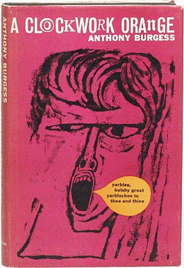
This famous cover is widely regarded as one of the best covers of all time, however I really don't see why. I find the illustration poor quality, and the use of bright colours looks childish, not communicating what the book is about at all. 
This is much more communicative of the themes the book explores, with the lino print looking distressed and disturbing, the red evoking anger and thoughts of blood. I don't however like the speech bubble, which is in too different a style than the rest of the illustration. 

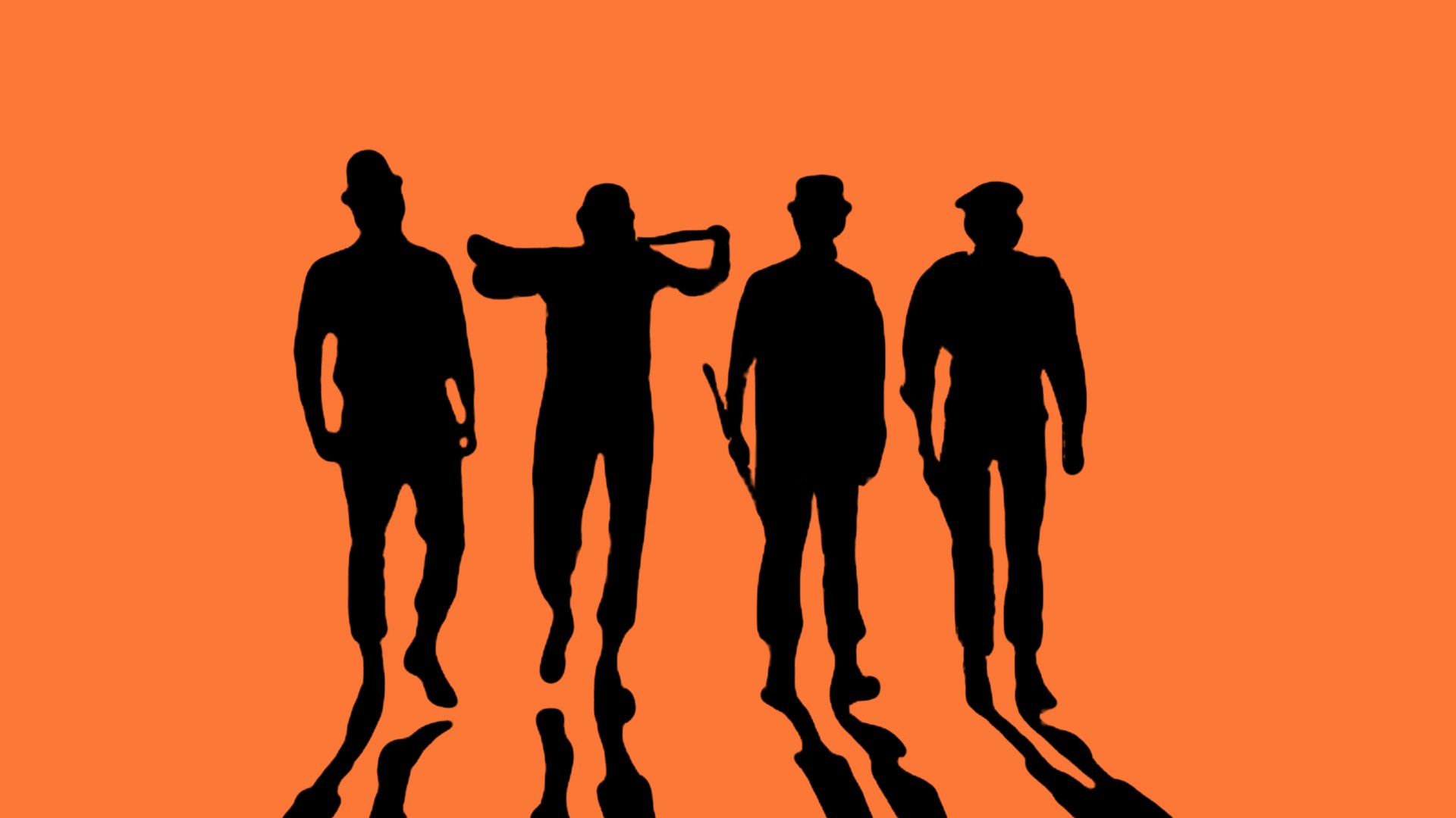
I want to stay away from cliched imagery such as the eyelashes, eyes and Alex. The ransom-note style typography on the last image is very interesting and could be explored further, however I dislike the imagery which looks too tatty for a modern print of the book. I also wanted to avoid using orange as the main colour as I felt that it was too obvious a design choice, regardless of how relevant it is. 
Punk aesthetics are relevant thanks to their anti-establishment attitude and connotations to rebellion 
Heavy black type and images look sinister and dangerous, which would definitely be applicable to the clockwork orange cover.

One of my favourite covers is for LOTR. It's beautiful foil finish and matte stock give it a rich and luxurious aesthetic, with the imagery being relatively simple, but plot relevant. The typography is very readable, sampling the gold colour for the subtitle. Something that this cover doesn't deal with however that I will have to, is a quote and the 'penguin books' logo. Having a quote on the front of the book is something I really hate as it breaks immersion so much. The cover shouldn't have to advertise the book- I don't think anyone buys a book in this way, they usually know about the book prior, or become interested by the blurb. 


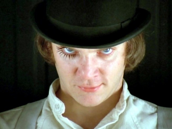
THOUGHT: the movie is world famous nowadays, and is most likely the reason why anyone would read the book, however the movie has some visuals which are not spoken about in the book. Would using these visuals on the cover be an error or not? I think it would be fine to do so thanks to how famous the movie is, but I am going to avoid it, as once the book has been read, the reader will undoubtedly question the imagery. 

Current favourite book covers

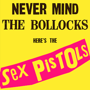
The use of colour, negativ space and simplicity here is fantastic, no element can be taken away without ruining the design- showing how refined the idea is. The serif compliments the sans-serif, as does the contrast in line weight. The bright yellow connotes happiness and sunshine- themes within the book, whilst the arc of the type obviously suggests a frown, contrasting again with the bright yellow. 

This non-fiction book on the columbine massacre uses a standard photograph, exploiting the grey sky to represent an ominous and gloomy atmosphere. The white helvetica type looks dead and emotionless.

Here the coathanger makes the audience think about self-worth, with the sexual imagery conjuring thoughts of human nature and the way we look at ourselves and each other.  The orange dress fits nicely, using the same colour as the penguin logo. The typewriter font gives it a personal and dated aesthetic. 

The simple use of type as image here is brilliant, as is the use of negative space in the chair. The gold colour communicates weath as does the simple elegant illustration and art-deco style font. This cover perfectly shows how powerful good typography is at communicating themes.

This cover for The stranger gives a sense of height and vertigo just through these violent and jagged lines. The simple type gives nothing away, making the text 'the stranger' a mystery- conceptually linking to the books character. The black and white colour scheme also give no extra connotations making the cover a mystery to be decoded by reading the book. 

I would like my cover to be influenced by these - I want the reader at certain intervals to go 'so that's why the cover has this element' etc. 


I watched a documentary whilst researching for this project called 'The mind of a murderer'. Alex in clockwork orange murders and rapes multiple people, so I wanted to know what it was like inside his head. The psychologists examined and questioned multiple murderers, assessing that the mind of a psychopath/sociopath is fragmented, the ability to compartmentalise different emotions and memories removes empathy and can damage their ability to create proper relationships. 
This fragmented and compartmentalised mind could be visualized with broken graphics, an ecclectic use of type (as if the brain can't remember the same typeface twice), or distorted and warped graphics. 


Concepts: anarchy/chaos within systems/confinement (playing on the murderer's mind research). This is displayed through taking single letters from different typefaces (being taken from their natural environment, as Alex was). The orange O is representing the physical orange, as well as an eye on the back page. 

I experimented with imagery, using vector icons of the weapons Alex's gang use, however I felt that it was unnecessary and detracted from the serious tone of voice i was trying to achieve. It also meant that there was too much on the page, making it very hard to fit on the quote.

I added a white boundary around the type, the idea being that the letters are in confinement with others not like it. I chose futura condensed for the blurb again running with the idea of pressure and confinement. The type is still very readable. I changed the line 'but at what cost' to the orange used through-out to emphasize the importance of it, the effects of Alex's incarceration being paramount. The boundary plus the removal of some of the elements gave room for the quote. 

I lightened the black to (4,0,0,95) as I felt that the original black was too contrasting to the white type and needed softening slightly. The type is now easier to read also.


Final
In this final design, the dark watch mechanics in the background would be gloss whilst the rest of the design would be matte. 


I'm very happy with my final design, which I think is a contemporary and polished cover which somewhat disguises the content as Alex does with mask. The chaotic typography confined in the box I feel is a good visual metaphor for Alex's incarceration with the O being a nice simple touch. It would be nice to have the freedom to explore different stocks and finishing methods, however I don't think that they would be needed.

I am still somewhat unsure about the type on the blurb. I felt that transitioning from a complex and fragmented front cover to a necessary legible back may break immersion, so I carried the clockwork imagery onto the back, and used the same typeface I used for the quote. If I had more time with this project, I would experiment more with deconstructing the blurb's type and seeing how far I can take it before it becomes too illegible to function.


Restaurant Branding Brief

Symbolism.Argentineans' cultural symbols are mostly the result of hybridization. Football (soccer in the United States) and tango (which encompasses more than just the dance itself) are probably the two strongest symbols of a common national identity. Tango refers to the music, the lyrics, and the dance itself and is a complex urban product that originated in lower-class neighborhoods of Buenos Aires city. The music, its lyrics, and the dance represent the profound transformation of the urban landscape at the beginning of the twentieth century, with the influx of diverse European immigrants. Tango expresses the amalgamation of already existing traditions, themselves a mixture of African, indigenous, and Spanish influences with elements brought by Italians, Spaniards, French, Germans, Polish, and Jews. Argentine nationalists felt threatened by the newcomers because they felt they jeopardized the existing hierarchical system of social relations and refused to see tango as a national cultural product.

food is also a powerful cultural symbol. Argentines sometimes use the expression "she or he is more Argentine thandulce de leche." Dulce de leche is a milk-and-sugar spread used in a manner similar to peanut butter in the United States. It appears on toast, pastries, and various confections. Argentineasado, a barbecue that is part of the gaucho heritage, is still one of the most important meals in the Argentine diet. Like football, it is a strongly gendered cultural symbol, associated with manliness. Shopping for beef, sausages, and other animal parts that go into a barbecue, as well as the cooking itself, is a male activity. Asados are an important part of Argentine socializing on any occasion.


Certain men and women stand as undeniable national icons. Historical figures, sportsmen and sportswomen, politicians, and intellectuals contribute to a common identity. Who best represents or plays a role in shaping who Argentines are and had been is a highly contested issue. Several men and women are important in the development ofargentinidad.However, there would be no agreement on whether they positively or negatively fostered the rise of some kind of national consciousness.
José de San Martín is probably the least controversial of many Argentine icons. Seen as liberator of the Americas in the nineteenth century, he stands as a moral model to be emulated. Some Argentines use him to represent how they would like to think of themselves vis-a-vis other Latin American nations: as messengers of modernity and freedom, without personal or national ambitions of domination. Juan Manuel de Rosas, a landowner from Buenos Aires province, who came to rule Buenos Aires province for almost thirty years and represents the interests of the provinces before Argentina became unified as a nation, is a good example of the schisms in the process of nation building. Derided by the liberal, modernizing, and urban-oriented sectors of society who regarded him as a tyrant who deliberately kept the masses ignorant, he was an idol for the traditionalists who saw him as and adamant defender of national sovereignty against imperial ambitions. While Rosas was at the center of the disputes around the fate of Argentina in the nineteenth century, Juan Domingo Perón, was the focus of impassioned divisions among Argentines during the last half of the twentieth century.
Argentine cuisine may be described as a cultural blending of IndigenousMediterranean influences (such as those created by Italian and Spanish populations) within the wide scope of agricultural products that are abundant in the country. Argentine annual consumption of beef has averaged 100 kg (220 lbs) per capita,[1] approaching 180 kg (396 lbs) per capita during the 19th century; consumption averaged 67.7 kg (149 lbs) in 2007.[2] Beyond asado (the Argentine barbecue), no other dish more genuinely matches the national identity. Nevertheless, the country's vast area, and its cultural diversity, have led to a local cuisine of various dishes.[3][4] The great immigratory waves consequently imprinted a large influence in the Argentine cuisine, after all Argentina was the second country in the world with the most immigrants with 6.6 million, only second to the United States with 27 million, and ahead of other immigratory receptor countries such as Canada, Brazil, Australia, etc.

Choosing a restaurant name is as important as deciding what type of food you are going to serve. A good restaurant name is easy to remember and easy to spell. It may reflect your restaurant’s theme, its location or simply be a play on words. The important thing to consider when choosing a restaurant name is the impression it will leave on customers.

Naming a Restaurant After a Location

Often times naming a restaurant is simple. The owners take a cue from their restaurant’s location. For example, our restaurant is located in the former boiler room of an old New England shoe factory. Because of this historic link, we decided to call the restaurant simply The Boiler Room Restaurant. It is easy to remember and most of the locals know that it refers to the old shoe shop. Tourist’s passing through love that is was once part of an old factory.
The French Laundry, in Napa Valley, California is one of the countries most esteemed restaurants. Its name stems from the fact the restaurant building once housed a French steam laundry during the 19th century.
The building was also once a brothel, but the restaurant owners wisely stayed away from incorporating that name.

Reflecting a Theme in a Restaurant Name

Choosing a restaurant name can also come from a theme or menu. Chinese restaurants do this perfectly, with names like Jade Palace, Fortune Fountain, and The New Great Wall. Each of these restaurant names let customers know that they serve Chinese food. Avoid calling your restaurant an ethnic name if you are serving a different type of menu. For example, if you are serving authentic Mexican food, calling the restaurant Giovanni’s will confuse your patrons, who may think you serve Italian food.

Adding a Personal Meaning to a Restaurant Name

Opening a restaurant is like having another child in many ways. Sometimes a restaurants name is a reflection of the owner’s name or someone dear to them. Wendy’s founder, Dave Thomas, named his restaurant concept after his daughter. Perhaps your grandmother influenced your joy of cooking, so you might name your restaurant after her. What ever the meaning behind your restaurant’s name, be prepared to share it with the public, who love a good story.

Restaurant Name With a Play On Words

Paula Deen’s first restaurant business was called The Bag Lady, because she and her sons went around delivering bagged lunches to local businesses. This is a great example of playing with words. Fun restaurant names that have nothing to do with food are usually easy to remember, and pass on by word of mouth. Celebrity chef Wolfgang Puck called his earliest restaurant Spago, (Italian slang for spaghetti.) Little in the name would tell you that it serves a fusion of Mediterranean and California cuisine, with a specialty in wood-fired pizzas. It’s just a great restaurant name.


Research

Luxury Logo Design (and the inspiration behind them)
This research will give me an idea of how to approach my logo design, and what sort of themes I should try to represent with it.

 While we traditionally think of Medusa’s head as something unappealing, it is in fact her transformation into a beast by Athena that was at the heart of Gianni Versace’s intentions when he created the logo in 1978. The Medusa emblem picked up by Versace became an iconic motif in fashion as it evoked sheer authority, attractiveness and fatal fascination; three basic attributes of Medusa. “When I asked Gianni why he chose Medusa’s head,” Donatella Versace later said, “he told me he thought that whoever falls in love with Medusa can’t flee from her.”
 Adolphe Jean-Marie Mouron or simply Cassandre – a Ukrainian-French painter, commercial poster artist and typeface designer – created the YSL logo in December 1961 only a few years before his suicide. As some have put it, “The challenge [was] in how Cassandre dared to break the unwritten rule of not mixing – in the same word – two typeface features that are, in principle, incompatible.
 The Spirit of Ecstasy – also referred to as “Emily,” “Silver Lady” or “Flying Lady –  was designed by English sculptor Charles Robinson Sykes and meant to discreetly tell the story of the secret passion held between John Walter Edward Douglas-Scott-Montagu, (second Lord Montagu of Beaulieu and automotive pioneer) and his love for Eleanor Velasco Thornton who served as the model.
Hermès began as a small harness workshop in Paris, which was dedicated to serving European noblemen and creating luxury harnesses and bridles for horse-drawn carriages. The Hermès logo is a royal carriage and a horse – and uses a slightly modified form of the Memphis typeface which was originally designed by Dr. Rudolf Wolf in 1929.


The Chanel logo was designed by Coco Chanel herself in 1925 and remains unchanged to this day. A popular story suggests that it was inspired by the stained glass windows in an Aubazine chapel which featured interlaced curves and also housed an orphanage where Chanel spent the latter half of her childhood.
Another legend says that Coco Chanel saw the interlocking Cs at Château Crémat, a château in Nice that Irène Bretz – a friend of Chanel – had purchased. As the story goes, “One summer night Coco Chanel looked up at a vaulted arch at one of Irène’s famous parties and found inspiration in a Renaissance medallion: two interlocking Cs.”
A final anecdote focuses on Boy Capel – the love of Chanel’s life and the source of funding for her business and her first boutiques. As writer Justine Picardie insinuates following Capel’s death, “There was no business contract to bind them together, just as there was no marriage certificate, but it nonetheless joined them, as the double C logo seems to suggest; Chanel and Capel; overlapping, but also facing away from each other.”

The Maserati Brothers took inspiration from the statue of Neptune that sat in the square in Bologna, Italy where Maserati was originally headquartered. While Mario Maserati, an artist, was responsible for the original logo, he would never work on any designs relating to engineering or automobiles.

 While Prada chooses to solely use their name for most branding, they do in fact have an emblem with a rich history. The classic rope design that aligns the periphery comes from when the Italian house were appointed as the official suppliers to the Italian Royal Household in 1919 – thus allowing them to use the House of Savoy’s coat of arms.
 The Louis Vuitton monogram was first introduced in 1896 and created by Louis’ son, Georges Vuitton. Described as a “Japanese-inspired flower motif,” the monogram’s original purpose was to thwart the counterfeiting of the Parisian company’s designer luggage and is one of the earliest examples of fashion branding. The pattern of alternating brown and beige squares was known as Damier (French for checkerboard).


 The ubiquitous signature is in fact, not Paul Smith’s own signature. Rather, it was drawn by Zena Marsh, a friend of Smith’s who created it in the early ’70s while working at his hometown shop on Nottingham Byard Lane. The signature logo “was never intended to be anything other than a mark,” says Alan Aboud, principal, creative director of Aboud Creative. “It’s a tremendously tricky device to use. It works small and discreet, or massive; any kind of middle ground just looks a bit awkward. It’s only with experience that you know how big it should be or how small it should be.” The hand-drawn logo was tightened up a little in the early 1980s when Smith opened his first shop in London.
The Rolex emblem is an extension of the company’s slogan of “A Crown for Every Achievement” which has been used since the brand’s inception in 1903. For founders Hans Wilsdorf and Alfred Davis, the crown represented prestige, victory and perfectionism.


Although too relaxed and casual for my establishment, The colour scheme and graphics here work well together. The main logo works well with or without the added flair.
When thinking about my designs, I am trying to paint a picture in my head of what the restaurant itself would look like. This helps me decide whether the work I am producing will be suitable for the restaurant. 

Illustrations could be used as I definitely don't want to use photographs as I feel that they cheapen the aesthetic.
Simple wordmark seems most appropriate- It feels confident and classy with the correct type choice
Dark rich colours with white type on-top elevate a spread- the type shouldn't be too large that it shouts at the reader, but large enough that it speaks confidently.
The use of illustrations cheapens the aesthetic, as does having the signs hung rather than mounted. I also think that the small plants are too basic and simple- no plants at all or something more intricate such as bonsai's would be more interesting.

String bound menus look great when done properly. If I were to use this technique with La Parrilla, I would need to use a black string to match the colour scheme, with a thick ropey texture to suggest authenticity and hand-craftmanship. 

I find circular coasters to be much nicer than square- you don't have to worry about aligning them to other things and I believe the look more relaxed thanks to not having any corners. Black and White coasters like these look visually interesting with the custom symbols; to make them look more high end and appropriate for La Parrilla, less detailing should be done- only 1 ring would suffice. 

I like simple graphic design like this for restaurants, although this menu type would be inappropriate due to the number of items on the menu, and that a simple clip doesn't look luxurious enough. A leather wrap or wooden cover would be more appropriate. 

Simple menu designs like this (no illustrations or photographs) look great.


The bar could use lighting like this to create a visually exciting environment for customers to get a drink before they get seated. Interesting visuals in the first part of a restaurant are perfect conversation starts for dates.


The illustrations here are fantastic and don't make the design look cheaper thanks to the colour being only slightly different than the background, making them an elegant piece of detail rather than a stand out piece of design. The foiling on the packaging also elevates the design as it shows craftmansship and the shiny material connotates elegance and luxury.


Photographs here have been used very well to display authenticity by showing the food at an earlier stage. This is an interesting tactic which makes the venue look more transparent and trustworthy. It does however prevent the restaurant from looking luxurious as it's almost impossible to make food look high-end at this stage. 


This logo thanks to it's shape is sturdy and looks reliable and professional. I will need to consider shape heavily and how it changes what my logo communicates. 

White space usage here generates a laid back and calm aesthetic along with the thin line weight. 

Loose disposable menus are far too cheap for La Parrilla- the menus that I produce must look like they would last forever- even though they would be changed in and out regularly when dirty or when specials change etc. Having the menus covers made of a material that is easy to clean or cheap to replace will also be important. 


I love this elegant but bold use of typography, incorporating the pattern into the type itself. This pattern can then be used through-out the materials. I will need to do something similar to this, or have a secondary logo which I can use for pattern work and decoration.

I love this binding method and grained stock choice by Bovino. the gold metal looks precious and the stock looks hand-crafted and gives a brilliant effect onto the printed type, making it look traditional and slightly dated. 

A pattern produced from the logo or related to the logo helps to decorate print media, so this should be considered when producing the logo.

Stamps give a handmade feel and make the work more personal
Things like bulldog clips and trendy typography are too casual for La Parrilla, so a more intricate binding method and typographic style will need to be utilized.

This advert for Zizzi is exactly what I am trying to stay away from. 


Elegant flourishes like this look superb- if it fits my theme, I could create flourishes like this based around argentinian themes and culture.

Again this sort of scene is what I am trying to avoid, the american style booths and a bad logo painted on the wall, nothing about this scene suggestst elegance.

Black and White with select use of colour looks elegant and refined.  I believe I will keep my colour scheme black and white, or a charcoal grey with a bone white for conceptual relevance to meat.


Here a dark blue looks classy, with illustrations that look like they belong on an expensive china plate.

High Quality illustrations like this would look great, but would mean collaborating with an illustrator- This would take a lot of time which I am somewhat uncomfortable with at this stage. 

I should stay away from typical spanish/argentinian designs like this, that overuse colour and handdrawn type.

This is much classier with the gold and black colour theme, the website having far more structure and less type making it look far more beautiful.


Gaucho have also excelled with their website, using extremely select areas of colour, with elegant black and white photography of Argentina which makes the restaurant feel authentic 

I love this branding but it relies heavily on colour which I don't want mine to do. I will need to make sure the use of type and layout communicate high-end dining.


Menu Research
A leather bound menu would be very fitting given that the restaurant would be a steak house. The stock would be a thick slightly textured paper/card in bone white again following the meat theme.
From personal experience in a wide range of restaurants, I believe that a high quality menu is very important to the dining experience. Tall thin menus look the classiest I believe, whilst wider menus tend to look cheap. Materials are extremely important, as is typeface choice and imagery. High quality black and white illustrations or line drawings look great, whilst photographs almost always cheapen the menu.


A wooden menu is also nice, thinking about a natural feel which would certainly be kept throughout the restaurant interior. it would also be easier to maintain.


My first idea was 'Barbacoa' for the name, simply meaning barbecue, the b using one of the lightrays from the argentinian flag's 'sun of may'. I chose Bembo at first for it's elegant style and hard edges which look carved by hand.

I rushed some stationary to see how it would look, using the sun of may's face as a secondary logo. I didn't take nearly enough time thinking about the logo properly, so I went back to the drawing board.

I had a lengthy conversation with Tom Houghton, who also was branding a restaurant. We broke down what we wanted our restaurants to communicate, thinking of a manifesto for each of them. Authenticity was top of the chain, along with meat and barbecuing, and Argentinian cuisine. Doing everything by hand (no machinery) is important in Argentine cuisine, so I thought about hand-rendered type (but not a handwritten style, as I learned how bad it looked during visual research). Which led me to Butler, the typeface I would later use in Montage, albeit in a different weight). I then rethought the name, as Barbacoa was too common. La Parrilla was my second choice, so I started to run with that. 

I thought about how things could look inside the restaurant. I had an idea where half burnt matches would be stuck into wood to form the restaurant's name as an installation which would sit behind the bar or on a wall.

I tested a range of different sans-serif typefaces which would be used through-out the menus. I only wanted to use 1 typeface for it all, so the different weights must work well together. I ended up choosing Calibre (second test down). Its letterforms look formal without looking corporate, whist the thinner weights look elegant and easy to read. It has a strength to it with it's fully finished terminals that make it look confident but relaxed at the same time. 


The final logo uses the stencil version of Butler, reminiscent of old spray-painted barrels and boxes found in Argentinian markets. 


The website design is clean, using colourful photographs on a black and white background, inspired by the Gaucho website. I used gold to decorate the website on the seperators and sliders, as well as the text boxes and price illustrations. It's simple scrolling design makes it easy to use for anyone.


I visited Latitude (Wine Retailers in Leeds) to research wine bottle design.  I looked at bottle shape, materials, label shape and style, as well as typography and use of images.

The gold foiling really elevates the wine bottle, the shine giving it an extra element of visual depth. 

A select of use colour with a traditional style illustration communicates expense and quality, given that aged wines are usually more expensive. 


The menu designs set the mood with a brief intro to Argentinian Cuisine and Drinks, before going into the minimalistic layout of food. I used a contrast of weight of separate the dish names and the descriptions. A simple dotted like is used to separate the titles and add some decoration. I didn't use a £ sign, as during my research I came across an article (http://www.stuffyoushouldknow.com/blog/dollar-sign-menu-explained/) which explains that ''“The dollar sign is a symbol of cost, not gain.” When we see it, apparently some part of our brain is activated and driven to protect our money by figuring out how to get around it.''
This is also the reason why casinos give you chips rather than letting you use cash. Because this is a high price range restaurant, I removed the pound signs, removing that issue of the customer being weary of spending large sums of cash. 

The menu using a wood of leather bind would be conceptually relevant, look good and keep the menu in good condition all day.


Items like these could be spread through-out the restaurant, giving an old, trustworthy and authentic feel.


I redesigned the business cards to make them look more professional, using a recycled stock and letterpressed type for a personal feel. The sun of may sits in the corner for a small decorative touch, with charcoal grey edges to make the cards look like they have a barbecued sear.

A small refinement by making the sun of may slightly larger, and adding slightly more leading to the address type.

I designed a house wine bottle, which uses a black opaque shiny glass, with a matte finish label- the contrasting materials give a classy and sleek aesthetic. A simple Oblique version of Calibre is used for the wine type, with a regular thin Calibre for the bottle description. Again the sun of may is used to add some decoration to the bottle.

I elevated the design slightly by having the seperators and the sun of may's in a gold foil. This makes the bottle feel even more luxurious, perfect for a date. 


Menu design alteration: after looking at various materials at the fabric shop, I realised that black leather instead of brown would be more appropriate as my logo is black, and it runs with the concept of charcoal grilling better. Black is also a more sophisticated colour and less likely to clash with any interior design decisions. 

I purchased a 2m x 0.5m section of black dyed cow leather, which I cut down to size with a sharp stanley knife and metal ruler to ensure a clean straight edge with minimal fraying. I contemplated having the edges with a large amount of fray to make them look more raw and natural but I thought that in a dining setting it could cause complications.