Sunday 30 November 2014

9 Basic Principles of Responsive Web Design - by Sandijs Ruluks

Responsive vs Adaptive web design

It might seem the same but it isn't. Both approaches complement each other, so there is no right or wrong way to do it. Let the content decide.

The flow

As screen sizes become smaller, content starts to take up more vertical space and anything below will be pushed down, it's called the flow. That might be tricky to grasp if you are used to design with pixels and points, but makes total sense when you get used to it.
What is responsive and adaptive web design

Relative units

The canvas can be a desktop, mobile screen or anything in between. Pixel density can also vary, so we need units that are flexible and work everywhere. That's where relative units like percents come in handy. So making something 50% wide means it will always take half of the screen (or viewport, which is the size of the opened browser window).
Relative units in CSS

Breakpoints

Breakpoints allow the layout to change at predefined points, i.e. having 3 columns on a desktop, but only 1 column on a mobile device. Most CSS properties can be changed from one breakpoint to another. Usually where you put one depends on the content. If a sentence breaks, you might need to add a breakpoint. But use them with caution – it can get messy quickly when it's difficult to understand what is influencing what.
Breakpoints in the responsive web design

Max and Min values

Sometimes it's great that content takes up the whole width of a screen, like on a mobile device, but having the same content stretching to the whole width of your TV screen often makes less sense. This is why Min/Max values help. For example having width of 100% and Max width of 1000px would mean that content will fill the screen, but don't go over 1000px.
Min and max widths in CSS

Nested objects

Remember the relative position? Having a lot of elements depending on each other would be difficult to control, therefore wrapping elements in a container keeps it way more understandable, clean and tidy. This is where static units like pixels can help. They are useful for content that you don't want to scale, like logos and buttons.
Nested objects

Mobile or Desktop first

Technically there isn't much of a difference if a project is started from a smaller screen to a bigger (mobile first) or vice versa (desktop first). Yet it adds extra limitations and helps you make decisions if you start with mobile first. Often people start from both ends at once, so really, go and see what works better for you.
Mobile or desktop first

Webfonts vs System fonts

Wanna have a cool looking Futura or Didot on your website? Use webfonts! Although they will look stunning, remember that each will be downloaded and the more you'll have, the longer it will take to load the page. System fonts on the other hand are lightning fast, except when the user doesn't have it locally, it will fall back to a default font.
Webfonts vs System fonts

Bitmap images vs Vectors

Does your icon have lot of details and some fancy effects applied? If yes, use a bitmap. If not, consider using a vector image. For bitmaps use a jpg, png or a gif, for vectors the best choice would be a SVG or an icon font. Each has some benefits and some drawbacks. However keep in mind the size -- no pictures should go online without optimization. Vectors on the other hand often are tiny, but some older browsers won't support it. Also, if it has lots of curves, it might be heavier than a bitmap, so choose wisely.
Bitmap images vs vectors

Sunday 23 November 2014

Oranges are not the only fruit - Penguin Publications Competition - Responsive

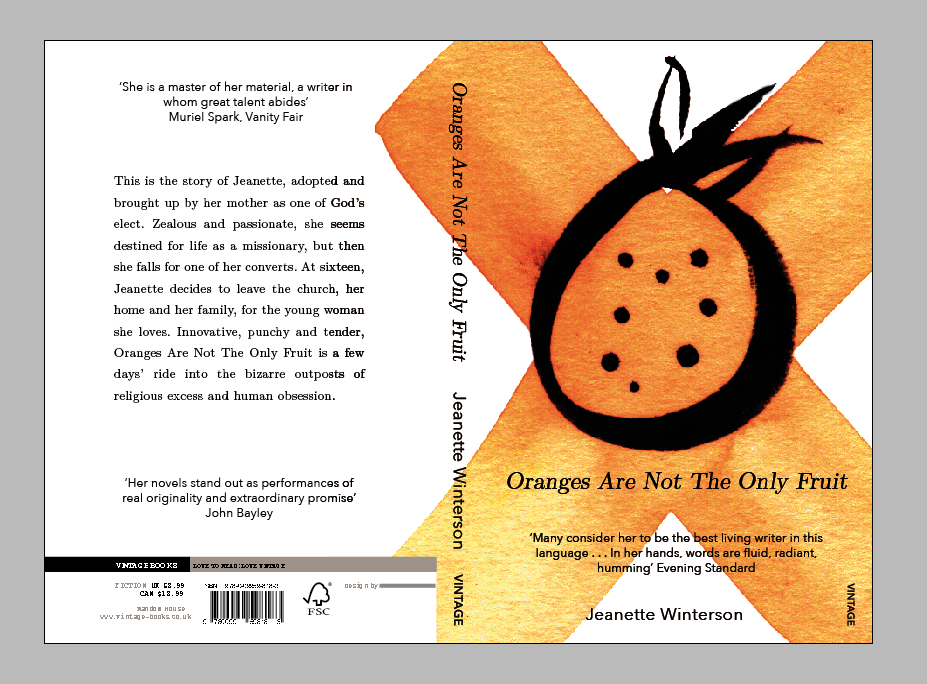
As one of the Responsive tasks, I have chosen to enter the Penguin Publications Competitions. The book is about an orphan who is adopted by devout Christians who bring the girl up with a strict religious education. As the girl grows up she discovers she is a lesbian and explores her sexuality, leaving her christian roots behind; much to the dismay of her family and peers.
I've found it very difficult to come up with designs that aren't cliche's that are also visually interesting and relevant.
 Oranges with a single strawberry, the idea being that the unique object is outnumbered and trapped.
More sketches which explore the fruit imagery. incorporating the X (xx female sex chromosomes), and a cross which is obviously religious.
Image as type replacing letters with fruits. I like the aesthetic of this idea but the concept behind it isn't strong.
I really liked the concept behind this idea, however I feel like it may be too complex. The orange representing her original way of life, once religion was cut out (in a literal sense here), her feminism and sexuality can be explored (shown by the symbol).

Inspiration / Typography research

I really like the typographic hierarchy on this book, as well as the readability of the typefaces. The broken lines are also aesthetically pleasing and conceptual.
I like the typography here but am unsure about the use of a typewriter font. Although it's conceptual I don't like it being used with the bold typeface.
Basic typographic layout but it works well. The colour choices are also interesting.

I bought some watercolours and wanted to experiment with different illustration styles. I knew I would have to keep things simple for two reasons, because of my skill level, and because of the time I had allocated to do this project. I tried crosshatch, simple lines, fineliner, brushes and inks.
I photoshopped them to enhance the saturation and levels making them stand out more. The vivid colours are much more exciting and eyecatching. 


I originally planned on using multiple fruits on the frontcover, however after talking with peers I decided on just using one large illustration. I chose this one because of the connotations behind the X, as well as the pleasing contrast that the brush pen gave the orange. 


Adjusting type and taking a few steps back. I was experimenting with different positions for the text because I didn't want to go for the standard centered layout. I thought the blue was working until I change it to white whilst experimenting with different colours. This just goes to show how experimentation is incredibly important. I also made huge changes after printing it for the first time and seeing it in it's usual format and media type.
Final blue design. After critting this, I realised I needed to change the colour scheme and center the text
Finished design in situe. I prefer the white as it makes the book less garish and much cleaner.

Wednesday 12 November 2014

Responsive

I have looked into multiple sources for Graphic Design competitions, such as DNAD, designcompetitions and 99designs. I considered the Yamaha brief however the deadline was incredible soon so I had to be realistic. I have decided to enter the Penguin books design brief as I wish to go into editorial design in my career. The brief is to design a cover for 'Oranges are not the only fruit', a small novel for children/young adults.

Friday 7 November 2014

CoP Essay - Is there a place for 'Limited Edition' in todays mass produced society?

I'm going to write an essay that explores 'Limited Edition' and it's worth in todays society. With communication being the main purpose of Graphic Design, does a limited edition print fulfill a purpose that mass produced design doesn't? Mass Produced media will reach more people, and thus communicate more effectively. However limited edition pieces are much more focused on a target audience of fans of that specific publication. I will look into how limited edition pieces started off, with the Rembrandt era, with lithograph prints where the plates would deteriorate at around 1000 prints, so prints were limited through practicality.
Newspapers will also be a key part of my essay, as I wish to explore the way that newspapers are both mass produced, but also limited edition as they are only produced for one day, and due to their fragility, become more and more limited over time to the point where newspapers that cover events of specific importance such as JFK's assassination or the moon landing sell for substantial amounts of money.
I may also investigate 'limited edition' in other creative areas such as fashion, where limited editions are almost exclusively used as a marketing ploy. Social media is plagued with people sharing imagery in the hope to win limited edition clothing, or to receive a code that allows them to purchase a certain piece of clothing. Photography also has this to an extent with Polaroid photography producing a photo that is one of a kind, however the practical side of having it instantly printed also plays a part in the use of a polaroid camera.
Another key topic I will investigate will be production methods that are utilized when creating limited edition pieces. I would argue that limited edition prints that are digitally printed are worthless, as there is no effort in the actual creation. This would link into the practical work, where I would create a piece of work based around possibly a bland newspaper or flyer, but created with intricate production techniques such as foil-printing, embossing and embroidery.
My topic is a currently quite vague I think and I'd like to narrow it down so that I don't get lost researching a vast amount of topics such as social media, print vs new media, advertising, fashion etc. I would like to keep my essay primarily mass production vs limited edition, with a secondary focus on the aura of print/printing methods.
I could also do with rewriting my question properly so that my essay topic is clearly outlined and my research is linked obviously to my statement of intent.

Sunday 2 November 2014

A brief history of... Web Design

I have been asked to produce a multi-page website that displays the information that I collected during the production of my Summer work. I will have to research existing designs and deconstruct them, identifying strengths and weaknesses, as well as the type hierarchies that are in play. I will also have to improve upon my summer work as I wasn't very pleased with the work I produced. This brief will also require me to learn how to code using HTML and CSS languages, which will mean attending multiple workshops as well as extracurricular learning using websites such as codeacademy.

What is the purpose of my website? My summer work was based around the packaging design of alcohol, and how it changes in relation to the price. This will need to influence design decisions I make in a number of ways. Who would be wanting to view the website, and for what reason? I believe that the people who would be viewing my website would be designers looking for inspiration, certainly 18years or older. The website would be informative, and entertaining in the sense that it would need to be aesthetically pleasing enough for the user to want to stay on the website.

Initial Research - Websites that I feel would display my information well


After an initial crit outlining my intentions for my website, I realized that my website didn't really have an obvious purpose. It needs to be informative, A place where people can go who are passionate about design or alcohol and appreciate/take inspiration from the content. I am contemplating creating a site which focuses on local/real ales. I could showcase the bottle designs, plus where they can be found in the city of Leeds.

CANONS OF PAGE DESIGN WORKSHOP
I learnt a lot of about page construction during this workshop. I also learnt that a lot of page constructing techniques and styles can be adapted to work for web. I like working with maths and geometry so I had fun creating the different structures.