Saturday 20 February 2016

Pionear Identity

Through a Facebook group I was put into contact with a Business student studying at Leeds Met university who was in need of a logo for a theoretical business (a networking platform for creatives- similar to behance, linkedin etc). The logo would have to be completed over the weekend for a presentation on the Monday, so a quick development was critical. The initial idea which was delivered to me consisted of a tree with many branches, with the roots forming a heart. I explained the cons of this, being the overcomplexity, and connotations linked to a bare tree (being death). I explained how logos should be more simple in order to be scalable and more applicable, but also more memorable and understandable.

I did a quick stage of research on current logos for both social media sites and networking sites, seeing how colour, shape and imagery were used, and what attributes of the platforms were marketed.


A unique colour along with a simple vector image proved to be the most popular and memorable.  nearly all examples were based around the first letter of the platform, or a simple illustration which represented it (eg an elephant for evernote - memory).


For Pionear I felt that it would be best to produce a logo around a P, but wanted it to be easily distinguishable from the Pinterest logo. This would be done by making the logo more formal and using a different colour. It would have to work in black and white also.

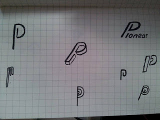
I produced a series of sketches, based around the idea of a stylized P, thinking about networking, linking things together etc.


Ideas based around connections and links
Hephaestus (god of craftsmen) has a symbol of an anvil. It was too conceptual in nature to work though.

Ideas based around expanding networks


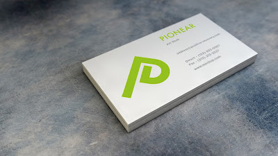
From these sketches we decided upon the Paperclip style P, but felt that it was too business like and needed to be less formal. Experimentation led to the P being turned 45 degrees to look like a mountain which tied in nicely with 'pioneer'.


I decided that an absence of colour was better and more professional, using a slightly warm black (0,0,0,97). I also swapped the font to something more bold and suitable, Futura Bold.


Wednesday 17 February 2016

Secret 7

This year, secret 7 are asking for designs for the following tracks:

John Lennon - Imagine
Chvrches - Clearest Blue
Etta James - At Last
Jack Garratt - Worry
The Jam - Art School
Tame Impala - The Less I Know The Better
Max Richter - Dream 3

chvrches - clearest blue

''Chvrches saw this track as pivotal to nailing the sonics they were after on theirEvery Open Eye album. "'Clearest Blue' was the 17th song we wrote, and it sort of informed the rest of the production," Martin Doherty of the band told NME. "To me it came to define how the rest sounds. When asked what he meant, Doherty replied "Well, it's big and happy and sad and a banger." 

"It's sort of cry-dance," vocalist Lauren Mayberry added.''
''Chvrches' Iain Cook explained to HMV.com why the band decided the lyric summed up the record. "We've had a mad couple of years and at times it's been kind of overwhelming, it's been great, but exhausting," he said. "We like the duality of that line, it's not necessarily a negative thing and not necessarily a positive thing."'

Light, it's all over us
Like it always was
Like it always was

Shape by the clearest blue
But it's not enough
It's not enough, not enough

Just another time we're caught inside
Every open eye
Holding on tightly to the sides
Never quite learning why
You'll meet me, you'll meet me
You'll meet me halfway

Whenever I feel it coming on
You can be well aware
If ever I try to push you away
You can just keep me there
So please say you'll meet me
Meet me halfway

Tied to the shifting ground
Like I always was
Like I always was

You, were the perfect star
But it's not enough, it's not enough
Not enough, not enough

Just another time that I go down
But you were keeping up
Holding to a hope you undermined
Never to be reversed

Just another time we're caught inside
Every open eye
Holding on tightly to the sides
Never quite learning why

Whenever I feel it coming on
You can be well aware
If ever I try to push you away
You can just keep me tell me

Tell me tell me, you'll meet me
Tell me tell me, you'll keep me
Tell me tell me, you'll meet me
Will you meet me more than halfway

Shape by the clearest blue


The Jam - Art School

Anything that you wanna do, anyplace that you wanna go
Don't need permission for everything that you want
Any taste that you feel is right
Wear any clothes just as long as they're bright
Say what you want, 'cos this is a new art school
Do what you want if it takes your mind
Better do it now, 'cos you won't have time
And never worry if people laugh at you
The fools only laugh 'cos they envy you
Time is motion and the hands are fast
Young words are mumbled, they don't always last
It's up to us to be sure they understand
Who makes the rules that make people select
Who is to judge that your ways are correct
The media as watchdog is absolute shit
The TV telling you what to think

Anything that you wanna do, anyplace that you wanna go
Don't need permission for everything that you want
Any taste that you feel is right
Wear any clothes just as long as they're bright
Say what you want, 
'cos this is a new art school
Do what you want, 'cos this is the new art school


When researching iconic album covers it's easy to see that many of the most famous designs aren't particularly well designed, they just gained fame as the album itself became famous. The best album covers in my eyes are the simpler more unique designs, as photographic covers get lost amongst all the others (unless the photography is particularly special or is framed in a unique way). Below is a curation of some of the best designs, some with type and some without. 

Existing Album Art Research
Sex Pistols - Never mind the bollocks

The punk/handcrafted aesthetic perfectly describes the music and attitude of the sex pistols, with loud and provocative colours and contrast.


The Strokes - Is This It
A highly sexualised design that grabs your attention by targeting people's basic desires, with the leather glove suggesting some rebellious themes. 
Joy Division - Unknown Pleasures
''The front cover image comes from an edition of the Cambridge Encyclopedia of Astronomy, and was originally drawn with black lines on a white background. It presents successive pulses from the first pulsar discovered, PSR B1919+21—often referred to in the context of this album by its older name, CP 1919. The image was suggested by drummer Stephen Morris and the cover design is credited to Joy Division, Peter Saville and Chris Mathan.''
The use of negative space draws the viewer in to look at the intricate details of the pattern. The lines suggest sound waves, complexity and depth with them layered. The lack of typography on the cover feels confident and refined. 


Pink Floyd - Dark Side of the Moon
New Order - Power, Corruption and Lies
Justice - 
The Velvet Undergroud & Nico - The Velvet Underground & Nico
Green Day - American Idiot


Yeah Yeah Yeahs - It's Blitz

This album cover also doesn't use any type putting all focus on the attitude of the photograph- rebellion, destruction and power. The bright orange of the yolk stands o


This album cover for Art School by The Jam incapsulates what I believe art school to be about, unbound creativity and the freedom to explore any topic via any means. Rebellion should be cultivated in order to produce original and unique pieces of work. The colours are meant to stand out as much a possible. Different typefaces are used in the main body of text to represent exploration and the breaking of rules, as does the spray paint stencil font.
This cover for clearest blue is an adaptation of my Triptych poster, representing clarity within a complex system. 
This design is influenced by Rayleigh Scattering, the light scattering process which makes the sky and oceans blue as light enters the atmosphere.