Sunday 1 December 2013


BA (Hons.) GRAPHIC DESIGN
LEVEL
04
 Module Code 
OUGD403              


 Module Title
DESIGN SKILLS


END OF MODULE SELF-EVALUATION

NAME
George Boreham


1.  What skills have you developed through this module and how effectively do you think you have applied them?
I’ve developed my illustrator skills and applied them effectively during the alphabet soup brief and also the partner typeface, where I utilized the software to create my name tag. My hand rendering skills have also improved due to sketching all of my designs before digitizing them.


2. What approaches to/methods of design production have you developed and how have they informed your design development process?
I have developed my drawing skills which have led to designs which incorporate illustration as I have felt more confident with my hand rendering skills. I have also have been to different inductions such as screenprinting which has opened my eyes to new production methods which I have thought about when designing print work.


3. What strengths can you identify in your work and how have/will you capitalise on these?
I feel that my research is strong and has led/will lead to more conceptual work.


4. What weaknesses can you identify in your work and how will you address these in the future?
I feel that there is room for improvement in all aspects of my work, but I feel that I definitely need to do more work on colour theory, type and layout.


5. Identify five things that you will do differently next time and what do you expect to gain from doing these?
More initial sketches to reach a better final product
More critiques to better my chosen design
Manage my time more efficiently to produce a larger body of work/ higher quality of work
More research into type – better final outcome
Try to cut down time printing research etc- do out of college hours


6.How would you grade yourself on the following areas:
(please indicate using an ‘x’) 

5= excellent, 4 = very good, 3 = good, 2 = average, 1 = poor

1
2
3
4
5
Attendance


x


Punctuality


x

Motivation


x

Commitment


x

Quantity of work produced


x


Quality of work produced


x


Contribution to the group


x


The evaluation of your work is an important part of the assessment criteria and represents a percentage of the overall grade. It is essential that you give yourself enough time to complete your written evaluation fully and with appropriate depth and level of self-reflection. If you have any questions relating to the self evaluation process speak to a member of staff as soon as possible.


Friday 15 November 2013


I started out by taking a photograph of a fracking pump and desaturating it. I then turned it into halftone, which will help push it into the background (similar to how the disasters have been pushed into the back of people' minds) and make the text jump off the page more. This was inspired by my research on Matt Jones's typographic poster of Sarkozy (on inspirational design board). 
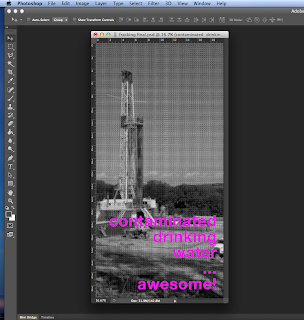
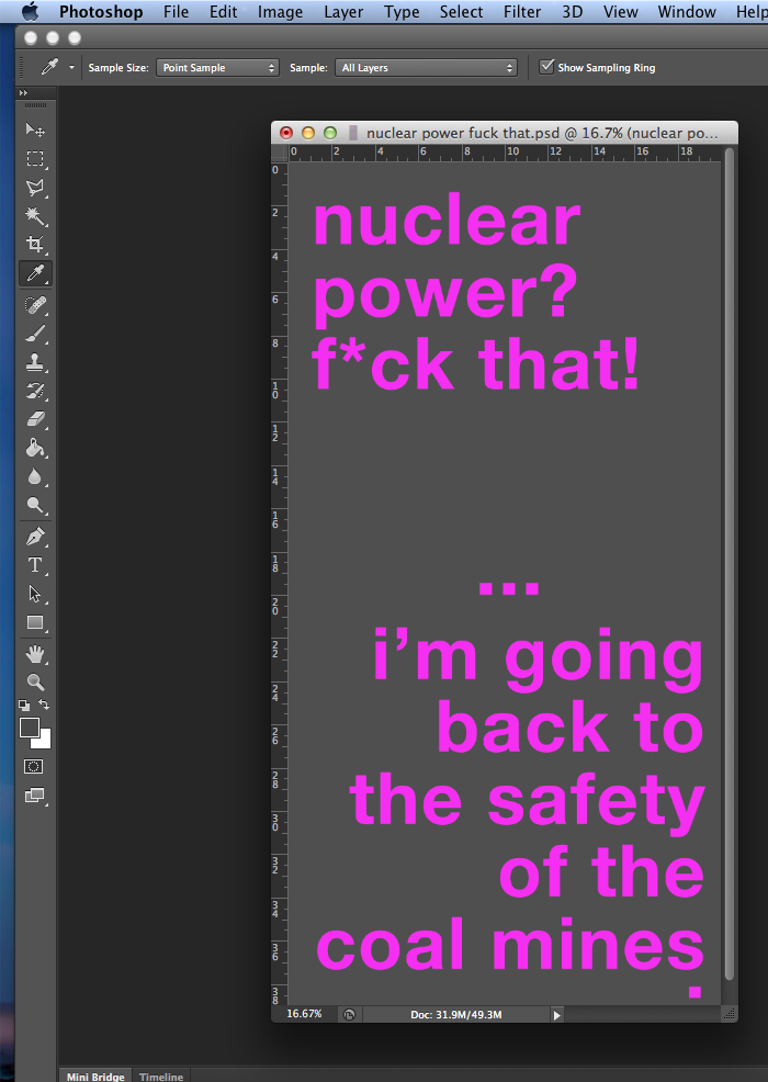
I then chose to be quite tongue in cheek and sarcastic with my text, to try and display how narrow minded or ignorant views can seem stupid. I chose pink as it was eye-catching and helped to display the idea of the comment being silly and out of place (being in a serious setting). I used helvetica because I think that it's lack of attachable connotations gets straight to the point and doesn't risk the text being interpreted in any different way. The usage of Helvetica was largely inspired by my research on Cody Paulson (on my inspiration design board). I felt it's usage was eye-catching and conveyed a viewpoint immediately.
I followed the same method here with my image only poster, desaturating the image then halftoning it. I also edited the levels to bring out the shadows as the original image didn't have hardly any contrast between the land and oceans- this became even worse once put into half tone. 
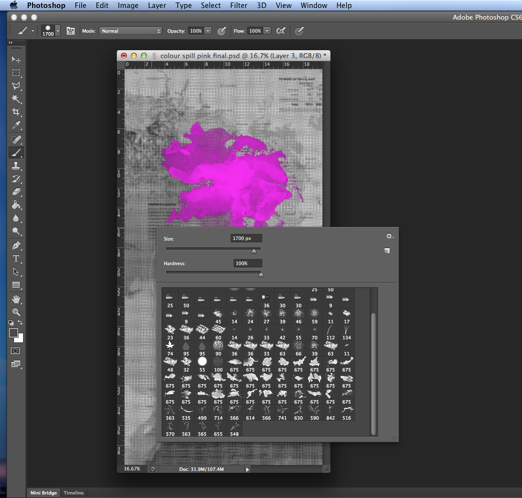
Using some free-to-download brushes, I applied an ink stain (originally in black) to the idea effected by the Deepwater Horizon Oilspill using a few different brushes and opacities. I then decided to turn the layer pink so that there was more continuity to my poster series. I think that it still works as it looks like ink still, and looks even more like it doesn't belong.
For my image only poster, I sampled one of the greys from my other poster, which I would print, and find a close enough colour of stock to print onto to match the brief criteria.
Again using the same pink to match the other two posters, I took the strongest design from my crits. Using a sarcastic tone again, I satirised the viewpoint of uneducated scared nuclear power haters.
For a background I used the 'greater than' and 'less than' symbols to represent progression and regression of society. Again I used a sampled grey from a previous image used, one only slightly lighter than the stock colour so to not detract from the message.
Here i inverted the 1 and 3. I filled it with the same polaroid style but didn't add peaks as I felt that the numbers should be as legible as possible.
With some letters I had to experiment with different types of peaks as some of them looked strange with peaks in certain positions. I also kept the Q rounded without a peak to resemble bike wheels.
I decided at this point I would definitely use this idea, so stopped producing different designs to be as efficient as possible whilst producing the typeface. The time I gained from not producing new designs allowed me to try different styles of the same polaroid type.
'i' was the first letter where I had to do a dot. I tried having it with a slant, and also with an angled dot, but neither seemed to work. I kept the main part peakless and the dot circular, which ran well thankfully with the O and Q.
I then decided to apply my peaks and polaroid style to letterforms which I thought would be problematic. The F, because the weight could make it look like it will topple over. The G was difficult as I had to edit the black area of the polaroid around a bowl. With the O, I decided not to add a peak, which I also did with the Q, as I liked the similarities between them and bike wheels. I also did the glyphs, which I chose because of their loud, communicative and slanted nature. I also chose 1 and 3 as during my research I found an unwritten cycling rule where if your bike is number 13, you are to invert the numbers, which I will later do.
With the peaks I tried it at either side to see what effect it had on the balance of the letter. I also tried rounding the edges signifying the roundness of bike tires, but it lost it's strength and impact which the corners gave.
I then started narrowing down my ideas and combining ones which I liked. Adding spokes to the letter C looked quite good but again it wouldn't be applicable to all glyphs. I added peaks to each letter to represent the Alps, and grew more fond of the polaroid idea. I felt that it in combination with the peak and the bold/italic style really worked with Elliot.
I began producing ideas for the type manipulations. I looked into polaroid styles, using a mountainous edge on the letters, making the letterform extra-bold and adding peaks and also using portions of the Tour de France as the edge of the letter. The rocky letters didn't look good as it was difficult to make the edges look deliberate. The Tour de France concept I thought was really interesting, but it wouldn't fit all of the glyphs. I'd also be reusing certain parts as there is unfortunately only 23 stages.
More of the same, getting to know more about his ambitions and favourite things.
Here I looked more in depth of the key things that represented him. I narrowed my field of view down to his love of cycling, the alps and photography, as well as his extroverted, bold persona.

More of the same, done on a different day with the aims of finding new links that i'd missed the previous day being in a different frame of mind.
I had Elliot write the alphabet in upper and lower case to analyse his handwriting to see if it could give me any insight into his personality. You can see that his letters are structured well and is far less script style than mine (in blue). His favourite typefaces were both sans serifs and both well structured typefaces. This, along with his bold/strong personality influenced me to use upper case, sans serif.
His love for the alps made me look into Swiss modernism, and I eventually chose Helvetica Bold Italic as my starting typeface- it represents his bold personality, love of structure and the italic styling conveys the idea of movement which links to his passion for cycling.
I began Brief 3 by getting to know my partner as well as possible. A series of questions were asked, trying to find out who he is, what his favourite things are and what his experiences in life have been.
This is my final piece which is printed on white matte paper (a2) using the digital print resources. I applied the same manipulation to each letterform and didn't encounter any serious problems in the process. I'm happy with the way it turned out but I would have liked to try printing on different materials such as acetate and cloth.
All i had to do then was remove the line, and group the remaining objects. I repeated this process with all of my letterforms. I realised after I had produced all of my letters that I had positioned my letters on slightly different parts of the line, making some of the cuts slightly higher or lower on different letters. if i were to repeat this task i'd have used a grid to align all of my letters to ensure a more consistent manipulation.

I then placed another copy of the letter over the top of the original, and repeated the process but in reverse, which gave me the letter cut in two, along my diagonal plane.

To make my manipulations, i created a shape over the top of the letterform where I wanted to shift it. I then selected the letter and my shape, and used the 'minus front' which got rid of that section.
I created outlines of the letters so I could manipulate them.
I positioned the letter above the line where I wanted the slice to be made. I chose the lower portion of the letter as I felt that it was more impactful than when near the top.
I started producing my typeface in Illustrator by creating a 30degree line which my letterforms would be dissected along. I chose this angle as I felt the steeper the angle of intersection was, the more it would unbalance the letter.

Final 10 Intervene designs


Experimented with my 'interventions' interrupting the joining of the bowl and leg of the letter. I widened the points where they would meet to suggest motion coming to a halt.

Vertical Stripe idea inspired by the idea that referees intervene during situations in sports. I chose vertical stripes as it is what style shirt referees are known to wear.


Idea based on the police force. I strengthened the terminal at the top left, and lengthened the leg (representing the long arm of the law). I also added a police style band around the base of the stroke.
When researching 'intervene', the U.S 'intervention' of syria came up frequently. I looked into arabic letterforms and tried to recreate the calligraphic style on this R. I changed the line weights to make it look like it was written by a fountain pen, made the terminal more 'flicky' and made the bases of the legs slanted again to make it look more handwritten. 
I decided to experiment on different letterforms. Here I took a G, to see how I could manipulate it. I created this design which has the spur of the G elongated to cut through the bowl. This creates a paradoxical style which I like where an earlier stage of the letter is interrupted by a later part.
Modifying an X, here I looked into how i write the letter. When I write this letter, my pen goes top to bottom on each diagonal stroke, so I decided to create this design, which has the second stroke intervene the first at an earlier point. This however unbalanced the letter, so I added dots which get larger as they travel up the letter, which helped to push it back up and make it more stable. 
Looking into Polish and Russian letterforms, I noticed that some of the letters have bars which intersect them. Although they are meant to change the pronunciation of the letter, I figured that I could apply them to my letters without them being needed to be pronounced differently because of them not being in our alphabet. 
Looking into different meanings of intervene, I thought about interventions and what they're usually associated with. People I asked immediately spoke about drug usage, so I produced this very literal representation of that, with a syringe being one of the legs of the R. 
Experimenting with the strength of lines, the bolder line is usually seen as the strongest, so I turned this on it's head here with the lighter line cutting through the thicker one. I then added some weight to the lighter stroke with smaller lines that run parallel with it. I felt that this helped balance the letter out as it looked weak in the centre with a large portion of the letter removed. 
Here I used a simple manipulation, but I feel that it's an effective one. Cutting the letter along a diagonal plane shows an intervention in it's production similar to when something is moved whilst being photocopied. This manipulation could be applied to all letterforms and glyphs easily and is still legible. This will be the design which I carry forward into the Illustrator brief. 

Tuesday 12 November 2013

Brainstorming different things to do with his hobbies allowed me to look at them in different ways, attempting to find links between them, and also to typographical elements.

Monday 11 November 2013

Again using the lower case, I played with the idea of having a latter part of the letter intervene upon on earlier part. Here I had the bottom of the S sharpen to a point which pierces the top half. I think that this works well as it's a simple manipulation, but also quite a powerful one given the contrast between the sharp points and the flowing curves of the S.
I realised that i was only manipulating upper case letter forms, so I wanted to experiment with lower case. Here, I took the lower case Y, and used the descender mirrored to also be the top of the diagonal stroke. I then had the other intersect it. This gave the feel that it was stopping the fluid motion of the curved diagonal stroke.
During a group critique, I was given the idea of having a letter composed of circuit board style elements. Although I liked how the letter looked, I felt that it was a little farfetched when linking back to 'Intervene' as when I asked others what the letter represented, all of the responses were to do with technology and mechanics.
Going back to a more literal representation of intervention, I looked at the letter Q, and thought about how 1 part of the letter could intersect another. Although i liked this idea, i wouldn't be able to apply it to the entire typeface as some letters such as I and O don't have multiple parts to interact with.
Again looking at people who intervene, the emergency services came up, primarily the police. To represent strength I added a blocky serif to the top and added some thickness to the line weight. I also extended the bottom right leg signifying the long arm of the law. the bottom of the stroke also has the dashed emblem.
After looking into people who are synonymous with intervention, Referees came up. This inspired the vertical stripe style, as referees stereotypically wear a striped shirt.


When searching the net for things related to 'Intervene', the story that came up most frequently was the U.S intervention in syria. This led me to research into the Arabic language, and influenced this design. I added calligraphic line weights, aswell as adding a flair to the top, and diagonal rather than flat terminals.


Tuesday 29 October 2013

Inspired by the IBM logo, I created an X which has lines removed in a horizontal fashion representing multiple interventions which interrupted the letter. The style has been proven to work well as a logo, however it can become quite illegible if there is too much negative space.
I started looking at letterforms which could interact with itself in an unusual way. Here the stem of the G intervenes upon the stress in an almost paradoxical fashion, as the latter stage of the letter interrupts an earlier stage. I really liked this and would like to continue it further, however I feel it would be inapplicable to many other glyphs.