Since my website is about craft ales and alehouses, I need to think about my target audience. I think 18 and 19 year olds are too young to care about craft ales, and are still in the 'drinking is new' phase where you drink whatever you can. I also think craft ales are quite a trendy thing to drink so I'm going to cap by target audience at 35. I also need to consider where my promotional material with be displayed. This will not only inform how I design my work, but also what I could design.
Materials wise, I would need to use the cheapest possible, as things will need to be mass produced and thus would become extremely expensive with the use of special printing techniques or materials.
What could I design?
Beermats
Rubber Bar Mats
Bottle Openers
Bottle Neck Tags
Posters
T-Shirts
Coasters
Stamps
I don't want to produce flyers or brochures as I feel like they're just too boring and irrelevant to my concept.
Design Research
I really like how balanced this magazine cover is and how the type is laid out. The neutral earthy tones in the photograph balance well with the dark grey background, which creates a sophisticated feel that i'd like to project onto my own work.
A much more fun design than the previous, I love this style of illustration which utilizes a refined colour palette.
Although the production methods involved in producing these amazing bookmarks would be far too expensive, I love the patterns used which were inspired by different geological features.
Although this poster could be perceived as boring, it communicates it's message extremely effectively, which my poster will need to do if it will compete with the huge amount of other posters everywhere.
Coasters are the most obvious media type for this task. Being in every pub/bar on every table their influence is unparalleled in this industry. I will probably stay away from using colour as I find that people overuse it currently, and the most noticeable pieces of design are black and white due to their contrast with the surroundings.
Looking into other media I could design that is found around pubs such as coasters, spill mats and barblades.
Poster ideas. I didn't like these because I felt that the imagery was too cliche.
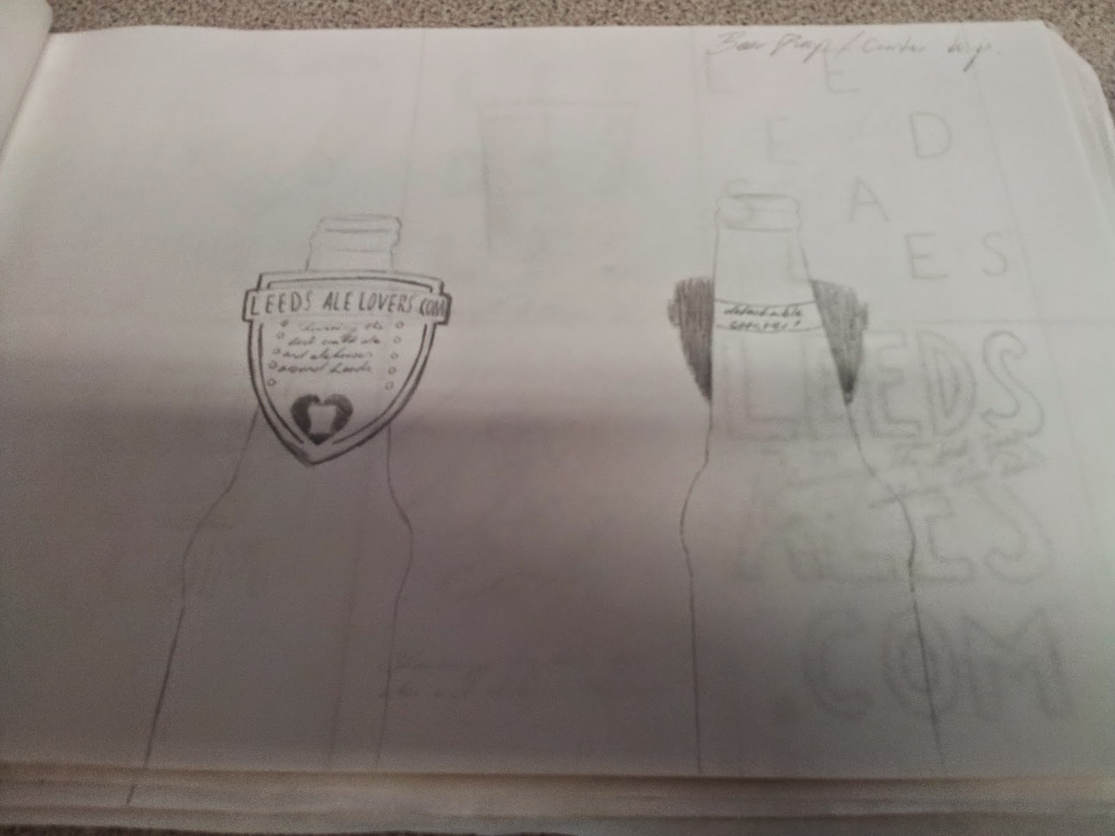
Bottleneck designs in a flag style. I liked the idea of having a piece of advertising going on bottles although this design wasn't very versatile and the dimensions didn't give much room.
This style of bottleneck ad works much better giving more room to design. I used a shield shape which is often used on ale pump designs to keep to the ale theme.
Coaster ideas which focused on typography. Due to a lot of the imagery being cliche I decided that type based coasters would be best.
First bottleneck idea, didn't give enough room for the type which i wanted a certain size, plus definitely no room for imagery.
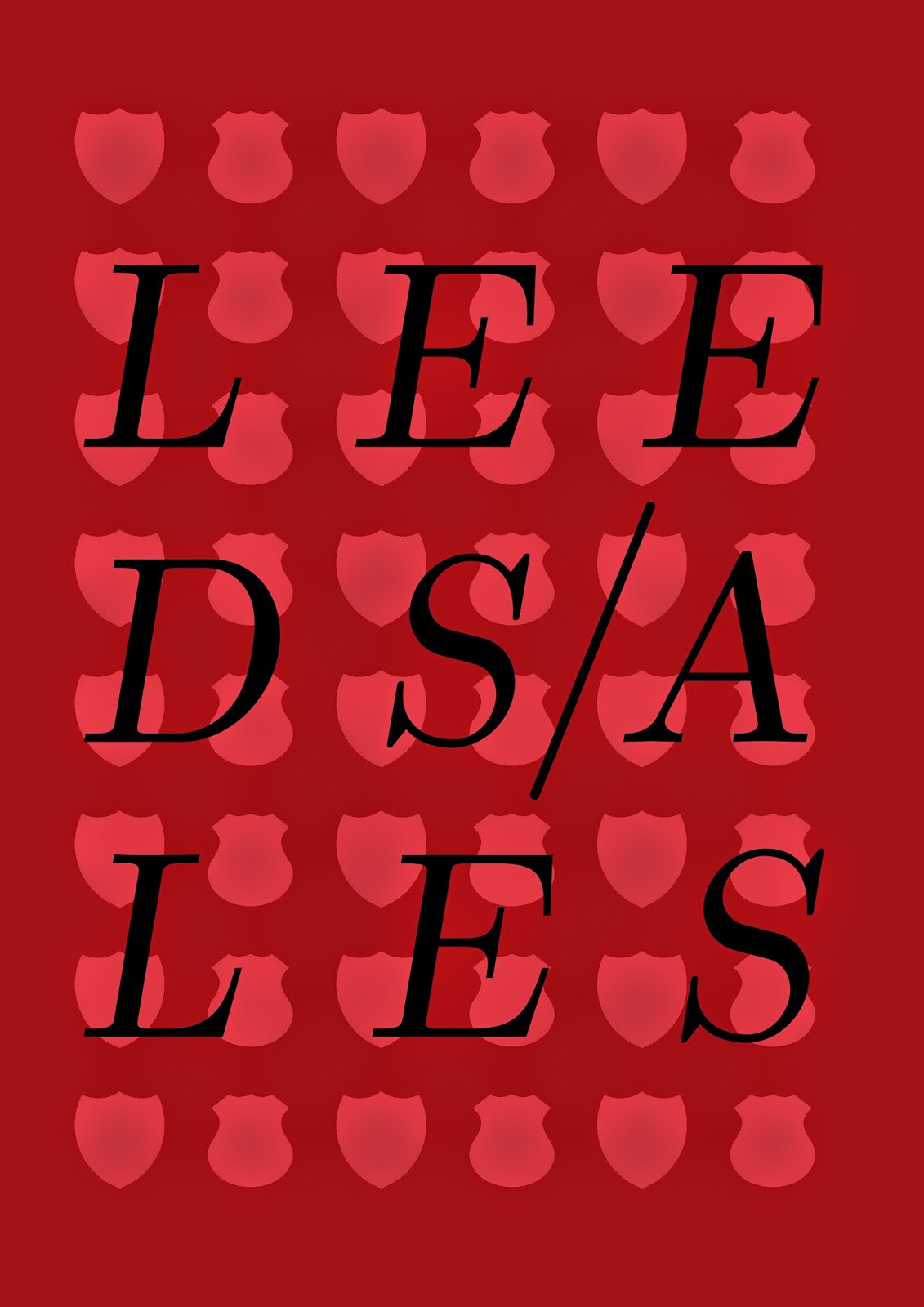
Minimal poster. Imagery was too cliche although I liked the typeface, Baron Neue.
First coaster which inspired the whole barley/yellow type theme. I liked this but I wanted a coaster that was up market enough to be used anywhere.
Experimenting with colour and type, I didn't like this at all. I need to learn more about typography and how it can be played with.
Original shield style bottleneck design. I liked this but it was too boring in black and white.
Again trying different colour combos, this time orange. i liked this, but many people found it difficult to read so I scrapped the idea.

