Sketching different ideas that use negative space on different parts of the leaflet which come together to create an image.
Trying to make my design more interesting I considered using a concertina fold that has multiple pop-out sections
I developed a flowchart which explains my design process. I felt that this was the best way to illustrate my method as I find it easy to follow, as well as incorporating fail safes as sort with 'yes/no' paths incase mistakes are made. This could be developed into a poster which would fit inside the leaflet, giving the design as a whole more of a reason to be kept.
Different folding techniques and ideas, some sounded great in my head until I actually tried to make them, when I realised that it was either far too difficult/slow to produce, or was in fact impossible.
Square design which used different pull-out sections to reveal more and more information. This design was interesting but when i attempted to mock it up, it took so much time that producing it on a larger scale would be impractical and extremely expensive.
This is my finished piece after much trouble using illustrator as I'm not particularly confident. I'm pleased with the way it came out, although I should have been more careful with the colours, which I chose on my home PC, then when I exported the file, they looked much different on the university macs, and different again on the colour configured digital print macs.
I needed some imagery for the back, so I created a serious of small icons to do with design and my process. most of them are obvious, except the fingerprint which represents individuality, and the raven which represents problem solving.
A first print on normal paper showed me that the dark blue was too dark, and the type was far too small. I also knew that I would need better quality stock to print duplex.
Stupidly I had left on the cut marks where I was so create the cuts to shape my leaflet, so I had to reprint it and then cut the final print by using math.
My first print in digital print was great, all of the colours were true and the type was large enough to be easily read. The paper was also the perfect density to print dulex and to be scored/folded.
Again stupidly I had left a guide on my work, which led to me reprinting it, which made the printing process quite expensive.
Too small, type was unreadable.
Size comparison. I made the final just over twice as large.
Final piece. Type is now readable and the piece as a whole more noticeable and sturdy.
Tuesday 21 October 2014
LogoStarter Development
Nomad logo based on old traditional typefaces. Not sure whether it looks too british/european.
Logo based on the idea of movement and travel. the perfect circle of the O representing the plate and I would use things like the diagonal and horizonal lines from the A as an arrow in the menu.
Traditional logo again with heavier stroke and a section of negative space on the inside.
I really liked this logo, however after consultation I found that a few people believed it looked too medieval which put them off.
Multiple ideas, some revolving around the foraging nature of the restaurant, which I felt was a little clumsy and basic. and other based around the idea of travel and landscapes.
Looking into different styles of logos, and thinking about the different text that might need to be on there, such as established year, location etc.
Footprint negative space in the A. N design that is divided by lines representing paths.
Any additional information that may be included, I decided against this though as I didn't want to over complicate the logo.
More logo ideas that look at the word Nomads meaning.
Extra pieces of text would could be applied to the logo.
experimenting with adding the additional information in different locations. I think I will just leave it as I don't want to over complicate the design.
Monday 20 October 2014
Beautiful Bottles
Left Field Cider Co. - $8.95 for a 500ml bottle.
Russian Bear Vodka - $10 for a 750ml bottle
Royal Dragon Superior Vodka £38.50 for a 70cl bottle
White Fences Vineyard Meteor Merlot - Price unknown
Bowmore Single Malt Scotch - £100,000 for 70cl
Adnam's Copperhouse Absinthe
Tempt no.9 Cider
La Antigua Wine
Darius II 2005 Cabernet Sauvignon Wine
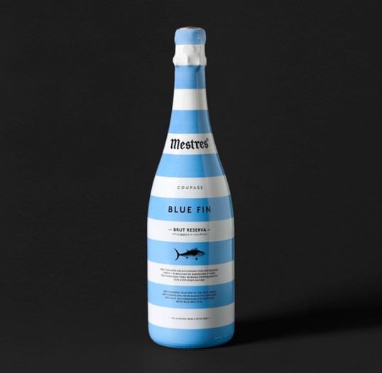
Mestres Blue Fin Wine
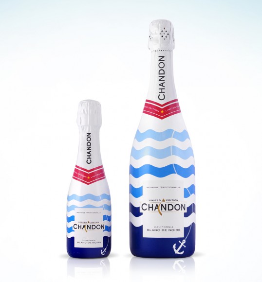
Chandon Summer Sparkling Wine
Russian Bear Vodka - $10 for a 750ml bottle
Royal Dragon Superior Vodka £38.50 for a 70cl bottle
Ron BACARDI de Maestros de Ron MMXII 150 anniversary Rum - £2000 for a 50cl bottle
White Fences Vineyard Meteor Merlot - Price unknown
Bowmore Single Malt Scotch - £100,000 for 70cl
Adnam's Copperhouse Absinthe
Tempt no.9 Cider
La Antigua Wine
Darius II 2005 Cabernet Sauvignon Wine
Mestres Blue Fin Wine
Chandon Summer Sparkling Wine
Wednesday 15 October 2014
Logostarter Brief
I have been challenged to choose a project from Kickstarter.com that interests me, and create a logo/brand for said project. Kickstarter has a large amount of ridiculous ideas, so finding one that was both interesting and realistic was time consuming. I have decided to brand a restaurant called 'Nomad', located in Vancouver BC, Canada. The concept is based around fresh local ingredients, some of which are even foraged, enforcing the idea of sustainability etc, which Vancouver is known for; aspiring to be the greenest city in the world by 2020. It also has the 4th highest quality to living in the world, so designs must reflect quality and try to stay away from certain cliches.
My research started by looking into the company and what it wants to project about itself- sustainability, local produce, healthy menus and interesting food/cocktails. I viewed the location on google maps and noticed that it is right next to a busy dual carriage way, so having a shop front identity which is attention grabbing to motorists is important.
I also looked into the name itself, 'Nomad', the definition of which is 'A member of a people that travels from plane to plane to find fresh pasture for its animals, and has no permanent home. From this, ideas for imagery began to emerge, such as livestock, caravans, yurts/tents etc.
I need to decide whether i will use a style that reflects this, with rustic typefaces or historical serifs etc, or go down a more juxtaposing style using modern typefaces and clean cut imagery which reflects more on the city of Vancouver than the ideals of the restaurant.
This is the current logo for Nomad. I hate this logo for a number of reasons. The first being the distressed typeface. It has no connations of food or nomadic themes and looks painfully unprofessional. Next is the imagery which is way too complicated and cliche. I dislike the way it's placement elevates the rest of the text and makes it annoying to read.
Another restaurant called Nomad can be found in Shepard's Bush, and uses this logo, which is arguably even worse. the painfully uncreative imagery with the ugly typeface make for a typeface which is far too complicated, uses strange dimensions and won't work well in black and white.
Logo Inspiration-
I've been looking on blogs to find ideas and inspiration, mainly on From up North and Pinterest.
The problem is making the logo memorable. This means finding an equilibrium between creative and impactful. It should also look as unique as possible. An image logo I think would be a bad idea, as a restaurant isn't something you visit enough for an image to be remembered unless it's a chain restaurant. This means I should focus on the word Nomad and try to form a logo based around that.
My Design Process - Brief 1
For our first brief in year 2, we've been asked to produce a folded leaflet that displays and communicates our own individual design processes. I will need to explore different folding techniques, as well as grid systems that will conform to the chosen folding technique.
Die cut front immediately sets a style which leads on to different coaster and dnd signs. i think this can look a little too gimmicky though.
I love this cut design that allows a vibrant burst of colour through a monochromatic front.
An interesting folding technique and easily reproducable design, this could display my information very easily and in a creative way.
Grid Systems
I must find a grid system that will work well with my chosen folding technique.


Subscribe to:
Posts (Atom)


