Avenir is a 'geometric sans serif' typeface, created by Adrian Frutiger in 1988 and released by Linotype GmbH. Many companies use Avenir, including LG, BBC2 and Apple. Inspired by Erbar, it was intended to be a more organic and humanist version of highly geometric typefaces.
Dante is a 20th century typeface by Giovanni Mardersteig created for the Officina Bodoni private press. It is a serif typeface which was influenced by types by Francesco Griffo from 1449-1516. The main objective with Dante was keeping a good visual balance between the roman and italics. Used in many books, it reads very easily with large pieces of copy.
Painter Kafeel is an Indian street style typeface created by the Painter Kafeel from Old Delhi. It comes in 9 styles and allows the user to colour each section differently to create incredibly vibrant and exciting typography.
Edwin Store uses a mix of script, sans serif and old western fonts with plain earthy colours to create a beautiful store front.
Vivienne Westwood along with nearly all other shops in the Victoria Quarter Leeds utilizes this stylised sans-serif metallic gold font, creating a classy and luxurious feel.
Multiple examples of Hand Rendered type by Scott Biersack.
Hand Rendered type by Sean McCabe using micron pens and paint pens. The edgy style makes the logo feel adventurous and exciting, whilst the blue water connotations on 'flow' bring the whole piece together.
Buddy's Bourbon Beer. The distressed sans serif block typeface, especially in brown, makes the bottle feel rustic and manly. The colouring also matches the bottle well preventing any colour clashes. The red script type used for the signature makes the bottle feel more man-made and human.
Kiehl's Store. This script typeface is custom type typography. The soft edges and flowing elements make the logo feel more friendly and approachable, whilst the decorative elements on the K make it look more classy. It's easily legible against the black background thanks to a high tonal contrast and a relatively strong line weight.
The White Company London. A sans-serif humanist typeface, using Gill Sans; a typeface designed by British designer Eric Gill. It's a hyper clean design which communicates purity and cleanliness. It's very easily legible and readable thanks to a high tonal contrast and well tracked letters. The point size of 'London' creates a feeling of intricacy and creates a typographical hierarchy which has your eye read down the logo.

Baltic 39. This Swiss-modern sans serif typeface (nearest match: Compacta EF) uses sharp clean edges with a thick lightweight, as well a very small sharp counters to create a bold and modern look. The thin line weight on the vertical line which separates Baltic and 39 contrasts nicely against the bold lettering, and also makes sure it is not confused for a letter.
Osaka Restaurant.
This sans serif typeface used for Osaka utilizes sharp edges and angles along with script-like elements such as the flowing A to create an oriental feel to the logo, I like this logo however i feel that the orange edging and the strong line weight makes the logo look like a clothing company rather than a restaurant. If there was more intricacy to the logo, either with a much thinner line weight, or more decorative flourishes to the other letters it would better suit it's purpose.
Di Marco Italian Restaurant
This is a custom script typeface, and resembles many other Italian restaurants/takeaways. I think that it looks very low end and cheap both thanks to the colours used and the typeface. The curvy rounded lines make it look childish and unprofessional. Although the typeface style does connotate Italy, it's still not suitable in my eyes for a city restaurant.
Dr, Martens. A bold slab serif is used by DM, which carries connotations of strength, sturdiness and reliability. It's not the most legible/readable type, but the iconic weight and serifs make up for that and make the logo memorable.
French Connection. A modern squared sans serif typeface (Eurostyle). very legible although the depth of the type gives a drop shadow which can make the letters slightly blurry, especially to people who don't have 20/20 vision. The tonal contrast adds to the readability. Suitable for the modern and clean look FC are going for, the typeface doesn't carry many connotations which allow the brand to produce clothes of any genre.
Fatface. A bold sans serif, slightly squared typeface which has an arch applied which i feel makes the type feel a little more relaxed and friendly. The slightly damaged effect applied gives it a rustic, handmade feel which connotates to me trust and strength.
Calvin Klein. Futura Book is used for this ultra modern geometric type. The thin weight makes the type look sleek whilst the white colouring signifies purity and cleanliless. It's also a very trendy colour right now. It's very easily legible and readable thanks to it's perfect spacing, and is more heavily tracked for smaller text to aid this.
Central Arcade. This transitional serif typeface has elements of neoclassical typeface in such as the serifs on the R. It feels very Victorian and traditional, which is emphasized by the fancy metal work below and the stone architecture. I don't like this type as it feels very unwelcoming and I don't get a sense of what is inside. The white on blue gives a cold and almost nautical feel which is very out of place.
Ellen's Perfumes. Here we have a hand painted sign found in a market. It's a decorative font which uses very slight serifs, a drop shadow and old fashioned flourishes. Everything about this type suggests old-fashioned and hand crafted products. As much as I enjoy handcrafted signage, I don't think this is appropriate due to the prestigious and high-class nature of perfumes.
I like this typography. Very relaxed and calm, this slab serif typeface with it's brown/beige colour scheme feels very inviting and hospitable. The softness of the serifs and lack of sharp edges lets the eye flow freely around keeping a relaxed feel.
Sabai Hairdressing. Almost a polar opposite to the last type, this serif (old style) is extremely sharp, which is emphasised by the removal of the crossbar of the As. It's looks very roman and in my opinion very unwelcoming, It looks much more like a nightclub. I don't like this type because of this, and feel also a new colour scheme would be beneficial as it looks to dark and creepy.
Cafe Royal. A signature like formal script font suits this up market cafe thanks to the connotations linked with signatures like money and wealth. The soft grey gives a neutral tone to the text which usually I wouldn't use for a food company, however thanks to the font choice and the use of glass it works as it is more classy i think more than most colours.
Caffe Nero. I'm yet to decide whether I like the use of this modern squared sans serif typeface used for Caffe Nero's branding. It feels too modern for a coffee shop and almost feels digital. I also find it slightly hard to read due to the unusual spelling of cafe, and the very small spacing between the two words. I think the type may work if it used richer colours such as chocolate browns or a deep purple, however these cold colours do not work.
Reel Star Adult Gaming. This is another squared sans serif typeface which I thought was similar to the Caffe Nero typography, used in a much more appropriate setting. The modern feel of the squared type works well with the gaming industry, as does the striking colour combo of green and black which also carries digital connotations.
Richard Campbell butchers. Again, with hand rendered signs in this day and age I feel that they appear cheap and quite tacky most of the time. This black-letter typeface is very medieval and old-fashioned which for a butchers fits well, however the use of orange in this case makes the text feel even cheaper.
Olivers cafe. I really like this typography. It feels very upmarket, which I'm not 100% fits a cafe, however it does fit a restaurant. The transitional serif typeface looks very clean with he white on black colour scheme .
Pizza Hut. I really like this decorative type for Pizza Hut. It's fun and playful whilst not looking too cheap which matches the restaurant very well. A high tonal contrast with flat type makes it very readable and noticeable.
Yo-Yo noodle. A decorative font mixed with a sans serif. I feel that the 'Yo Yo' text really ruins this typography. The imagery of the chopsticks is strong enough by itself to need awful decorative type with it. It cheapens the design a huge amount and the yellow against the red gives too much of a contrast of hue.
Travelling man. Everything about this typography is beyond awful. The typeface used is one of the least legible and readable things ever created, which is worsened further by the huge contrast in hue. It wasn't until I had taken this photo and looked back at it that I even saw the word 'men' in the blob underneath the 'travelling' text thanks to the sudden pointless use of negative space. Then the use of arial for the other typography is extremely boring and doesn't work at all with the above text, although I don't think anything would.
Guitarguitar.I like this simplistic typography. The use of Helvetica (a neo-grotesque sans serif) to create a neutral piece of text works well as it speaks to not just one genre of music enthusiast. The orange connotations of cheapness are balanced out by the neutrality of Helvetica, and leave a more fun and outgoing vibe.
House of Smith. I like this typography which uses a neoclassical serif font to create an up market and sophisticated body of type. It does however give off a clothes store vibe because of it's logo and name similarities to 'house of frasier'. I don't like the addition of the website at the bottom as it's too informal, and also quite obsolete since people would rarely use a bars website. The colour scheme of black, white and a very light pink strengthen the sophisticated tone.
Miami Bar. This awful type is for a tropical bar which is supposed to be fun; however the typography is anything but. The black on white in this case looks cheap thanks to the ugly decorative font used.
Revolution Bar. This squared sans serif typeface uses large tracking and gold colouring to establish a powerful and striking vibe. The matte finish gives a classy look.
House of Smith bar. Using a sans serif typeface this House of Smith type looks much more appropriate than the last. The contrast against the serif type below creates an interesting dynamic whilst the size of the lower lettering creates a working hierarchy.
Evening Chronicle Newspaper. Using Helvetica
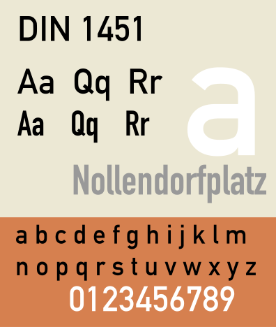
Din 1451.
DIN 1451 is a sans-serif
typeface
that is widely used for traffic, administrative and technical applications. It was designed by Albert-Jan Pool. It was also used on German car number plates from 1956 to 2000. I really like this typeface thanks to it's modern shape and legibility. It also works with a variety of different fonts.
Lobster. A free condensed script font by Impallari Type. It's grown in popularity massively over the past few years to the point where I believe it to be overused. I dislike this font a great amount and feel it's too gimmicky and silly to be used in serious graphic design.
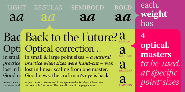
Warnock Pro. Designed by Robert Slimbach, Warnock Pro is an Adobe Originals type composition family named after John Warnock, the co-founder of Adobe Systems. It's a modern Old Style serif typeface with sleek sharp serifs.


.jpg)


