Wednesday 25 March 2015

Responsive Evaluations

Module Evaluation

I really enjoyed this module. It was the first module in which I really felt like I was producing work which I could show people and be proud of. This is why it really hurt when at 10 minutes before the deadline, InDesign crashed, corrupting my entire file. I managed to put together design boards (about half as many and of a lower quality) which made me feel slightly better, but it was still devastating after all my hard work. During the hand-in, Danny helped me a huge amount for which I am very thankful. I submitted most of my digital files on a usb stick and also my sketchbook. I'm very pleased I had a sketchbook for this rather than loose papers like usual as it made the hand in much easier and presented much nicer. I put a lot of effort into this module, much more than I have in any other and I believe that my final products show this. It has been the first module where I have been proud of work I have created, and have been happy showing friends. I think my work has evolved a huge amount.  Having motivational friends and tutors has made my work come along leaps and bounds, and has for the first time in a long time made me confident and happy to call myself a designer. From now on I'm going to be entering many more competition briefs in the hope of getting my work into the public eye and also to try network with as many other designers and companies as possible. The prizes are also rather motivational too.


Secret 7 Evaluation

The first brief I chose to tackle was Secret 7. I enjoyed taking part in the brief last year so I knew I wanted to do it again. After listening to all of the songs and analysing the lyrics and music videos, I felt that the St.Vincent song had the most possibilities. I found it easier designing for a song I disliked than a song I liked for some reason, possibly because I wasn’t distracted by the music and could focus more on the message. As always with briefs like this I sketched out ideas whilst listening to the song and watching the video, trying to immerse myself in the world St.Vincent was trying to create. I wanted to take an element from the video which wasn’t particularly important and showcasing it as an Easter egg of sorts. I liked my concept of real world vs digital world, even though I did worry that it wasn’t obvious enough. After consideration I realised that the work was interesting enough that it was ok, and anyone that watched the video would understand.
I liked the work that I created. I felt that it nicely encapsulated the song and aesthetically linked to the video. I think that my work has a good chance of being chosen; as my first piece of design work which I was properly content with I am going to be looking back at my design process for this module when tackling other briefs in the hope that I create more work I’m proud of.
If I were to do this brief again, I would just give myself more time to go more in depth in each area. Spend slightly more time researching existing album covers, produce more sketches and longer on illustrator perfecting the design.


Feathr Evaluation


Feathr was the next brief I tackled. I gave myself a very small amount of time to tackle this brief as I knew that I wanted to do the penguin books brief, which I knew would take a lot of work and time. I quickly ran through a few ideas on what I could produce and what my target audience could be and came up with a strong concept with targeted children, attempting to introduce them to healthy eating. As I do with all of my briefs, I began by researching what already existed. This let me understand how colour, shapes and repetition were being used and how successful it was. I then sketched out a handful of ideas, which was when I came up with the fruits concept. I'd have liked to have spent more time generating ideas, or possibly just expanding on my chosen idea more as I felt that my final product could have been more successful if I had allocated more time into experimenting and research. I also should have produced more types of fruit, which then could have been mix’n’matched to produce more customized wallpapers (even though the feathr competition/format wouldn’t allow for it, I liked the concept). The simplicity of the icons means that a brand could be established, creating furnishings like bed linen and stationary very easily which I like. If I were to redo this brief I’d certainly do more research and spend more time developing the designs, as I felt like the concept was really strong.


Coco Chanel Evaluation


This brief was a relatively small one, which I did mainly to see what I was capable of illustration wise. I realized very quickly that I wasn't a talented illustrator, so would have to rely on my design knowledge to create something simple but effective.
After researching Chanel, she certainly had an interesting life, with many controversial points. This however I felt was a distraction. I wanted my design to be all encompassing, not just looking at a single part of her rich life. I wanted to use my watercolours for this, as I felt that a vector illustration just wouldn’t suit the book. The book is about the woman not her company etc, so I wanted there to be a sense of human creation and involvement. Whilst looking at her pictures I found a particularly high contrast image of her, and could immediately recognise the most prominent features; her eyes/eyebrows, nostrils and lips. There was also a cigarette; however I removed that element as I felt that it may cause friction with a certain audience.  Experimenting with different ideas, and drawing from my research from the Feathr brief where I experimented with different illustration techniques, I produced a handful of different illustrations each with a different twist. The one I liked the most was the simplest one. Irritatingly the drawing was very small so I had to scan the file at a huge dpi which made the file huge which caused some problems, which certainly contributed to the huge file loss I had at the end of the module. This being said I was happy with what I produced but should have spent more time perfecting the illustration. I feel like the lines could have been smoother, the angles sharper and the lips could have been perfected.


852 Fitness


I took on a brief from 99designs.com, a website I had avoided for a long time to due believing that their process is incredibly immoral. I decided to tackle a small brief, creating a logo for a fitness company. They asked for a vintage style logo which was masculine, loud and used red, grey and white. The logos already submitted were all horrendous, some even had typos in the logo itself. They seemed to want a relatively clichéd logo, which I thought was easy, however trying to make a unique logo with clichéd elements proved to be almost impossible, especially since a gym has such a small amount of imagery related to it. I sketched a tonne of logos, seeing now I could fit the numbers together, how I could manipulate the negative space etc to no avail. I also asked my friends who go to gyms what they’d expect/want to see from a gyms branding. This was when I reluctantly started looking at vintage logos that used shapes and grains etc. It was much easier to design using these elements, which must explain a large part of their current ubiquity. I produced a logo which I was happy with that worked on different backgrounds and I think would look suit their gym and apparel. The main thing I learnt from this brief is that I don’t have to like my final product, the client does. This is something I will have to remember in the future as it often impacts my decision making. After this project, I still don’t like 99designs or other websites which force clients to fight to work. I believe it to be immoral, and more often than not a waste of time.


WWF


I undertook this project with my good friend Sarah Coletta who is a student on the Visual Communications course at LCA. She often produces illustrations of animals and is passionate about conservation, which is the reason we chose to tackle the WWF brief together. Her illustrations are always fantastic so I didn’t interfere with any design choices she made, whilst her knowledge on typography isn’t as strong as mine so I took charge of that aspect of the designs. We wanted to have a more relaxed tone of voice than most charities that currently are out there. Many tv and print ads show horrific and depressing imagery which is just ignored now due to it’s ubiquity. We wished to show the beauty of nature that we currently have, rather than a dystopia that we may have without human intervention. Once both had been completed we came together and tried different layouts and design ideas including the copy itself. After deliberation, talking with peers and some compromising we finished our posters and were happy with what we created. We then realised that since the typography was strong by itself and so were the illustrations, that we could create a wide range of different products which used our designs to spread the word and to create revenue for the cause. This included things like furnishings, phone cases and clothing. I think we did well on this brief; however I think more research could have been done to try influencing the aesthetic and typographic layout. I also would’ve felt bad altering Sarah’s illustrations, but I possibly could have experimented with some editing and manipulation.


Penguin


I was really passionate about this brief. As a lover of literature and book cover design I was incredibly excited to tackle this competition for ‘Oranges Are Not The Only Fruit’. It isn’t a book I myself would choose to read, but I did read the blurb, a synopsis and some reviews to gauge the correct target audience and plot points. I began sketching out covers which I thought would look beautiful and that slightly incorporated the topics in the book. After spending a lot of time researching covers I liked and sketching, I realised I was wasting time creating a cover that I would like, rather than a cover which matched the brief properly. I went back to the drawing board, creating different designs that I thought would resonate more with the books target audience. These new sketches were much better received in group critiques. I used my watercolours to create illustrations in different ways and using different shading techniques. The simpler versions were much better. I had to keep in mind that it would be in CMYK and that I can’t use any fancy printing techniques or inks. After deciding which illustrations to use I put the book together, drawing inspiration for the typographic layout from both existing penguin books and other books I’d researched. I also had a consistent dialogue with 2 friends who I trust with typography which helped evolve my work into what I believe to be a great piece. The only downside I think though was the quality of the scan, which even though it was at a high DPI, the paper which I had done my illustration on was poor which gave the illustration strange edges and some artefacts. If I did this brief again I would recreate the illustration larger and on higher quality paper. I would also have liked to spend more time researching typography to try produce something more interesting and new.I could have also handled my time better as I was having to rush towards the end, although this led to me realising just how much I can achieve even with a small time frame.


Responsive Design Boards

Tuesday 24 March 2015

852 Fitness - Logo Design - Responsive

I have decided to tackle a brief from 99designs.com in which I am tasked with creating a logo for '852 Fitness'. They are a company which have class orientated fitness programs, sell apparel and health foods and run a gym.

They ask for '852' bold, simple and vivid. 'Fitness' can be placed at the bottom.
The text should be converted to outlines before sending and I am to send the client a message which explains how to acquire any fonts which I have used.

They provided a handful of logos to take inspiration from which use the desired aesthetic.
Obviously looking for a vintage feel using geometric shapes and bold text, possibly incorporating a graphic.

Current Branding 
No too bad a logo, feels top heavy though and it's generic. 
Their aesthetic looks rustic and you can tell they are cleaving for a brand which is a mix between rough and traditional with new and luxurious.


Research into existing gym logos


I like this logo using just black and white with careful consideration put into line weight. However it doesn't fit my brief. I may try using image as text somewhere if it fits.


 One of the most famous gyms in the world I believe has a terrible logo, only iconic because of the gyms success and celebrity clientele. The text looks tacky and the bar which the bodybuilder is holding is comically small. the colours however are good and suggest quality.


Eyecatching text and clearly represents a gym, however the spelling and Y character make it look unprofessional and cheap. 


All of the logos i came across seemed to be all centered around men and muscles, which I don't want to do. Since the gym I am designing for is more about fitness I think the muscle aspect may put off more casual gym goers. They also seem overly masculine and may put off women, cutting off a large demographic.


Inspiration


I took inspiration from these logos which very often had a grain and rustic look. the typefaces were either sans serif and bold or script. Given the nature of 852 a script would be a poor choice so I believe I will use a bold sans serif similar to Bebas or maybe one with more stylized features like Haymaker.

Producing sketches. I explored the way the numbers could possibly fit together, as well as shapes, different styles and ways that imagery could represent the numbers.
I decided that my strongest sketches were the bar logo with the 3 sections, and the logos with vintage shapes. I also wanted to mock up the 5 and 2 that used arms just to see how it would look.
Apparently not very good.
Experimenting with type/imagine combinations. It looked far too gimmicky and hard to read. Very unprofessional.

I created the final 2 in illustrator experimenting with colours and typefaces. I knew sans serif would work much better and that a larger more bold font would be better than a geometric or curved font. I chose Franchise bold.

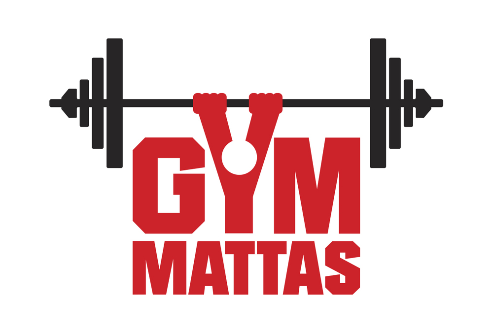
This is my final logo. It works well against different backgrounds and clearly represents 852 thanks to the use of the word 'fitness' and the weight imagery. The vintage style paired with the bold typeface and interesting shape would also work well on clothing, looking more fashionable than other gym logos.


In Situe mockups. For the tag I added an 'apparel' element to show how easily it would be to branch into different areas of business without having to create a new logo.

Thursday 19 March 2015

Feathr - Responsive

''Artist-designed wallpaper that's anything but wallpaper.''

''Our mission is to fill the world with more art and less decoration. We’re for everyone who loves art and has a house with walls. So here’s to more good shit and less shit shit.
Who’s we? That’s Tom, Anne and Oli. We’re ex-advertising people who love art, big ideas, design, craft, interiors, having our socks knocked-off, originality and art (again).
We left advertising to start Feathr: an interiors company that combines all the things we love. You’ll find us in Helsinki, London, Bali and all over the web.''


Looking at different wallpaper styles i'm beginning to understand the limits of wallpapers, and how repeating patterns are continued from sheet to sheet.

I'm unsure as to whether I like wallpapers which use multiple colours, but I can definitely see why children would like them, as they're much more engaging and interesting. This led me to the idea of creating a wallpaper for children which is not only engaging but beneficial. Getting a child to eat healthily is incredibly difficult, but with the use of fun surroundings it may be easier to introduce the idea. 

I want to create a wallpaper which is bright, colourful, and most importantly interesting which showcases fruits and/or vegetables in a bid to make children believe healthy eating doesn't have to be boring.

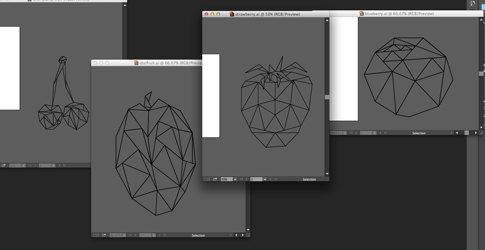
Since kids study shapes, colour and numbers at school, I figured using a low poly aesthetic would be highly engaging, allowing them to count segments, see different shades of colours and see how shapes can form other shapes. After creating the low poly shapes in illustrator, I colourized them, by placing a photograph of the fruit behind it, using the colour picker to choose the colour and filling each segment.
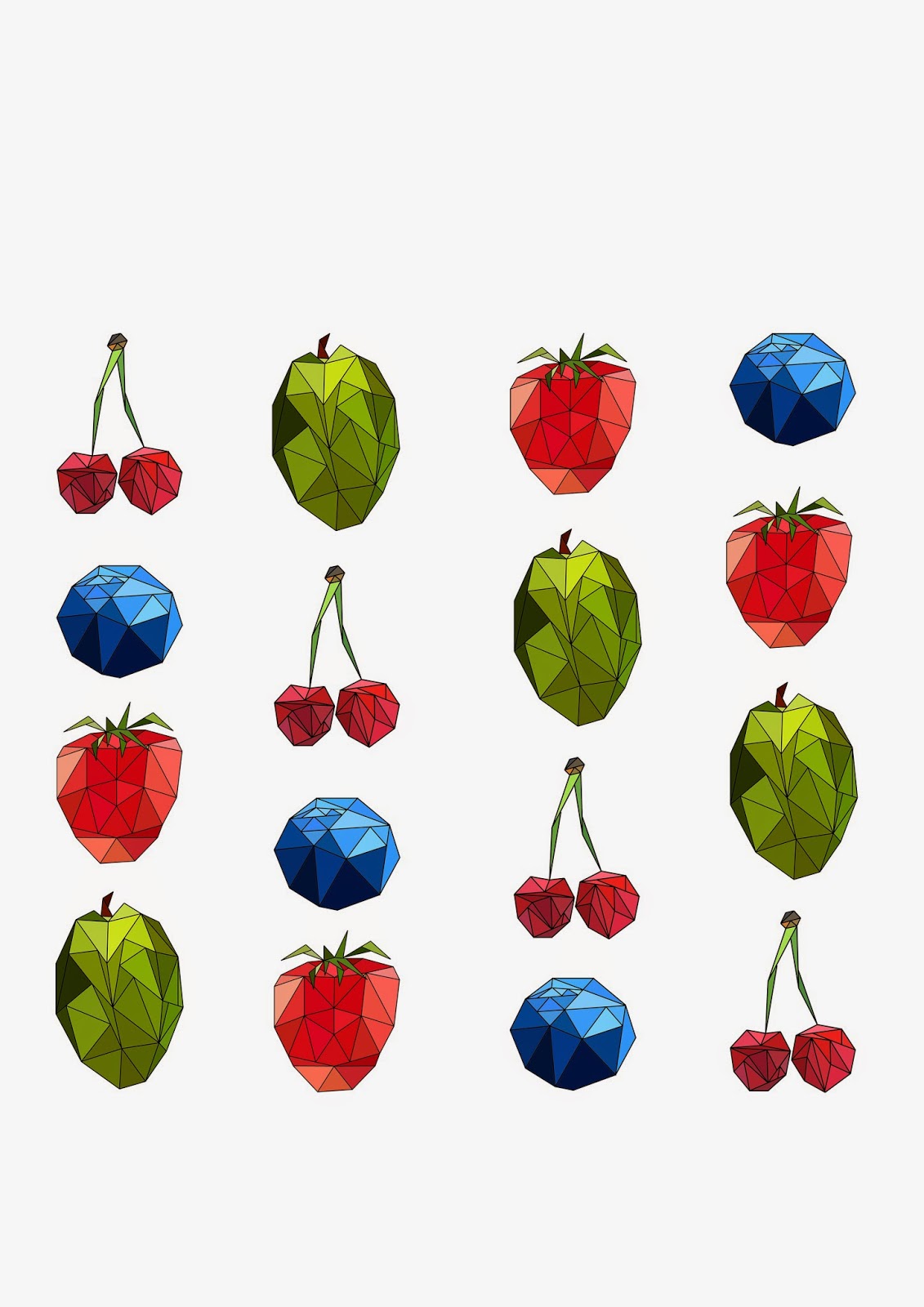
Final product, using a drop down pattern. I felt like I needed more white space so I doubled the gap between the fruits.
I much prefer this now. The background is pure white, I'm not sure why when uploaded to blogger it becomes a light grey.


Friday 6 March 2015

PushkinPress - CoCo Chanel - Responsive

I am entering a competition in which I am tasked with creating a new front cover for the non illustrated version of the book 'The allure of Chanel'. It is to be an illustrative interpretation which will inspire readers to immerse themselves in in her extraordinary world.

TECHNICAL SPECS
The competition encourages responses in any media, in colour or black and white, but artwork must be supplied as an RGB tif or jpeg with a white or transparent background, and be non-framed.

''Gabrielle Bonheur Chanel (19 August 1883 – 10 January 1971)[1] was a French fashion designer and founder of the Chanel brand. Along with Paul Poiret, Chanel was credited with liberating women from the constraints of the "corseted silhouette" and popularizing the acceptance of a sportive, casual chic as the feminine standard in the post-World War I era. A prolific fashion creator, Chanel's influence extended beyond couture clothing. Her design aesthetic was realized in jewelry,handbags, and fragrance. Her signature scent, Chanel No. 5, has become an iconic product. She is the only fashion designer listed on Time magazine's list of the 100 most influential people of the 20th century.''
- Wikipedia

Known for: No5 perfume, Houndtooth design, Chanel Suit, Pearls, Smoking, Little Black Dress, Suntan, Simplicity, Black and White. 


I looked into existing covers which use illustration, in an attempt to see how the tone of voice and overall aesthetic changes with different illustration styles and colour usage.


Sketching process revolving around chanel herself and the iconic imagery related to her, including her pearls, the little black dress, houndtooth and no5.

using watercolours i experimented using type as image

I also experimented in using the brush to create typography, accidentally creating some beautiful letter forms. this inspired me to start a book of letters which i accidentally write in a particularly nice way.
Houndtooth idea, poorly executed.
Red lips. I really liked this design as the vivid reds were extremely eye catching and had great contrast to the rest of the book. The size of the lips is very small which i also like, balancing nicely with the large amount of white space.


Interesting letterforms created whilst using the watercolours


Final image created in illustrator. I'm pleased with the way it came out although the quality on the lips could have been better. I'm not sure whether it was due to too low a dpi scan or the wrong settings used to trace them. I will have to research this in the future.


Mocked up on the book. I really like the design. I thought about having the face smaller so the whole head would fit between the type but after talking to friends they said to keep it larger so the book doesn't look too boring on the shelf.


Wednesday 4 March 2015

Collaborative Brief - WWF -Responsive

I have chosen to tackle the WWF D&AD brief, which I am challenged to 'Inspire the new generation. Make them act for our planet'. I will be working with my friend from the Visual Communications course, Sarah Coletta, who specialises in illustration.


Sketches have been produced of different animals who have endangered habitats, which I will use to create a poster series which uses the beauty of wildlife mixed with the capabilities of human beings to reach a younger audience, and the up coming generation which we believe are becoming more and more appreciative of art and design. 

Looking into typographic posters, I have been researching different ways I can use type and language in a way that is evocative and thought provoking. I have also been looking into the type can be distorted and broken to represent the habitats of the animals. 


I believe that posters which utilize creativity rather than shock imagery or are too formal in tone of voice are much more powerful. This campaign which used body art was much more thought provoking to me than a more serious and fact heavy poster.


With the abundance of tragic and unsetting news on television, newspapers and the internet, I believe that people are starting to ignore themselves by putting up mental blocks to any works like this which are obviously upsetting. Showing the beauty of nature and suggesting how we can create a beautiful future, rather than showing a dystopian future if we don't act will be more effective, especially with younger audiences which this campaign is intending to reach.

More research on posters which use both photographs/large illustrations and type.
Production

After messing around with different size animals we decided that having white space around the animal would make the poster more eye catching amongst other posters. It also allowed for the illustration to be properly appreciated as it has a sort of frame. Te type size and layout was the biggest issue.
Clipping mask experiment. Sarah liked this, however I found that it made the text too difficult to read and looked less professional than having it in black. She allowed me to take charge in this decision and we moved forward happy with the choice we made. It stood out more against the white and the colourful illustration.


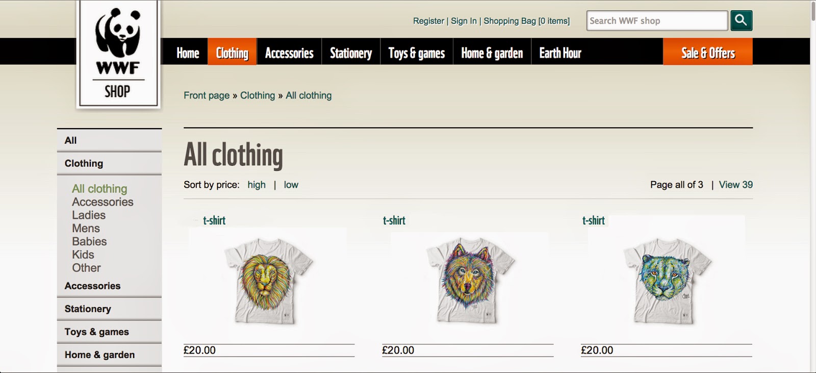
T-Shirt mockups which could be used to make revenue which would help the cause. This way our work would not only advertise the issue but attempt to tackle it.
Sarah completed a new illustration of a Cheetah which we immediately put into effect. The blue colouring rather than purple gives people a wider range of choice since people will have different personal preferences. This would hopefully increase revenue.
Showing how they would look in the store. We both believe these items would sell very well. Full bleed illustrations which cover the entire T-Shirt would be even better however due to time restraints we couldn't fully explore this idea. These T-Shirts could also be worn by any WWF representatives and campaigners.

Magazine adverts would be an ideal place to put the posters. We tried to think of other concepts to strengthen it such as having the page perforated many times to encourage ripping, continuing the concept of losing something precious, but decided against it due to production costs and we felt it wasn't suitable.


The type was made using illustrator, simply by creating outlines then removing undesired elements.
Here i produced a clipping mask using the altered type and the illustrations. We decided against using this although we may experiment with this for the clothing.
QR code which links to the WWF store, website and d&ad wwf logo


Almost finished posters, we wanted 1 extra tagline to sit underneath the manipulated text but haven't yet come up with a phrase which is memorable and encourages action.


We opted for 'Live Sustainably'. It's short, easy to remember and allows the reader to think for themselves without sounding too demanding. Ads can sometimes sound demeaning when they list how to do things, so this open request we feel does the job well.

Finals in Situe.


All of these items would ideally be sold on the online store, pop up stalls, events and in stores which deal with pets and the outdoors. 


I'm not sure about the use of a QR code, but it's presence I believe doesn't detract anything from the poster so I left it in.