Tuesday 13 January 2015

Chosen topic for Studio Brief 1 - Raif Badawi / Freedom of Speech in Saudi Arabia

''Raif Badawi was sentenced last May to 10 years in prison and 1,000 lashes. He had criticized Saudi Arabia’s powerful clerics on a liberal blog he founded. The blog has since been shut down. He was also ordered to pay a fine of 1m riyals or about $266,600. The first 50 lashings were administered on January 9th 2015.
Badawi's lawyer Waleed Abulkhair has been jailed after setting up Monitor of Human Rights in Saudi Arabia, a Saudi human rights organization. He is being charged for "setting up an unlicensed organization" and for "breaking allegiance with the ruler". His requests to license the organisation were denied.


Badawi’s punishment is part of a wider campaign against domestic dissent. His lawyer, Waleed Abu al-Khair, was sentenced to 15 years in prison last July because of criticism of human rights abuses.
His case resumes on Monday, with the government reportedly seeking an even harsher sentence.
Fadhil al-Manasif is facing 14 years in prison on charges stemming from his assistance to journalists covering protests over the treatment of Shia Muslims in the Sunni-dominated country.''

- Wikipedia


Possible Outcomes:

Protest/March signs/banners/stickers - guerrilla style
Badges/Posters

Barnbrook - Disobedient Objects

Disobedient Objects
DO_05
‘First they ignore you. Then they ridicule you. And then they attack you and want to burn you. And then they build monuments to you.’ — Nicholas Klein
DO_15
With these words, a fascinating new exhibition at the Victoria & Albert museum begins. Disobedient Objects is the first exhibition to examine the power objects in movements for social change. Showcasing 99 objects that defy conventional definitions of art and design, the exhibition explores the catalytic effect of political activism on collective creativity. Barnbrook – with its history of political design – was commissioned to design the visual identity, exhibition graphics, book and marketing campaign.
DO_27
The exhibition identity is centred around a prominent theme of the exhibition – the ingenious transformation of everyday objects into weapons of social change. Rather than placing the focus on the exhibition title, a call for social action takes centre stage: a silhouette of an ordinary object, superimposed with directions on how to transform it into an object for political activism. Intrinsic to the curatorial thinking was a hope that the Disobedient Objects will be viewed not just as activist objects but as thoughtfully designed objects. This naturally led to the adaption of a user-manual aesthetic as a method by which to reveal the intelligent design and construction of the objects. The posters take on the technical language of a user manual with hope to empower the audience and have them create disobedient objects of their own. A series of these bold call-to-arms feature across exhibition posters and the book produced to accompany the exhibition (details of which below).
DO_25
The design concept for Disobedient Objects is typographic in application and the deploys the VirusFonts typeface Doctrine – itself a political critique of the North Korea dictatorship. Moreover, Doctrine’s alternate character set provided a second voice in which to speak the words of activist, artist and maker, a voice which speaks alongside the more conventional museum narrative.
DO_21
DO_03
The utilitarian aesthetic of the user manual finds its way into a series of how-to guides – illustrated instructions to make objects featured in the exhibition. These guides were applied to the invitations and are available as well as tear-off sheets in the exhibition itself.
DO_13
DO_17
In the spirit of the everyday materiality, the title of the exhibition was created from cable-ties affixed to an upside down crowd-control fence hung at the entrance of the gallery space. A large-scale representation of the history of barricades dominates the doors of the Porter Gallery. Each individual panel features one particular moment, from the French Revolution to the latest barricades seen in the Arab Spring and Ukraine. The drawing features the same utilitarian aesthetic as the how-to guides – simple line drawings in white against black doors.
DO_14
DO_20
DO_16
DO_18
DO_26
The exhibition itself includes a multiplicity of voices from the various artists, designers and makers involved in the creation of the objects. Each each section panel is printed on a unique material all of which are cheap, mundane and most-importantly used in the making of the objects on show: fabric, stainless steel, cardboard, plastic, tarpaulin and OSB board. The object labels include the curator’s statement set in Doctrine’s regular character set and on grey board, and the maker’s statement set in Doctrine’s alternate characters and on yellow board.

Studio Brief 1 - Current Issues

Paris Terror Attacks - Je Suis Charlie

On 7 January 2015, at about 11:30 CET (10:30 UTC), two masked gunmen forced their way into the offices of the French satirical weekly newspaper Charlie Hebdo in Paris, France. They killed 12 people, including the editor Stéphane "Charb" Charbonnier, 7 other Charlie Hebdo employees, and 2 National Police officers, and wounded 11 others. Charlie Hebdo had attracted attention for its depictions of Muhammad, the founder of Islam.

The gunmen were armed with AK-47 assault rifles, a shotgun, and an RPG launcher. They fired up to 50 shots with automatic weapons, shouting "Allahu Akbar", Arabic for "God is great".

Police detained several people during the manhunt for the two main suspects. A third suspect voluntarily attended a police station after hearing he was wanted, and was not charged. The assailants were described by police as "armed and dangerous", and the threat level in Île-de-France and Picardy was raised to its highest possible status. On 9 January, police tracked the assailants to an industrial estate in Dammartin-en-Goële, where they took a hostage.

Another gunman also took hostages, at a kosher supermarket near the Porte de Vincennes. GIGN (a special operations unit of the French Armed Forces) combined with RAID and BRI (special operations units of the French Police) conducted simultaneous raids in Dammartin and at Porte de Vincennes. Three terrorists were killed and four hostages were killed in the Vincennes supermarket before the intervention; some hostages were injured. A fifth suspect is still on the run. 17 people were killed at four locations between 7 and 9 January, in addition to the 3 suspects; at least 21 others were injured, some critically. The attacks are the deadliest act of terrorism in France since the 1961 Vitry-Le-François train bombing by the Organisation de l'armée secrète (OAS).

On 11 January 2015, up to 2 million people, including more than 40 world leaders, met in Paris for a rally of national unity to honour the 17 victims. In all, 3.7 million people joined demonstrations nationwide, in what officials called the largest public rally in France since World War II. The phrase Je suis Charlie (French for "I am Charlie") came to be a common worldwide sign of solidarity against the attacks. The remaining staff of Charlie Hebdo announced that publication was to continue, with plans for a print run of three million copies for the next week's issue, rather than its typical 60,000. The "survivors' issue" of Charlie Hebdo will also be sold outside France.

"Je suis Charlie"  is a slogan adopted by supporters of free speech and freedom of expression after the 7 January 2015 massacre in which 12 people were killed at the offices of the satirical newspaper Charlie Hebdo in Paris France. It identifies a speaker or supporter with those who were killed at the Charlie Hebdo shooting, and by extension, a supporter of freedom of speech and resistance to armed threats. Some journalists embraced the expression as a rallying cry for the freedom of self-expression.

Wikipedia Entry - 13th January 2015


Boko Haram Crisis

Who are Boko Haram?
A screen grab taken from a video released on You Tube in April 2012, apparently showing Boko Haram leader Abubakar Shekau (centre) sitting flanked by militants
  • Founded in 2002
  • Initially focused on opposing Western education - Boko Haram means "Western education is forbidden" in the Hausa language
  • Launched military operations in 2009 to create Islamic state
  • Thousands killed, mostly in north-eastern Nigeria - also attacked police and UN headquarters in capital, Abuja
  • Some three million people affected
  • Declared terrorist group by US in 2013

The insurgency by Boko Haram, which is fighting to create a hard-line Islamic state in north-eastern Nigeria, has left more than 13,000 dead and 1.5 million displaced since 2009.
The group has seized dozens of towns and villages in north-east Nigeria in the last six months and now reportedly controls large parts of Borno state, which borders Niger, Chad and Cameroon.
Meanwhile in the Borno state town of Baga, a resident on Monday said he saw "corpses everywhere" following a major assault by the militants there last week.
"They have set up barricades in strategic locations in the town. There are corpses everywhere. The whole town smells of decomposing bodies," Borye Kime, who fled the attack to Chad but returned briefly Monday to collect some possessions, told AFP.
Local officials have cited huge numbers of dead in the attack on the town on the shores of Lake Chad in Borno state.
There was no possibility of immediately confirming the figures.
Nigeria's President Goodluck Jonathan has been fiercely criticised for his failure to beat back Boko Haram, whose territorial gains have led to fears of a total collapse of government control in the north-east.


North Korea - Nuclear Threats and Inner Atrocities
Yeonmi Park was nine years old when she was invited to watch her best friend’s mother be shot.
Growing up in North Korea, Yeonmi had seen executions before. She remembers her mother piggy­backing her to public squares and sports stadiums to watch the spectacles used by Kim Jong-il’s Workers’ Party to silence even the slightest whisper of dissent.
But this killing lodged in her mind. Yeonmi watched in horror as the woman she knew was lined up alongside eight other prisoners and her sentence was read out. Her crime was having watched South Korean films and lending the DVDs to friends. Her punishment in this most paranoid of dictatorships was death by firing squad.
As the executioners raised their weapons, Yeonmi covered her face. But she looked up again, just in time to see an explosion of blood and the woman’s body crumple to the ground. ‘It was a shock,’ she remembers. ‘It was the first time I felt terrified.’
Yeonmi is recounting the horrific incident over a milkshake in Seoul, the ultra-modern capital of South Korea that is only 35 miles from the North Korean border but, with its luxury cars and 10-lane motorways, feels like another planet. Twelve years have passed since that day, and Yeonmi, now 21, is one of tens of thousands of North Korean defectors who have escaped one of the world’s most reclusive and repressive regimes.

Hoeryong concentration camp (or Haengyong concentration camp) is a political prison camp in North Korea. The official name is Kwan-li-so (penal labour colony) No. 22. The camp is a maximum security area, completely isolated from the outside world.Prisoners and their families are held in lifelong detention.


Qatar Football Deaths - Modern Day Slavery
Nepalese migrants building the infrastructure to host the 2022 World Cup have died at a rate of one every two days in 2014 – despite Qatar’s promises to improve their working conditions, the Guardian has learned.
The figure excludes deaths of Indian, Sri Lankan and Bangladeshi workers, raising fears that if fatalities among all migrants were taken into account the toll would almost certainly be more than one a day.
Qatar had vowed to reform the industry after the Guardian exposed the desperate plight of many of its migrant workers last year. The government commissioned an investigation by the international law firm DLA Piper and promised to implement recommendations listed in a report published in May.


But human rights organisations have accused Qatar of dragging its feet on the modest reforms, saying not enough is being done to investigate the effect of working long hours in temperatures that regularly top 50C.


Studio Brief 1 - Product, Range and Distribution


Examine graphic design outputs relating to social, political and ethical change. Aim to increase your awareness of historical examples plus contemporary practice that is responsive to 21st Century issues. Be sure to note the relationship between medium and message.You should then produce a body of research work that explores the connections between these concepts and their respective design outcomes prior to your own practical and conceptual exploration of possible products, ranges and methods of distribution that may be suggested by your preferred content or, indeed, those that reflect your own ideologies, concerns and/or ambitions.


This brief is in two parts -

Part 1:  Based on the introductory workshops, develop a practical, visual and contextual investigation of a specific subject. You should aim to develop research from a range of primary and secondary sources in order to fully explore the opportunities for informed creative development. Your research and development of this part of the brief should be documented on appropriate blogs and will be presented as part of your interim concept pitch.

Part 2:  Devise and develop a body of practical work that both distils your knowledge of an identified issue and demonstrates your ability to tap into the market potential for socially, politically and ethically-driven design. This output should still work within the broader creative and professional contexts of graphic design but could be based around ideas of awareness or protest. Examples of potential deliverables include (but are not limited to):
materials relating to an issue-led campaign (this could be one affiliated to an established organization or a more ‘guerilla’ approach)
a poster series
a booklet/publication/manifesto
a web/digital platform
placards, banners or a set of badges
a range of products or merchandise that communicate your identified core message
Your contextual research, critical observations and reflective evaluations should be documented on your Design Practice blog and summarised within reflective content that supports your design submission. Your response should explore the relationship between product range and methods/media of distribution as well as specific audiences, contexts and appropriate tone of voice. 

Ethics in the design field -

SPEC WORK

The ethics of doing spec work have gotten a ton of attention in the past couple of years in the design world. Designers have mostly come down firmly on the side of not doing spec work. And for good reason. There are a number of disadvantages to doing work for spec, and it’s not just bad news for the designer. Clients can suffer from spec work, too.
First, lets look at the arguments for doing spec work. There are a few, and on a purely superficial level, they seem like good ideas. New designers will often be willing to work on spec to build their portfolios. Sometimes they can pick up more prominent clients by promising the client that they’ll only pay if they like the design, or by entering design competitions for bigger companies or organizations.
Companies requesting spec work often feel like they’ll get better designs, since they’ll have a variety of designs to choose from. They feel that by making it a competition, they’ll somehow get better work.
Let’s look at the negative impact of spec work on clients, first:
  • Spec work causes designers to raise their prices, to cover the costs of work that was performed but not paid for.
  • Designers don’t have a full picture of what the client needs, so the designs tend not to be as good as they could be if a full fact-finding phase was conducted.
  • Clients have to spend hours sifting through mediocre work with no guarantee that they’ll find an entry to suit their needs.
The second one there is probably the most damaging. A designer can’t create the best design without a full picture of the client’s business and their needs. Most clients aren’t adept enough to put together a thorough design brief for these contests that gives a true picture of what they need. Skilled designers can ask the right questions to get the information they need to create an awesome design, but that’s generally not possible in these kinds of contests.
As far as the damaging effects on designers and the design industry as a whole, we’ve already mentioned that designers doing spec work are effectively working for free at least part of the time. What other industries expect their workers to perform a day’s work without a guarantee of pay? Would an accountant agree to work for free and only be paid if you’re satisfied with their work? Not likely. Other negatives for designers and the industry include:
  • Time you spend on a spec project could be better spent on paid work, or on marketing yourself to get paid work.
  • You’re opening yourself up to infringement. A company might go with a different designer, but then incorporate parts of your work, without paying you.
  • You’re setting a precedent that design work isn’t as valuable as other kinds of work, and that it’s all just one big contest, not “real” work.
The last one there is the one that tends to get designers who have nothing to do with spec work worked up. Because when you take on spec work, you’re inevitably damaging the standing of the entire design industry. It’s a bad precedent, and one that could prove difficult to overcome.
If you’re a student or new designer looking to add pieces to your portfolio, there are a few other options available to you other than spec work.
  • Get in touch with local charities or community groups and see about doing some pro-bono work for them.
  • Get in touch with friends or family who own businesses who might want some design work done and see about making a trade or doing some work for free. Make it clear that this is a one-time offer, and that you’re doing it to add to your portfolio.
  • Create projects for fake clients, or create some stock designs to sell. This is a great way to add to your portfolio without providing work for free, and if you sell stock designs, you might even be able to earn some money on the side.
Another reasonable option that can work for some projects is to offer to do only a part of the project (for your regular hourly rate), and if the client likes it, they’ll have you do the rest of the project, too.
This way, you’re getting paid for the work performed, but the client doesn’t have to shell out a huge amount of money when they’re unsure. Just make sure you get a deposit or payment up front in full, and that they understand that additional work will require additional payment.

GOOD CONTEST AND CROWDSOURCING OPTIONS

Now, just because most spec work could unequivocally be called unethical doesn’t mean that there aren’t any examples of companies that use crowdsourcing in positive ways.
Crowdsourcing contests that are aimed squarely at fans and amateurs, rather than professionals, are generally good fun. These contests aren’t usually looking for professional-caliber design work (no big rebranding campaigns or the like), but are rather looking for ideas that come from the people who love their products. These types of contests often don’t have cash prizes, but rather prizes of products or related items (trips, electronics, etc.).
The big difference here, again, is that these contests are aimed at non-professional fans of a company, not at design professionals. They’re simply a way of giving fans more input and making them feel more involved, and are more of a PR effort than a serious search for a new design or artwork.
Another popular type of design contest is one run for children and/or students. These are often done by charities or organizations, and the prize is rarely money (though sometimes prizes are things like scholarships). Sometimes the winning design is used in some sort of marketing or product sales, but just as often they’re simply showcased as the winner of the contest. When the contests are for older students (including college students), the prize might even be something like an internship.
These kinds of contests, when squarely aimed at students rather than professionals, is a good example of a positive type of design contest. The students can add the contest to their college applications or future resumes, but these contests are generally done more to raise goodwill than for any other purpose.

TAKING ADVANTAGE OF CLIENTS

Any designer who’s been in business long enough has dealt with nightmare clients that are never satisfied and can never make up their minds. We’ve dealt with other clients who are assertive and demand that we meet our obligations as laid out in the contract to the letter (which we should be doing anyway).
But then, every once in awhile, we get a client who isn’t assertive, who doesn’t hold us accountable, and is generally so agreeable that they’ll never complain or hold anything against us. This can be a dream client. But this can also make it very tempting for some designers to take advantage of their goodwill.
These clients won’t complain if we miss a deadline or don’t do everything quite as they asked. They’ll still pay us on time and tell their friends about us. But that doesn’t mean it’s ethical not to hold up our end of the bargain.
In most cases, designers know a lot more about design than their clients do. We know more about the technical aspects, the aesthetics, and the process. And clients put their trust in us to steer them in the right direction. They also trust us to act like professionals and to respect them in return for them respecting us.
Whatever client you’re working with, whether it’s the nightmare client who demands you go way above and beyond or the pushover, make sure you uphold your side of the contract. Do what you said you’d do, when you said you’d do it, and if for some reason you can’t, offer to do what it takes to make up for it.

TAKING ADVANTAGE OF OTHER DESIGNERS

If you ever subcontract or outsource any part of your design work, make sure you’re not taking advantage of your contractors.
Sure, it’s reasonable for you to make some profit on the work they’ve done (after all, you’re the one who had to secure the contract and serve as a liaison with the client), but that doesn’t mean you can take advantage of a contractor.
It’s not ethical to charge your client $100/hour for design work that you’re then outsourcing for $10/hour. Your client wouldn’t appreciate it, and I’m sure your subcontractor wouldn’t appreciate it if they found out you were marking up their services 1000%.
The general rule of thumb here is that if you’d be ashamed to tell your client how much you actually paid for the work performed, you’re probably stiffing your subcontractor.

OVERCHARGING

Clients don’t always know what goes into a design project. They don’t know whether you spent an hour or ten hours working on something. That makes it easy to charge clients way more than what your usual hourly rate would be.
Then again, the ethics of this also depend on how your rates are structured. If you charge a set hourly rate based on the time you actually work on a project, then charging for more hours than you actually spent on a project would almost certainly be unethical. But, if you charge by the project or based on market factors, then you’re not agreeing to charge based on the time you spent.
In those cases, as long as you’re charging what you and the client agreed upon, there’s nothing unethical about it if your hourly rate ends up being $500 an hour because this particular project went more smoothly than most others. Devaluing your work by charging less than what the client expects could end up doing more damage to your longterm business and the industry in general than charging the agreed-upon fee. After all, what happens if their next project for you is a nightmare and they expect another discount?
Make sure that you’re also upfront with clients about when they might incur charges above and beyond what’s spelled out in your contract. Clients who suddenly get a bill that’s 15% or 20% higher than what they originally expected aren’t going to be happy.
It’s a good idea to not only lay out in the contract when extra charges might occur, but also to let the client know when a request they’re making will actually result in those extra charges.

FULL DISCLOSURE OF TERMS

It’s important that you disclose all the terms of your work with your clients. This means everything from payments and when they might incur extra charges, to who owns the rights to the work you create. Ideally, this should all be spelled out in a contract.
Designers who aren’t working with a contract really should start. While a fully legal contract is a good idea, you should, at the very least, have a document that both you and your client sign that spells out what the work is to be performed and what both sides expect.
Make sure, too, that you let your clients know if any part of their design includes stock artwork, and what the licensing terms are. The last thing you want is an angry client coming to you saying that they’re being sued because they used some part of your design in a different way and then found out that part of the design wasn’t original.
In fact, it can be a good idea to tell clients up front that you may use stock artwork for aspects of the design (textures or patterns, for example). Some clients may not want any stock artwork to be used, and it’s better to know these things up front.

OWNERSHIP OF SOURCE FILES

This is probably one of the murkiest areas of design ethics. Should you turn over the source files to your clients when you complete a project for them? While you may have made it clear that they own the design, do they own the files for that design?
I think a lot of designers handle this by only turning over source files if the client asks for them. After all, most clients don’t need (and won’t have any idea what to do with) your PSD files. But, in the event that they want to have someone else take over making changes and updates to their site (maybe they’ve hired someone to do these things in-house), it’s really the ethical thing to do to hand over these designs, unless it was spelled out otherwise in your contract.

WHEN A CLIENT/YOUR BOSS ASKS YOU TO COPY ANOTHER DESIGN

This is one of those unfortunate situations that crops up from time to time. You start working with a client and they give you some examples of sites they like to “give you ideas”. You come back with a mockup, and they suggest changes. After one or two more rounds of revisions, you realize that they don’t want their site to be reminiscent of the site of one of their competitors, they want it to be identical.
There are two kinds of clients who do this. The first are the clueless ones. They just don’t get why it’s wrong to use someone else’s design. In those cases, education is the best answer. Tell them why it’s unethical and that you can’t do it, but that you’ll create something that’s better, because it will be specifically tailored to their business.
The other kind of client or boss that does this is the kind that knows it’s wrong, knows it’s illegal, but wants to do it anyway, hoping to ride on the coattails of the more successful business. These are the people who will blatantly tell you that they want it as identical as you can make it without getting them sued.
My best advice when dealing with these kinds of clients is to extricate yourself from the business relationship as soon as you can. You won’t be able to reason with them, and they’ll likely fire you anyway if you refuse to steal the hard work of others.
Stealing the designs of others is always unethical. If your client or boss doesn’t understand this, it’s time to find a new job or a new client.

IT’S REALLY ABOUT COMMUNICATION

A large percentage of ethical dilemmas in the design world can be overcome through clear communication between client and designer. If designers get a thorough idea of what their client wants and expects before signing a contract, they’re less likely to run into potential ethical issues.
Unethical practices hurt the entire design industry. Don’t be afraid to speak out against unethical practices, though make sure you’re doing so in a way that promotes ethical behavior as opposed to just ranting (though ranting can be helpful at times, too).

[http://www.webdesignerdepot.com/2011/02/ethics-in-the-design-field/]

Thursday 8 January 2015

Study Task 03 - Logo Requirements

My client (Nomad) will need a logo which is memorable, reproducible and that stands out both on web and on the high street. Due to how many restaurants there are nowadays, it is important for the imagery to be very unique, whilst having type that is readable and that has impact. I'm going to begin with designing in black and white, because it will need to work in that regardless. After I have that done I will experiment with appropriate colours, however black and white may be suitable. I need a typeface which projects the idea of nature and handcraft. It also needs to be as readable as possible but mustn't be reminiscent of a typeface found in an office scenario etc as a restaurant is a getaway from normal life. Reproducibility is massively important, especially for a restaurant where the logo will be on menus, possibly on crockery, uniforms, signage etc. a simple line drawing logo would be best as it would be reproducible in practically any media.
My clients logo needs to attract customers who are into healthy eating and conserving the environment. This means that a logo which is based around nature rather than food and cuisine may be more appropriate. Perhaps more important than this though is what my audience is, and what they see when they see the logo. They will need to immediately notice that my logo is representing a restaurant, as well as a place where the food is natural/organic, as well as supporting conservation.

Search Engine Optimisation


Study Task 12

What is the potential of interactivity in print?
 One of the main great things is that it can be interacted with at any time or any place, no need for internet connection or a screen etc. 
''interactive advertising also has some properties that expand the range of potential objectives and that improve advertising effectiveness. Interactive advertising also has the potential to decrease the losses associated with poorly coordinated advertising, to reduce the difficulties commonly encountered in clearly communicating an advertising message and to help overcome new product hurdles.'' (Journal of interactive Advertising 2001)
Can augmented design help draw people to your website?
I think that augmented design is just another style of advertising which will be effective in creating traffic. Just seeing the brand/website about will start to have an effect on the audience as long as the right image is projected.

Is it all just a bit gimmicky? Or, are there opportunities?
I believe that it depends on how the task is handled.I think that as soon as designs become too invasive they are distasteful. A good advertisement conveys the message it needs to in a memorable way then is gone. Something I hate about advertising is when you see an advert so often that it becomes irritating which destroys whatever message it's trying to convey.  

What kind of interactivity would be effective for my campaign?
Media which can be easily interacted with, but also ignored also to stop it becoming annoying.

Wednesday 7 January 2015

Inspirational Web Design

This new design for IMDB I love for it's simplicity and intelligent use of type. As this website also uses many intensely coloured images, it uses just one colour plus black which keeps the website clean and as minimal as possible. The mix of bold visible type for the captions then more delicate but still very readable type for body is beautiful, and the layout of the imagery using multiple sizes is very interesting.

Another site which uses a geometric layout, I really like the simplicity of this site. It's so user friendly and instantly gives you the information you need, which would be very important to a user of my site as most of the time I think it would be accessed by a mobile device. The perfect squared grid would be super easy to make responsive and would work over a wide variety of devices, which I would like my site to do.

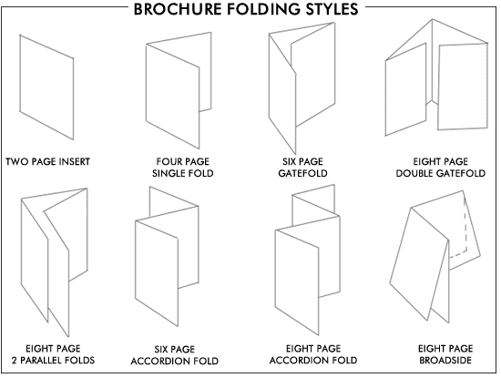
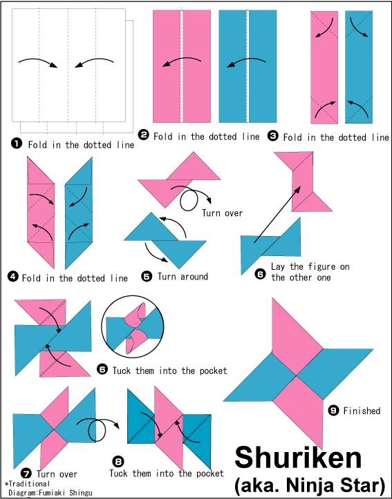
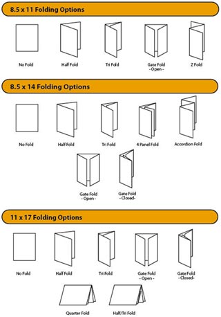
Study Task 02 - Folding Styles

http://www.printingforless.com/images/PaperFoldingTypes.jpg

Study Task 13 - Print Finishes

[production methods, digital preparations, costs, potential uses]

Varnishes

Varnish is often associated with wood. However, what you may not know is that varnishes are also used on paper.
Paper varnishes are applied to paper stock to give the page a smooth and consistent texture as well as having the added benefit of sealing the printed material to help preserve it better.
High-quality books and magazines usually have a paper varnish applied to their pages.
Varnishes can be glossy, as the example below shows:
image_17_varnish
Or matte (below):
image_27_varnish
Typically, varnishes are applied to the entire printing surface when a page needs to be robust but without adding too much weight to the paper stock, making it suitable for magazine pages, magazine covers, and brochures.

Lamination

Lamination adds a layer of protective coating (usually some type of plastic), often glossy or matte, to the printed surface while also improving its sturdiness and water resistance.
Lamination also has the added benefits of improving the tactile feel of the of the printed surface, lending it a smooth finish.
If a high gloss laminate is applied to the printed surface, photos and images appear to have more contrast and have better sharpness, as shown below:
image_15_lamination
Matte laminated prints are more subdued but add a very luxurious and elegant finish to the printed surface:
image_27_lamination_matte
Lamination is not unlike varnishes. However, whether lamination or varnishes are to be used in a project is wholly dependent on your needs and your desired outcome.
Typically, lamination is used if sturdiness is required such as for business cards and soft covered books. Also, in my experience, lamination tends to be one of the more expensive print finishes.

Spot UV Varnish

Spot UV varnishes are paper varnishes applied to the printing surface and is cured or hardened by UV light during the printing process. This results in a glossy coating on the surface of your print, as shown below:
image_09_spot_Varnish
UV varnishes are usually used as a spot application where only specific parts of the page get a UV varnish.
OLYMPUS DIGITAL CAMERA
This effectively gives texture and focal interest to different areas of the printing surface while leaving other areas untreated.
image_13_spot_varnish
image_07_spot_varnish

Foil Stamping

Foil stamping is the use of a malleable metallic material applied to the print surface by using heat and pressure.
image_03_foil
Foil stamping adds reflective properties to various elements of your design and can serve to add a bit of luxury to your project.
image_22_foil
Typically, it is used on text and the logo on the page or when certain elements call for it.
image_11_foil

Embossing

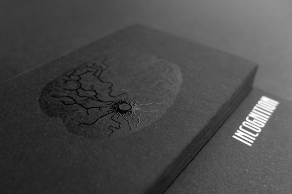
Generally, embossing refers to raising parts of the page for emphasis and texture.
image_18_emboss
This print finish adds physical depth to the embossed elements and thus, shadows and highlights are also produced in the design.
image_21_emboss
Embossing also adds a tactile dimension to your design. Images and text are literally felt.
image_20_emboss
Often, embossing can be combined with other printing techniques such as foil stamping to enhance the effects of both techniques.
image_19_emboss

Letterpress

Letterpress printing is one of the oldest printing techniques available. Some printers may call letterpress printing by the term debossing.
image1_letterpress
image_letter_press
A letterpress is used to depress or indent certain portions of the page. It can be seen as the opposite of embossing.
image_12_letterpress
Traditionally, the letterpress technique was used only for applying ink on a page as a form of relief printing and usually only for text. But it has evolved to also include pressing logos and other design elements directly into the paper substrate.
image_06_letterpress


 {http://designinstruct.com/print-design/print-finishes/}


Nomad Final

This was my final logo until reviewing it on deadline day. I decided that the type needed to change position as well as typeface, and I wanted to add another element to the logo so it looked more interesting on different backgrounds.

I much prefer this logo. It's shadow makes it more interesting on coloured backgrounds and also allows for different colour themes to be applied if needs be for different events etc the restaurant may hold. The type looks much more balanced underneath the mountains and makes the logo as a whole feel more complete as before the bottom of the mountains made the logo feel too open and almost vulnerable.