Coffee Visual Research

Good legible packaging but the cup is uninspired and uninteresting. Because of the plain design it wouldn't attract any attention.
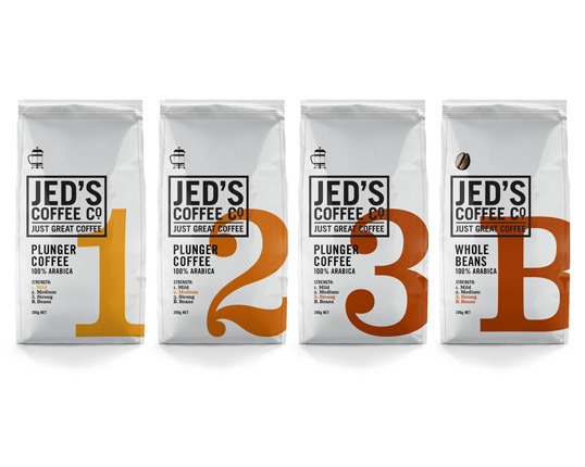
I like the rugged aesthetic that the bold sans serif font gives this packaging, as well as the colour gradients signifying the coffee strength. The clean white background contrasts nicely against the type aiding legibility.

This packaging design is quite trendy and 'hipster', but I think that the design is nice thanks to its use of colour, type and image. There is a good balance between content and negative space and the colour coding helps to distinguish each product. It looks to be aimed at a younger audience, more interested in independant coffee shops rather than chains, the imagery suggesting a care for the environment.

I feel like a design like this would pander too much towards art students and they would feel like the design was almost condescending, trying too hard to use their practice to sell them coffee. The type is also too playful for my taste.
a repeating pattern like this works well over different media, and thanks to the quality of the illustrations doesn't have the same problem as the previous playful design. The colour scheme is also more refined which I prefer.

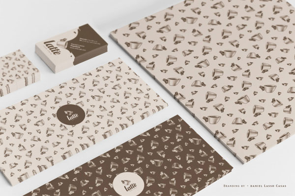
Again with a repeating pattern, I really like this design. The shine on the top half of the pattern gives the cup a more luxurious feel, as does the typeface used on the logo. The browns suggest richness and flavour whilst the white suggests purity and reminds me of cappuccino foam. This colour scheme and style will definitely influence my design.

Although the packaging for this coffee is in my opinion quite nice, the connotations of Starbucks now as a greedy corporate company is a huge downfall. I will attempt to make sure my design is in no way similar, by typefaces used or colour scheme.


I like the idea of a simple typography based cup, however I dislike designs like this because the quote is too pretentious and soppy.

The map idea here is somewhat interesting, however the type is looks far too goofy and has nothing to do with coffee.
Although not a fan of Costa coffee, I can see why these cups are successful. The type is easily legible, the full body corrugated card keeps the coffee well insulated and the deep red suggests richness and flavour.
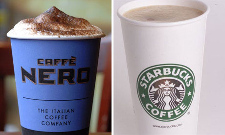
I find both of these cups incredibly bland. I dislike the typeface used for the caffe nero logo, as it's far too robotic and aggressive. The starbucks cup is boring, the only detail being the logo which connotes overpriced coffee and greed.
Seattle Research

Seattle ( i/siˈætəl/) is a West Coast seaport city and the seat of King County. With an estimated 662,400 residents as of 2015,[2] Seattle is the largest city in both the state of Washington and the Pacific Northwest region of North America. In July 2013 it was the fastest-growing major city in the United States,[6] and remained in the top five in May 2015 with an annual growth rate of 2.1%.[7] The Seattle metropolitan area of around 3.7 million inhabitants is the 15th largest metropolitan area in the United States.[8] The city is situated on an isthmus between Puget Sound (an inlet of the Pacific Ocean) and Lake Washington, about 100 miles (160 km) south of the Canada–United States border. A major gateway for trade with Asia, Seattle is the third largest port in North America in terms of container handling as of 2015.[9]
The Seattle area was previously inhabited by Native Americans for at least 4,000 years before the first permanent European settlers.[10] Arthur A. Denny and his group of travelers, subsequently known as the Denny Party, arrived from Illinois via Portland, Oregon on the schooner Exact at Alki Point on November 13, 1851.[11] The settlement was moved to the eastern shore of Elliott Bay and named "Seattle" in 1852, after Chief Si'ahl of the local Duwamish and Suquamishtribes.
Logging was Seattle's first major industry, but by the late 19th century the city had become a commercial and shipbuilding center as a gateway to Alaska during the Klondike Gold Rush. By 1910, Seattle was one of the 25 largest cities in the country.[12] However, the Great Depression severely damaged the city's economy. Growth returned during and afterWorld War II, due partially to the local Boeing company, which established Seattle as a center for aircraft manufacturing. The Seattle area developed as a technology center beginning in the 1980s, with companies like Microsoft becoming established in the region. In 1994, the Internet retail giant Amazon was founded in Seattle. The stream of new software, biotechnology, and Internet companies led to an economic revival, which increased the city's population by almost 50,000 between 1990 and 2000.
Seattle has a noteworthy musical history. From 1918 to 1951, nearly two dozen jazz nightclubs existed along Jackson Street, from the current Chinatown/International District, to the Central District. The jazz scene developed the early careers of Ray Charles, Quincy Jones, Ernestine Anderson and others. Seattle is also the birthplace of rock musician Jimi Hendrix and the alternative rock style grunge.[13]

Flag of Seattle
- Colour is too dull
-Imagery too irrelevant

Seal of Seattle

Space Needle
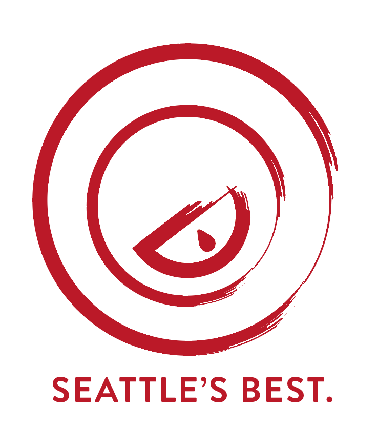
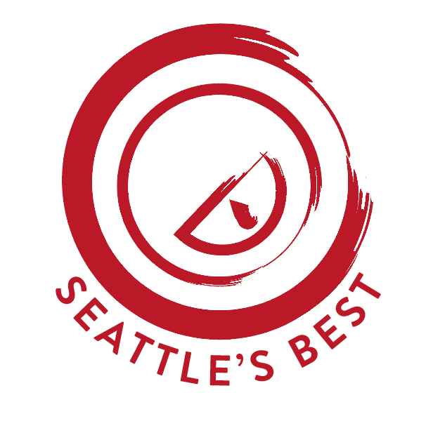
Seattle's Best Coffee Recent Rebrand, and why for me it doesn't work...
Originally their branding looked like this:


The reds aren't rich enough so just look cheap especially when mixed with the browny gold. The typography is uninspired and the tm logo being incorporated makes it feel too corporate.

The packaging gets worse, looking like a typical 80s american coffee pack. It looks cheap and basic, using again too many colours and different fonts.
The new logo design isn't that bad, but it doesn't work for a coffee company in my opinion. Having coffee in the name is unnecessary I believe, and the logo looks too playful. Again the red I think is too bright, with no clear links to coffee.

The cups are incredibly boring, again furthering the feeling that it is the most basic coffee available.


I began by trying to modify the current new logo to have more of a handcrafted feel, trying to make the coffee look more artisan-like.

The circular shape worked however I felt it was too similar to the Starbucks shape. I also really didn't like the paintbrush texture. I needed to make the logo look less corporate and more artisan-like without venturing into the handmade aesthetic.


Trying different framing methods to see what shapes worked. This logo looks like it's selling seattle's best washing machines, so I clearly had to change it.
Curved text again was too starbucks-esque.


Having a circular logo makes type placement tricky. Because of the perfectness of the shape, a sans serif was definitely needed. A serif would have also dated the logo too much.

This placement of type worked, making the logo feel like 1 icon rather than an icon with text. 


I decided to add the -est 1970- date as it gives a logo some trustworthiness and heritage, both important in the food and drinks business.

I lost the outer ring as I still felt like it was too similar to the starbucks logo. It's line weight was also far too heavy


I produced a series of colour tests seeing how the logo looks if it were to be used for different things such as vegan products (green), high end products (purple), nuts (grey and beige) etc. This was also a test of how versatile and readable the logo is.


vegan products

high end products

waters


nuts and other foraged items

I then changed the colour to a brown in an attempt to distinguish the logo from it's former. However it didn't look rich like I was hoping, but instead earthy.

I then looked back to my notes and thought about what it was that the coffee brand was trying to achieve. It was clearly trying to put itself at the top of the market, after all it is called Seattle's Best. I thought about imagery that signifies being at the top of a hierarchy and decided to use a crown rather than the droplet which really didn't signify much at all.

A darker brown was implemented with the new crown emblem, which I much prefer. I still needed to lose the paintbrush effect.

This was the first stage in which I was pleased with the logo. The type compliments the images which all look polished and created well. The crown emblem suggests the company's place at the top of the coffee brand hierarchy.

I set the logo in black as I was concentrating too much on colour, after all it must work in black and white. Luckily I think it works very well.

I had the idea of selling the coffee beans in small burlap sacks, making them look like they came straight from the sauce. However I was unsure on the hygeine of this. I considered having them in a foil packet inside the burlap, but this would have been uneconomic and not environmentally friendly using a double packaging system.

The beauty in removing 'coffee' from the logo means it opens up other pathways in the food and drinks realm for it to work in- other hot drinks like tea and hot chocolate, syrups and sugars as well as snacks and breakfast cereals.

Here the logo works perfectly in a circular sign using a black and white colour scheme which is neutral and calming.


The menu design is very simple utilizing a 2 column grid which is very readable thanks to using a lot of negative space and a highly legible typeface (Brandon Grotesque).


The stationary design is very simple (reflecting the establishments approach to coffee- no gimmicks), set in a sans-serif typeface for legibility. It would all be printed on recycled stock.


The packaging designs are simple and again use a recycled paper material. The colours are changing from dark to medium to light to represent the coffees level of roast.

The removal of 'coffee' from the brands name means that it will be more obvious that they also sell a range of teas, which would be packaged using the same colours as the coffee packaging. Other goods such as metal canisters for coffee would also be retailed.

No comments:
Post a Comment