Name : Nine Arches
''What makes a great logo design for a band? A clever concept and the ability to become just as iconic as the music is a good start, but originality can be just as important.''
''Typically, a logo's design is for immediate recognition, inspiring trust, admiration, loyalty and an implied superiority. The logo is one aspect of a band's commercial brand or economic entity. It's shapes, colors, fonts, and images usually are different from others in a similar market.''
I looked into existing band logos and tried to deduce what it was that made them work so well and become iconic. It was important that I also looked into the band the logos belonged to, as it if definitely possible that the logo became iconic purely because the band did, and the design itself was essentially unimportant.


HIM - the 'heartagram' is essentially just a stylised pentagram, but is easily accessable and recognisable thanks to it's reappropriation and altering of a known symbol. The pentagram having satanic connotations, it resonated well with teen angst and the rebellious.

ACDC- The gothic lettering used in the AC-DC logo was inspired by a typeface found in Gutenburg's Bible, and reflects bibilical imagery found in some of their songs, juxtaposed by the lightning bolt which suggests some darker undertones. The logo when colourized is blood red, against furthering the idea of darkness and evil.

Dead Kennedys - ''Designed by artist Winston Smith, the Dead Kennedys "DK" logo is a perfect example of simple, easily immitatable graphic design. A clever way of achieving a 70's shaped viral campaign, singer Jello Biafra is quoted as saying, "I wanted to make sure it was something simple and easy to spray-paint so people would graffiti it all over the place."
After showing it to Smith, he "came back with a bunch of designs that had the circle and slightly 3-D looking letters and he had ones with different patterns behind it. I liked the one with bricks, but ultimately I thought simple red behind it was the boldest and the best."''


Oasis - Like the gallaghers, the Oasis logo is bold and in your face. The bounding box gives the logo a punch and confidence that is similar to that of the use of a fullstop. The heavy weight connoting strength and power reflect the emotional and atmospheric music Oasis became famous for. Colour would be an unnecessary decoration, which again isn't something found with Oasis.

Nirvana - supposedly inspired by a Seattle stripclub, this punk logo works thanks to it's bright colour and the juxtaposition between the serious typeface and the goofy childlike drawing, suggesting a playfulness but also a serious undertone. It seems that there is a trend in that the logo
The Who - This logo designed by Brian Pike is very British, using the colours of the union jack. The O with the arrow suggests masculinity and progression, whilst the target shape is almost hypnotic, luring your eye to the centre.
They asked for the logo to be relevant to the name, sending me some images for inspiration.

The idea of repetition and structure is prevalent in both architecture and music, so would be fitting for the bands logo.


I then progressed to a different style using the archway imagery but attempting to have them look like sound waves. This logo reflected the music far better, with softer edges and the repeating pattern suggesting structure and beat.

My sketches looked at concept, format and balance mainly, with colour being an after thought. It would need to work in black and white first.

I did many variations of the number 9, but realised that because it's such a common symbol, that it wouldn't be unique enough for the logo.


I digitized the archway logo but disliked how blocky it looked given that the music of the band is quite fluid and smooth rather than hard.


Deciding what typeface to use was problematic. I wanted to demonstrate a high level of craft, whilst also showing britishness, indie rock and cool attitude. I ended up going for Gill Sans, a known british font which uses hard lines but soft flowing edges at the same time, which echoes the band's music nicely. The contrast in line weight against the logo also looks good.


I looked at band T-Shirts to see how they follow the logos concept, and every single one simply had the logo on the chest. The only thing that kept continuity was the use of colour, and the style of shirt (the Red Hot Chili Peppers using a america varsity style which was adopted by the punk movement).


It made sense to have the T-shirt in very dark grey- this is representing rock music whilst not being so dark that it may communicate metal.

I thought about different finishes and how most band shirts are just printed for cheap costs. A Foiled element could seperate the t-shirt from the crowd, however I don't think that a rock music fan would like to be seen with a shiny shirt.


The design could be used like this, focusing on the pattern (The design would cover the entire shirt, this mockup didn't allow that). The pattern could then be carried over to a wide range of different media.
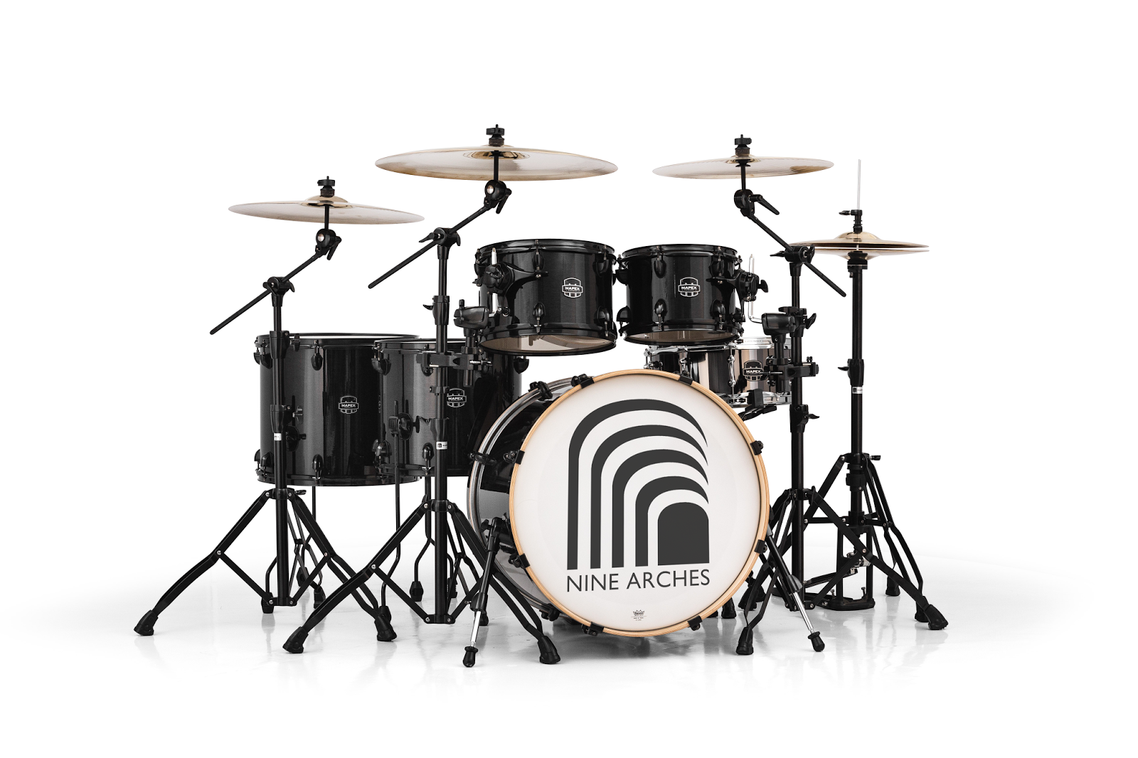
The logo fits a bass drum well, sizable so that the type is easily readable. Thanks to it's easy shape, the enblem is very easy to reproduce- the lack of bowls in the logo means that it can be spray painted onto different surfaces with ease.

It looks psychelic and 60's esque when applied as pattern only, which doesn't fit the music they produce, so the former was more suited.


Again thanks to the simplicity of the logo and the fact that it works at all sizes, stickers and badges are easy to produce which are used often by rock crowds- stickers on intruments, books etc, and badges on coats and bags.

I felt the best way to make the album cover since it's their first piece of music out, is to let the logo and type speak for itself. Any use of photography or illustration wouldn't suit the band members (I've known them a long time, so understand their personalities, straight forward and honest).

LOGO IMPROVEMENT
I realised that I had taken out the 9th arch from the logo and it looked much better without the heavy white block at the bottom corner, the entire logo felt more balanced. To match the concept, I added one more archway so it was still conceptually relevant.


On black

New logo on album cover
No comments:
Post a Comment