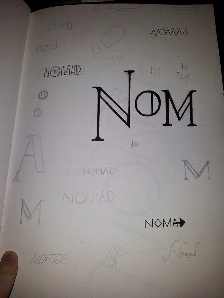
Nomad logo based on old traditional typefaces. Not sure whether it looks too british/european.
Logo based on the idea of movement and travel. the perfect circle of the O representing the plate and I would use things like the diagonal and horizonal lines from the A as an arrow in the menu.
Traditional logo again with heavier stroke and a section of negative space on the inside.
I really liked this logo, however after consultation I found that a few people believed it looked too medieval which put them off.
Multiple ideas, some revolving around the foraging nature of the restaurant, which I felt was a little clumsy and basic. and other based around the idea of travel and landscapes.
Looking into different styles of logos, and thinking about the different text that might need to be on there, such as established year, location etc.
Footprint negative space in the A. N design that is divided by lines representing paths.
Any additional information that may be included, I decided against this though as I didn't want to over complicate the logo.
More logo ideas that look at the word Nomads meaning.
Extra pieces of text would could be applied to the logo.
experimenting with adding the additional information in different locations. I think I will just leave it as I don't want to over complicate the design.


No comments:
Post a Comment