I've been asked to take part in a group project, attempting to create a viral campaign on a given topic, ours being 'Become an expert in ...'. We will need to research existing viral campaigns, and see why they were successful. I believe this will will a difficult task as we have a very small budget and can realistically only utilize local posters and social networks.
After looking into multiple viral ad campaigns, We soon realized that most of them nowadays are videos, which use the power of social media to generate hits.
The Melbourne Metro's 'Dumb ways to die' video uses a catchy song and playful/fun characters to send a powerful message, in a format that was fun enough to become viral. On the other end of the scale, the John Lewis advert became viral for hitting on more nostalgic and 'cute' notes. The animation was much more detailed than that of Melbourne Metro's, which was essential as the simplistic animation for theirs creates a fun tone.
I suggested that we make Vine videos, a 7 second video format which is becoming extremely popular online at the moment. They're easy to share on a variety of social networks and also has an app for android and iPhone so can be viewed via that. I suggested that we made spoof cooking tutorials, which would be a title page followed by 6 seconds of mayhem. A series could be made and just the fact that they're vines makes them likely to go somewhat viral. This however was overruled and we decided upon attempting to make a viral recycling campaign, something I was very much against due to the boring nature of recycling thanks to current campaigns.This being said I was very enthusiastic about the work as I find viral marketing very interesting. We felt that targeting it at students would be most appropriate as it's the younger generation that are using social media and the internet more than other demographics.
We all agreed that the best approach would be to create a blog, that has
linked twitter and facebook accounts to generate traffic to the blog.
Team Roles
Matthew
Creating own up-cycled product
Blog posts
Finding research/content
Jess
Illustrations
Creating own up-cycled product
Blog posts
Alex
Producing brand identity - Logo, Blog templates, Posters, Leaflets
Illustrations
Blog posts
George
Producing brand identity - Logo ideas, merchandise mock ups
Blog posts
Luke
Manage blog posts
Finding research /content
We brainstormed a few names such as 'From the clutter' and 'In with the old', we decided upon 'From the clutter'. Alex and I sketched some logo ideas which revolved around recycling and ideas, using imagery such as lightbulbs and boxes.
I had the idea of creating a video which would be of a Rube Goldberg machine, created out of a variety of household items, which purpose would be to ultimately topple a bottle into a recycling bin. We all agreed that this idea would be great, but unrealistic as it would take a huge amount of time to create and film, which we did not have.
Next was trying to decide upon a font. We needed to simply convey
Experimenting with different typefaces, we wanted one with more fun letterforms than a standard neutral typeface as we'd discovered from researching existing recycling movements that they end up making the whole thing seem very dull and dreary like most government ran projects.
Museo was close, but we didn't like the uppercase letter-forms, which we would put our brand name in.
Carrosserie again had the same problems as museo, however the many different weights could have been useful. The cost was also an issue as we were on a small budget.
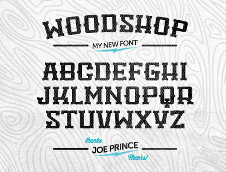
Woodshop at first seemed very promising, however after writing words with the typeface, it just didn't look right. Alone the letterforms were fun and interesting, but when actually read it's awkward for the eye to follow.
Lunchbox Slab is the typeface we settled with. The characters were fun and not boring, whilst the face as a whole was readable unlike woodshop. We also felt that because the letterforms looked handcrafted, they set the right tone for our brand.
The final logo that me and Alex created. I really like how this turned out. I feel that it could easily be made into stamps and it's easily screenprinted. The olive green colour is perfect; it reflects the nature of recycling but also it's the luminous green that most 'green' companies use which is vile.
Printed onto recycled paper which would further push the idea of recycling in our print media.
b+W negative and positive.


No comments:
Post a Comment