I've found it very difficult to come up with designs that aren't cliche's that are also visually interesting and relevant.
Oranges with a single strawberry, the idea being that the unique object is outnumbered and trapped.
More sketches which explore the fruit imagery. incorporating the X (xx female sex chromosomes), and a cross which is obviously religious.
Image as type replacing letters with fruits. I like the aesthetic of this idea but the concept behind it isn't strong.
I really liked the concept behind this idea, however I feel like it may be too complex. The orange representing her original way of life, once religion was cut out (in a literal sense here), her feminism and sexuality can be explored (shown by the ♀ symbol).
Inspiration / Typography research
I really like the typographic hierarchy on this book, as well as the readability of the typefaces. The broken lines are also aesthetically pleasing and conceptual.
I like the typography here but am unsure about the use of a typewriter font. Although it's conceptual I don't like it being used with the bold typeface.
Basic typographic layout but it works well. The colour choices are also interesting.
I bought some watercolours and wanted to experiment with different illustration styles. I knew I would have to keep things simple for two reasons, because of my skill level, and because of the time I had allocated to do this project. I tried crosshatch, simple lines, fineliner, brushes and inks.
I photoshopped them to enhance the saturation and levels making them stand out more. The vivid colours are much more exciting and eyecatching.
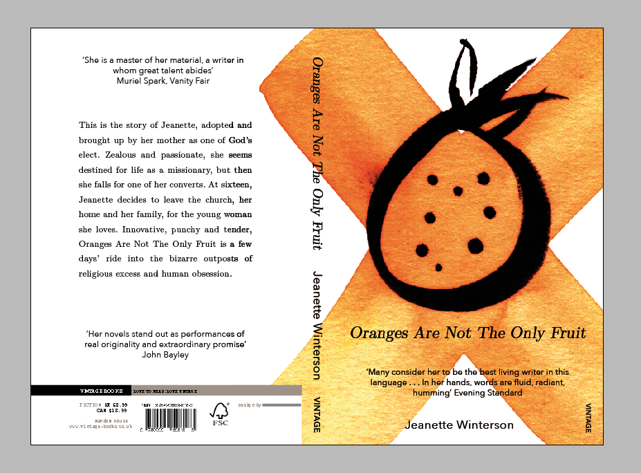
I originally planned on using multiple fruits on the frontcover, however after talking with peers I decided on just using one large illustration. I chose this one because of the connotations behind the X, as well as the pleasing contrast that the brush pen gave the orange.
Adjusting type and taking a few steps back. I was experimenting with different positions for the text because I didn't want to go for the standard centered layout. I thought the blue was working until I change it to white whilst experimenting with different colours. This just goes to show how experimentation is incredibly important. I also made huge changes after printing it for the first time and seeing it in it's usual format and media type.
Final blue design. After critting this, I realised I needed to change the colour scheme and center the text
Finished design in situe. I prefer the white as it makes the book less garish and much cleaner.


No comments:
Post a Comment